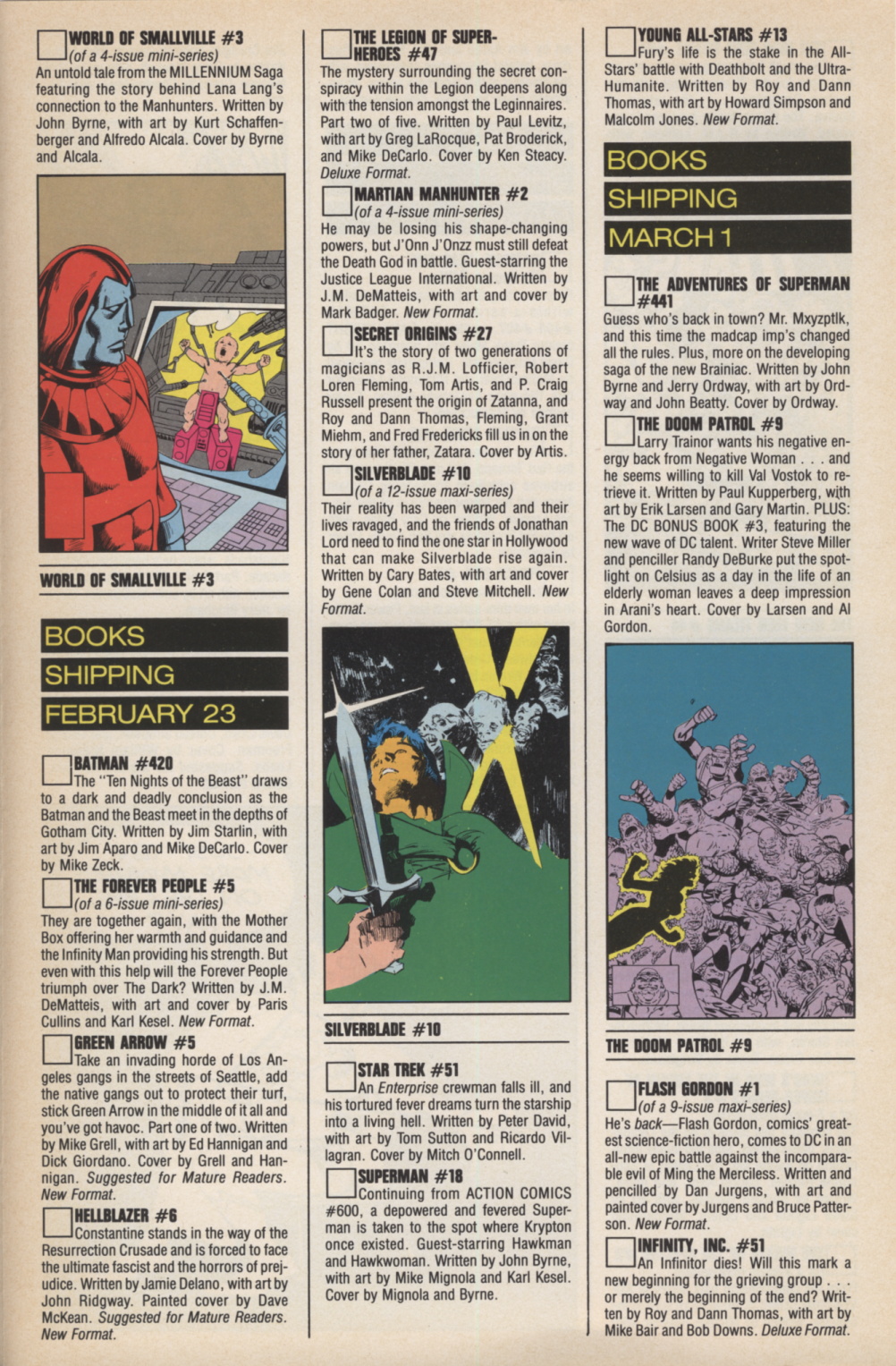
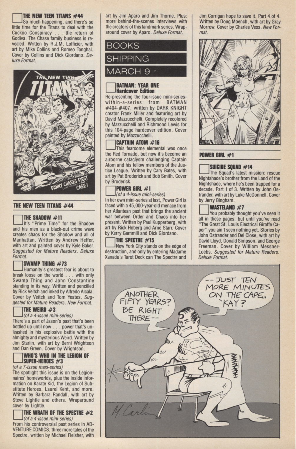
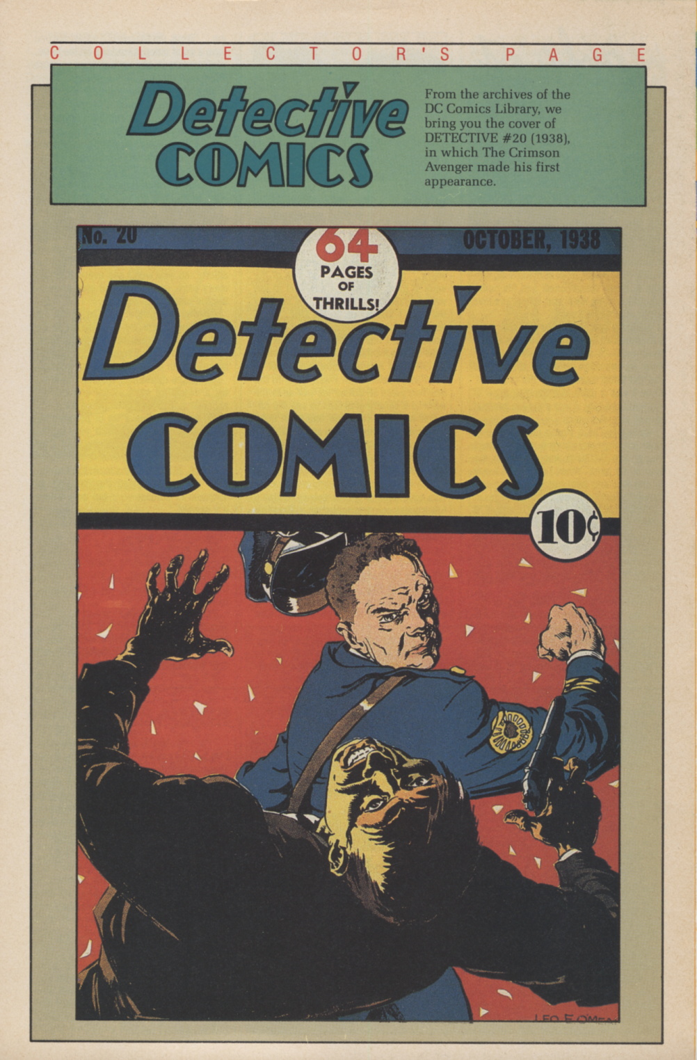
A continued look at pre-internet publisher’s comics solicitations, this time DC Direct Currents 1 January 1988. Glossy, colour, and a whole new direction for DC and its free solicitations. Interviews, golden age covers, and a little history.
The big release was the Batman: Year One hardcover, recoloured by Richmond Lewis. Here’s the interview from page 7 for easier reading.
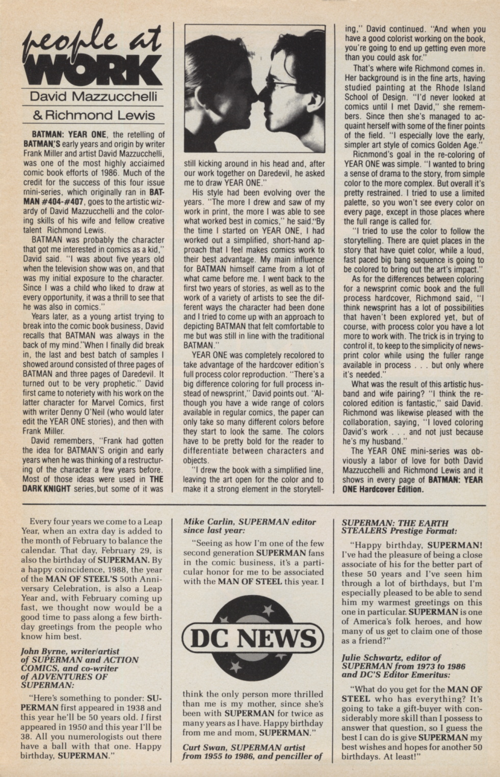
people at WORK
David Mazzucchelli & Richmond Lewis
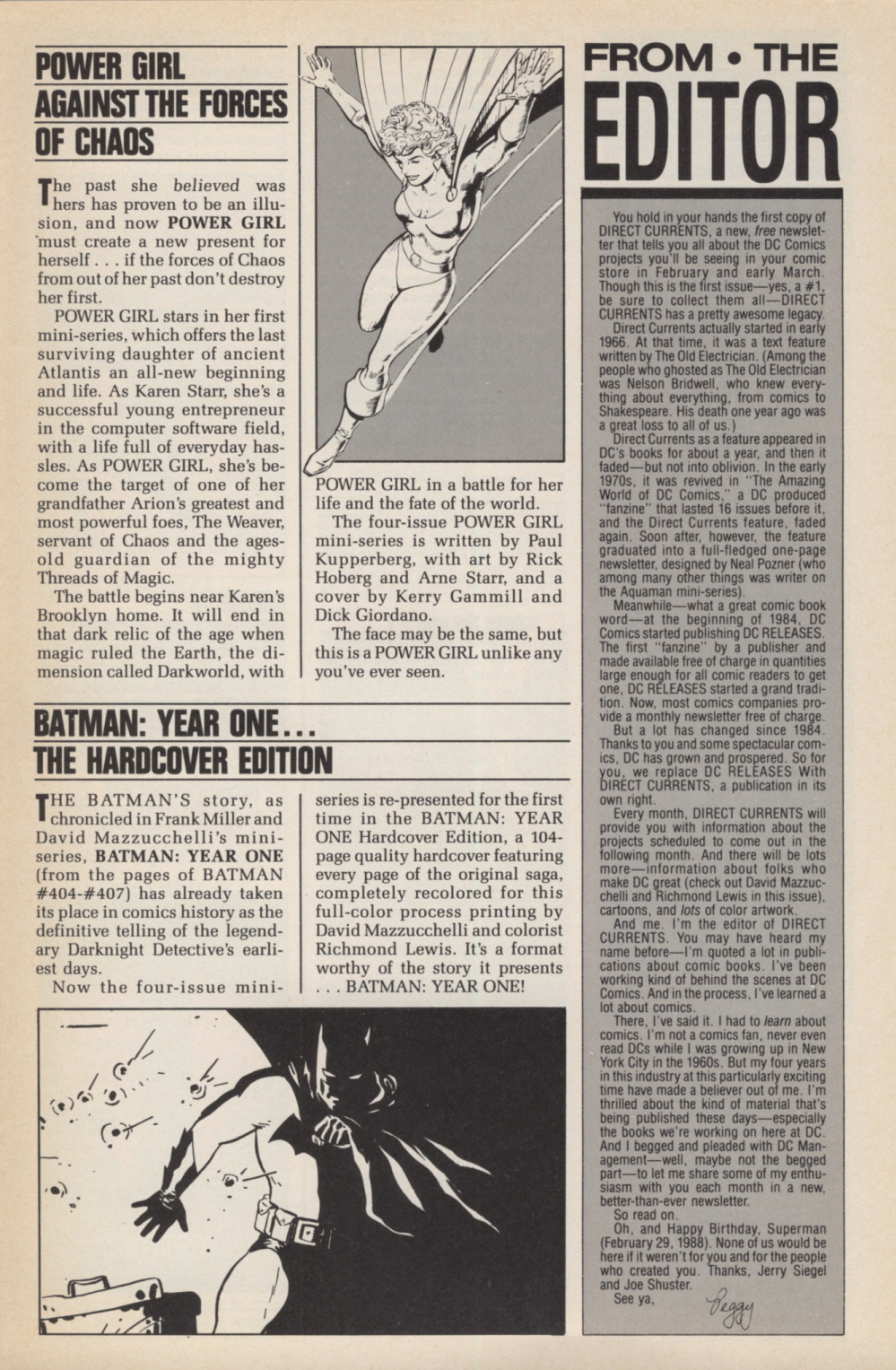
BATMAN: YEAR ONE, the retelling of Batman’s early years and origin by writer Frank Miller and artist David Mazzucchelli, was one of the most highly acclaimed comic book efforts of 1986. Much of the credit for the success of this four issue mini-series, which originally ran in BATMAN #404-#407, goes to the artistic wizardry of David Mazzucchelli and the coloring skills of his wife and fellow creative talent Richmond Lewis.
BATMAN was probably the character that got me interested in comics as a kid,” David said. “I was about five years old when the television show was on, and that was my initial exposure to the character. Since I was a child who liked to draw at every opportunity, it was a thrill to see that he was also in comics.”
Years later, as a young artist trying to break into the comic book business, David recalls that BATMAN was always in the back of my mind”When finally did break in, the last and best batch of samples I showed around consisted of three pages of BATMAN and three pages of Daredevil. It turned out to be very prophetic.” David first came to notoriety with his work on the latter character for Marvel Comics, first with writer Denny O’Neil (who would later edit the YEAR ONE stories), and then with Frank Miller.
David remembers, “Frank had gotten the idea for BATMAN’S origin and early years when he was thinking of a restructuring of the character a few years before. Most of those ideas were used in THE DARK KNIGHT series, but some of it was still kicking around in his head and, after our work together on Daredevil, he asked me to draw YEAR ONE.”
His style had been evolving over the years. “The more I drew and saw of my work in print, the more I was able to see what worked best in comics,” he said:”By the time I started on YEAR ONE, I had worked out a simplified, shorthand approach that I feel makes comics work to their best advantage. My main influence for BATMAN himself came from a lot of what came before me. I went back to the first two years of stories, as well as to the work of a variety of artists to see the different ways the character had been done and tried to come up with an approach to depicting BATMAN that felt comfortable to me but was still in line with the traditional BATMAN.”
YEAR ONE was completely recolored to take advantage of the hardcover edition’s full process color reproduction. “There’s a big difference coloring for full process instead of newsprint,” David points out. “Although you have a wide range of colors available in regular comics, the paper can only take so many different colors before they start to look the same. The colors have to be pretty bold for the reader to differentiate between characters and objects.
“I drew the book with a simplified line, leaving the art open for the color and to make it a strong element in the storytelling.” David continued. “And when you have a good colorist working on the book, you’re going to end up getting even more than you could ask for”
That’s where wife Richmond comes in. Her background is in the fine arts, having studied painting at the Rhode Island School of Design. “I’d never looked at comics until I met David, she remembers. Since then she’s managed to acquaint herself with some of the finer points of the field. “I especially love the early, simpler art style of comics Golden Age.”
Richmond’s goal in the re-coloring of YEAR ONE was simple. “I wanted to bring a sense of drama to the story, from simple color to the more complex. But overall it’s pretty restrained. I tried to use a limited palette, so you won’t see every color on every page, except in those places where the full range is called for.”
“I tried to use the color to follow the storytelling. There are quiet places in the story that have quiet color, while a loud, fast paced big bang sequence is going to be colored to bring out the art’s impact.”
As for the differences between coloring for a newsprint comic book and the full process hardcover, Richmond said, “I think newsprint has a lot of possibilities that haven’t been explored yet, but of course, with process color you have a lot more to work with. The trick is in trying to control it, to keep to the simplicity of newsprint color while using the fuller range available in process. . . but only where it’s needed.”
What was the result of this artistic husband and wife pairing? “I think the recolored edition is fantastic,” said David. Richmond was likewise pleased with the collaboration, saying, “I loved coloring David’s work . . . and not just because he’s my husband.”
The YEAR ONE mini-series was obviously a labor of love for both David Mazzucchelli and Richmond Lewis and it shows in every page of BATMAN: YEAR ONE Hardcover Edition.