The book:
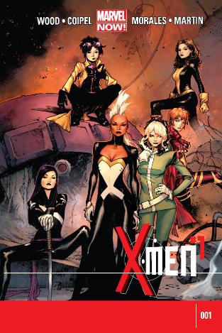
X-Men #1
Marvel Comics
Words by: Brian Wood
Art by: Olivier Coipel
Inks by: Mark Morales and Olivier Coipel
Colours by: Laura Martin
Release Date
05/29/2013 – Day-and-Date Digital
Age Rating
12+ Only
Why this book?
An interesting book to review, due to its scale. This is (arguably) the biggest mainstream, superhero book we’ve seen in recent weeks. The next being: DC’s Superman Unchained.
Probably.
The Vibe:
There was an impressive surge of hype surrounding this book prior to release.
Previews and physical advertising flooded the Marvel print range, website and mobile app. Between eager bloggers online and posters all over the local shop, it’s all been sold through the ‘controversial’ notion that… this X-Book will be starring the female X-Characters only.
Genius.
‘Girls only’ is a smart enough hook. This should make for an attractive gimmick for anyone whom wants to see women in comics (me) and anyone whom wants to be women in comics (fan-girls). Also, when the big male characters do finally make a first appearance, that moment will flaunt an elevated value.
There’s been a big and bold advertising campaign for this book in general, not something I’m used to seeing.
It all worked on me too, I remembered to buy my copy.
But, to really justify a campaign for a 1st issue comic book, you should probably broaden the delivery verticals and maybe use less comic-specific publishers to introduce the idea of actually buying a comic book… to a more general fan of popular culture.
Comics people will already pick this book up.
I’m also contributing to the hype myself (in a tiny way) by blogging about the book here, and this is typical fanboy behaviour, behaviour that all comics publishers can count on from their devoted, opinionated and tech-savvy followers.
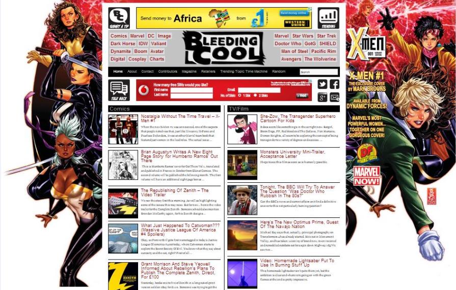
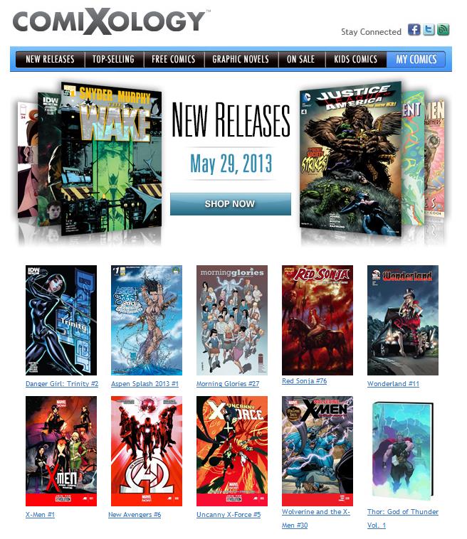
The book was also front-and-centre in Comixology’s weekly flag:
“New Releases! The Wake #1, X-Men #1, Star Trek #21, And More!”
We were promised the following variants depending on availability:
X-Men #1 (Arthur Suydam DeadPool Variant Cover), AR
X-Men #1 (Blank Variant Cover), AR
X-Men #1 (Joe Madureira X-Men 50th Anniversary Variant Cover), AR
X-Men #1 (Milo Manara Variant Cover), AR
X-Men #1 (Olivier Coipel Regular Cover), $3.99
X-Men #1 (Skottie Young Variant Cover), AR
X-Men #1 (Terry Dodson Variant Cover), AR
There were 4 of the 7 in my local shop. Not bad.
I’m someone who’s never bought a continued run of X-books. I find them to be a bottomless swamp of mystery. The X-books (for me) are a prime example of publishers not making it easy for new readers to jump on.
How many X-books are out there, right now?
These were all released on the same day as the 7 variant #1’s above:
All-New X-Men Volume 2 Here To Stay HC (Premiere Edition), $24.99
Savage Wolverine #5 (Dave Johnson Variant Cover), AR
Savage Wolverine #5 (Frank Cho Regular Cover), $3.99
Ultimate Comics X-Men By Brian Wood Volume 1 TP, $19.99
Uncanny X-Force #5 (Kris Anka Regular Cover), $3.99
Uncanny X-Force #5 (Milo Manara Variant Cover), AR
Uncanny X-Men #4 (Chris Bachalo 2nd Printing Variant Cover), $3.99
Wolverine And The X-Men #30, $3.99
A business needs ‘product’ to make money, sure…
But I’d love to see just one X-Book, one version, one title: X-MEN. Done.
Cherry-picking your own continuity is cool for comics people but, a true #1 should feel like ‘ground-zero’ for anyone whom wants to jump on and start reading from the top. Quality not quantity.
The Hold:
This book is standard dimensions – 22 Pages. Advertising and other content do disrupt the flow, as ever.
There’s no free digital code inside either, so it’ll be an extra few ‘tokens’ to get the digital version on your phone, tablet or phablet… if you’re so inclined.
The shop:
There were a lot of copies on the shelf in the local shop. They obviously have faith in the books preceding reputation.
The Art:
Olivier Coipel is penciller on this book and he’s also inking… with a little help from Mark Morales. Colours by Laura Martin.
Coipel is one of my favourite artists out there right now and this is the first thing (of his), that I’ve picked up since his short run on AVX last year… which included the best-looking commercial book of 2012, for my money.
Coipel’s trademark anatomy is evident throughout with his familiar ‘catwalk’ faces at the forefront and his thick and satisfying limbs leading the way in the visuals. His solid-looking head and shoulders sell most male beefcake characters perfectly.
In this book however, Coipel must sell us his feminine side, with delicate and young-looking females steering the story.
There are always robust and strong-looking hands and limbs in Coipel’s artwork which lend the narrative a nice amount of security and strength.
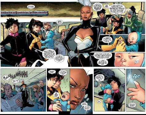
His facial expressions are fairly urgent, candid and menacing at times, but he does tend to use a default expression that’s quite ‘catwalk’ (as mentioned above), but that’s ok by me. There’s also a baby in this book… and a baby’s facial expressions are basically impossible to ground in believability, Coipel manages that just fine too.
The obvious cast members (in an all female X-Book) are showcased with individual posture and interesting-looking hair in both relaxed and energised poses. It’s all very well drawn. Quality.
The pacing feels like the opening set-piece in a medium sized movie.
The build (for an intro-piece) is expected and the action is exciting enough to carry the dialog, which… is confusingly positioned at times. For example: there’s narration in one scene from one place… and that continuous through a few panels which show us something else, and while that should be the case – if we expect the art and words to tell the same story in different ways – but if you’re not concentrating fully on the characters individual voices, it’s easy to lose the delivery of dialog among a barrage of simultaneous action panels in the art.
The girls look great in this book. I didn’t necessarily notice much direct sex-appeal, which could be intentional if the aim is to get more girls interested. The lines and form of anatomy are perfectly feminine though and work very well.
The colour palette is bright and mostly lit by daylight. There are some good interiors with some nicely contrasting depth-of-field and a slightly more serious tone is employed in the scenes with our villain. But the colouring is mostly safe, bright and bold.
The panel layouts again, are mostly safe. There’s only one real moment to really enjoy (in terms of layout alone), which looks a lot like a Coipel signature. I love the panel-breaks and gutters that are built using the characters themselves, while the distance and scale lets us know what’s happening around us. The panel composition and variation overall is quite average, but the finish makes up for that.
The architecture/mechanical art is believable, but it’s all really sold in the colouring and lighting. Laura Martin is equal to the pencils.
There are also no obvious short-cuts (that I can see) in terms of direct panel steals from previous work.
This is a fine looking comic book.
The story:
This is a successful book in that, it does exactly what it says on the box.
We’re introduced to the basic backbone of the plot within the first few panels, as the premise is nicely seeded in the opening. Familiar X-characters are used as the primary catalyst while lesser-known, secondary and tertiary X-characters are introduced quite casually, probably being ‘banked’ for a larger plot-driven moment in a few books time. Friends becoming enemies, enemies becoming friends and then everyone saves the day together.
Once all the editorial boxes are ticked, there’s a tiny little space for story. Which (by the way) feels quite average.
Explained in the opening panels is a premise dating back to the beginning of “life on Earth as we know it.”
Two siblings (male and female) are banished into the cosmos. The male wins a fight between the two and inherits primordial Earth as a place to settle (John Sublime). The female is pushed into the depths of deep space until the present day… when she hitches a ride on the back of a meteor and flies down to Earth in search of her brother… and her revenge.
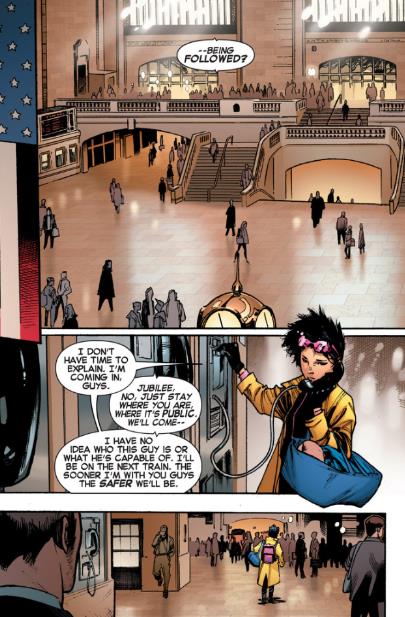
Our primary heroines: Storm, Rogue, Kitty and Jubilee find themselves in the bulk of the action as the opening story is introduced in the form of a train wreck, which ends with the inevitable splash-page teasing the terrors to come.
This book takes no chances. It’s delivered through a very well established, comics-shaped hole in the wall… and lands inside the target area with exactly the perfect amount of expected sure-footedness.
I like comics and I like Coipel very much, so I did like this book. But that’s not good enough in this case.
A new #1 should invite new people — from outside the culture — to pick it up! and those new readers should then want to continue buying and reading, based on the story.
There’s nothing new about this book.
It’s like they had an idea for a book… so they emptied out the contents of an old story-container, and then poured the ‘new’ idea into the now vacant space, and then just continued turning the handle of production.
It’s a mainstream Marvel comic book about superheroes. Everyone knows what this thing is, before a single page is turned.
I was hoping for something a little different Iguess, but then… I should know better maybe?
The Reaction:
X-MEN#1 has been received fairly well among fans and critics, and the following books will no doubt do very well indeed.
Summary:
Just a fair book.
It’s fine. It’s a book that readers of mainstream superheroes will probably pick up. I’d hesitantly recommend it (the art makes it all worth-while) but, I’d be sure to introduce a new reader with a firm warning that, the story could be more challenging and character-driven.
4.5 out of 10

Good article Danny. I agree with most of what you said; particularly about the continuity thing. All female? I’m really not very interested, but I won’t put it down for those that are. There are women out there that prefer this kind of thing and we all know some guys will show up wanting in the team’s door later. I like the diversity in comics publishing and this one adds to it, although it’s not the first all-girl team. The thing I most agree with is all these books featuring the same teams but with different members. Avengers, XMen, Justice League ad infinitum. It’s too much for me. I’ll pass.
Good points, Tom. I think… to really make a play for some more female readers, they’d have to – somehow — tap into more stereotypical female fantasies (whatever they are).
This just feels like a comic book with girls in it. It should feel more like a story about girls for girls (or women)… if that’s the objective.
These characters could literally be anyone and it would still feel the same.