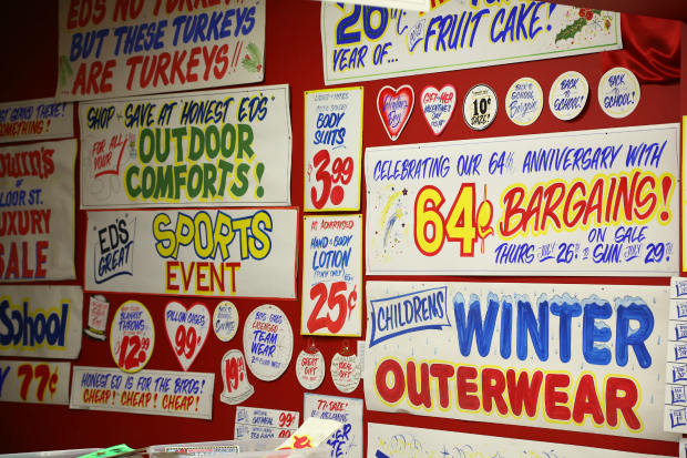
Honest Ed’s is local discount department store here in Toronto. They’ve been open since 1948 and over the years they’ve become an iconic symbol of our city. Sadly, they announced their closure in 2016. Aside from their long history, the remarkable thing about Honest Ed’s is not the goods that they carry but all their in store POP (point of purchase) signage, which are all hand rendered… even today!

Earlier this year, they decided to sell their signs with proceeds being donated to charity. Hand lettering is fast becoming a lost art so I was delighted by the response. Some people waited up to 3 hours in a line that went around the block for an opportunity to pick up a small part of their history. You can read more about it here and here.
Quick History
About 25+ years ago, and with the introduction of a high resolution laser printer from Apple, Adobe’s Postscript fonts started becoming widely adopted. Large and small typesetting house’s that served the advertising community had been made obsolete in a matter of a few years. Desktop publishing was born and crafts people, some with a career in typesetting spanning over 20+ were forced into retirement or had to find other work.
With Change Comes Opportunity
Soon there after, comic book letterer Richard Starkings, with partner John Roshell, started a company called Comicraft. Together, they created custom digital fonts for the comic industry. At one point, almost all comics used typefaces created by Comicraft. With an ever expanding library their fonts are still widely used and even sold at pro type foundry Font Shop. However, amongst more serious typographers, comic lettering is considered to be a novelty at best, which I find to be a little ironic considering many experimental fonts by celebrated designers Neville Brody, David Carson and Toronto’s own Paul Sych tend to resemble comic book lettering.
Being the old guy that I am, I’m tempted to state that digital lettering is not as good as hand lettering, which is the typical response to change. The tools are definitely different, however, I believe the sensibility has actually greatly improved. Comic book lettering is a big part of comics but it is also highly under appreciated, with all the glory split between story and art. Anyone who has tried to design their own typeface can appreciate the incredible effort that it takes to create a set of letters that is visually appealing, legible and chiseled so that each form is optically balanced.
However, I do miss the hand lettering of the pre-computer era. Without any formal rules, comics were a rich playground for experimentation. Wonky, mis-proportioned letters… often funky and rustic, added warmth to panels. Speech bubbles could easily be typeset with traditional roman lettering but the cold perfect letters can leave the reader feeling somewhat disconnected. There is a reason why digital comic book type resembles hand lettering. Not only does it compliment the art, but it’s expressive quality is simply more human. Perhaps you can argue that this is instilled or acquired but however it all developed, comics have a distinct visual language.
At its highest level, typography it is a specialized craft that deals with nuances so the topic of lettering may not go over very well at cocktail parties. Like the music in movies, comic book lettering is supposed to exist in the background so if you haven’t noticed it much, that probably means it’s working well. Admittedly, I don’t have the patience for it myself and as you can tell, I’m often torn between vintage handcrafted lettering versus the pursuit of optical perfection.
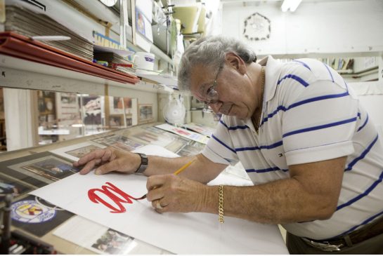
Hand lettering is another casualty of the digital age but I’m glad that the sign painters of Honest Ed’s got a small nod of recognition from the public for their craft. I can only hope to have as steady a hand when I’m a little older.


Charlie, nice post. I have always admired typography not only in comics but also on vintage commercial products, boxes,etc. It sure is a lost art !
I couldn’t agree with you more
Charlie. When I was a kid and all the other kids were singing the praises of the likes of Kirby and Ditko, I was also a big fan of Artie Simek and Sam Rosen, and usually the only kid I knew who even remembered the names of letterists. It also happened that I was a lousy longhand writer, so, very early on, I began printng everything for legibility. I have Rosen and Simek to thank for my style, and, now that I think about it, I should have mailed this response to you instead of keyboarding it!
Thanks Ed Dee. Speaking of lost art… if you like typography, check out this short documentary:
https://www.youtube.com/watch?v=XdfreJmK9R4
This blew my mind! David Smith…
• Designs the layout
• Illustrates all the details
• Is proficient enough on the computer to translate his art into a series of vector files
• He cuts, etches, shapes glass, paints… geez! Who does all this in this day and age.
This is why album covers are/were valued… and by extension comics. The care that went into ones own work was to be admired.
I would have loved to receive your handwritten letter. The only mail I get these days are from Rogers and Enbridge… bills, bills and more bills.
Back in the day (like the Victorian era), people had their own personalized note cards. Without any means of modern communication, like the telephone, messengers would run around delivering little notes. Looking at old historical books… the penmanship was just incredible.
“The House of Montague requests the presence of Sir Mel Taylor for tea.”
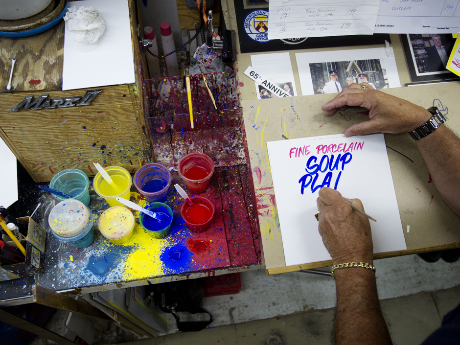
http://i143.photobucket.com/albums/r127/subliminaldissonance/PSstuff/makingsigns.jpg
One of the main reasons was because I collected comics.
My handwriting is not that good these days and I blame the use of computers for rewiring the brain in so many of us nowadays causing handwriting to decline in quantity and quality.
Very true… and think about what platforms like Twitter is doing to the English language. When I first met my wife, we would write each other love letters. My daughters, however, may tweet, email or text. Their affections may look more like this:
#I LUV U 4EVER (。-_-。 )人( 。-_-。) @lalaville
Which is fine I guess but it doesn’t have the same warm as reading a 30 year old hand written letter.
Great post Charlie.Most people don’t even give any thought to the beauty inherent in hand written lettering. It is a separate art form all together. When you see the original artwork that came before the digital age , hand lettered sound effects an ddialogue ,it adds a whole other aspect to the page.
Indeed. A friend of mine who used to work for Marvel says he can ink 1 page per day, maybe 2 if he really tried. If a typical comic has 22 pages and based on 30 day month… that leaves only 8 days for everything else… so that can’t be right. It makes me wonder how long it takes to type set a whole book. Printing and distribution alone would eat up about a week I assume.
As a designer, once the printing was scheduled, I would tell clients that it would take 2 weeks to deliver. It may actually take 1 week (depending on how complicated the job) but often, there would be issues that pop up during the process. Similar to magazine work, I assume there’s a lot of pressure putting a monthly together. At least magazines are departmentalized…
As an old hand letterer in the industry, I do miss it. I do enjoy the ease of computer lettering though. Lettering IS an art in itself and most overlook it unless it is bad. I have also been a sign painter since the 70’s and still use a quill to paint signs not a computer! It is definitely a lost art.