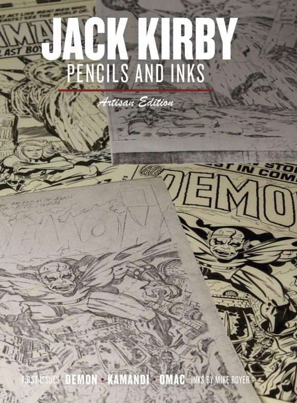
 Jack Kirby has been called the King of Comics, and rightfully so. For more than 40 years he was the most vital and groundbreaking artist in the medium. There have been dozens of books on Kirby over the years, including several oversized Artist’s Editions showcasing his original art. This book will present Kirby’s art in a new and unprecedented way, as side-by-side examples of his work, both in PENCIL and INK! Three Key first issues are showcased: The Demon #1, Kamandi #1 and Omac #1, along with a number of additional pieces presented. This is a perfect way to see Kirby art in its rawest form, from photocopies made from the original pencils as each page was completed, then next to it, the finished inks. We would almost call this a textbook of comic art except it’s too much fun!
- IDW Publishing, December 7 2016
- ISBN 978-1-63140-758-1
- 160 pages, 8” x 12”
- $49.99 USD
- Order online: Amazon
As with all original artist’s gallery editions this is a collection of classic comic material and I’ll be reviewing the book and not the story. For a complete list of all current and announced editions, with review links, please visit our Index.


Three first issues from Kirby’s Fourth World: The Demon, Kamandi, OMAC. A look, page by page, comparing Jack Kirby’s photostat pencils with Mike Royer’s inks and lettering. All wrapped in an 8″ x 12″ hardcover bearing the Artisan Edition title.
Since it’s coming from IDW’s Scott Dunbier and says Artisan Edition you’d expect the same quality and care seen in Artist’s Editions, and you’d be correct. And it’s a completely different product from previous Artisan Editions which seemed to be softcover reduced size versions of Artist’s Editions.
It’s a complete, well produced package. An introspective introduction from Royer, and a heartfelt afterward by Lisa Kirby. Before each issue are Kirby’s series introductions, setting the stage. Then pencils on the left and inks on the right, page after page. Closing it all out is a one page Kirby biography.
While we’re all here because of Kirby, half the book is Royer’s work. It’s not Jack Kirby pencils and inks now is it? I would have liked a bio for him as well.
Moving through the book, comparing the pencils to the inks, shows progression but not process. Royer notes in his introduction he didn’t embellish but faithfully inked what Kirby had on the page, and that is wonderfully accurate as you turn page after page. At it’s 8″ x 12″ size the book is manageable to read and large enough for you to see and admire the art’s details.
The scans are very good, with no blurriness or pixelation. Kirby’s photostats are grainy, but that’s the limitation of the technology he had available at the time. The completed inked pages are flawless in their presentation. I was concerned about viewing and comparing the art at this size but it just works.


Tom Kraft, of the Jack Kirby Museum and What If Kirby website, is credited with concept and design. A clear and clean departure from other AE format book designs, Kraft employs photo montages of the penciled and inked pages with printed covers and a unifying burgundy from the cover title divider to the biography. It works well throughout, but for me the wraparound cover lacks punch. Loved the endpapers working the theme.
Excellent production overall. Sewn binding of thick matte paper stock. After carefully breaking in the book and smoothing pages most pages wouldn’t lay open; perhaps a combination of too tight binding and the size. A welcome sight are the page numbers that appear under the inked pages.
Kamandi issue one has already appeared in Jack Kirby Kamandi The Last Boy On Earth Artist’s Edition Vol 1, but OMAC and The Demon are new to AE readers. Let’s hope more issues are available so we can get Artist’s Editions of this Fourth World material. While I fully enjoyed this volume I still wish it was original size.


SOLD!!!
I like how good the pencil pages look. Looking forward to getting my copy.
A nice looking book… I’m planning to pick one up during boxing day (assuming there’s any left). So let me see if I have my definitions straight:
Artist Editions – Reprints complete books.
Artifact Editions – Reprints incomplete books.
Gallery Editions – Covers only?
Curator’s Collection – Hand selected pages by someone?
Archival Editions – Unreleased art?
Studio Editions – With colour?
Apex and Art Editions – I’m lost here.
Now we have the Artisan Edition. Doesn’t anyone believe in systems any more?
Big Book!Big Price Tag!
It should be pointed out that the scans for the pencils to the great two page splash pages are not included and probably don’t exist. Scott Dunbier says he believes they were two large for the copy machine Kirby used,.
I was a little skeptical about this at first, but any imaginary concerns I had were both imaginary and unfounded. This book deserves a spot on any Kirby shelf. One aspect of Royer’s work that rarely gets mentioned (because I’m the only one who seems to talk about it) is his lettering. Royer knew how to design with type. The weight of his letters was just as important as the weight of his ink line in the overall appearance of the finished art. He was like Sinnott and Simek and Rosen rolled into one. Certainly, D. Bruce Berry’s inks could have used Royer’s letters. Royer’s letters elevated Kirby’s DC books. Compare the look of the books before Royer took over, both in inks and letters. I’d like to know if he designed the logos for Kamandi and the Demon. Both are very memorable.
We’ve all read or heard how Royer made it his mission to reproduce Kirby’s pencils as accurately as possible. This book is a testament to his success. Comparing the pencils and inks side by side you can see just how little deviation or interpretation there are in the inks, if you can find it at all, unlike Sinnott who added a certain elegance and refinement to Kirby’s work.
I’m not sure what Scott means when he says you can’t see process. There are three pages in the Demon that were combined into one for the printed issue, because the issue ran long. All three are reproduced (in a gate fold) along side the final cut and paste page that appears in the printed comic. You don’t get more process than that. Seeing the pencils and inks together certainly infers process, but perhaps we’re thinking of process differently in terms of sitting down with a page to letter and ink. Too bad there are no step by step photos of Royer inking Kirby. If they were teamed up today, it would be all over YouTube.