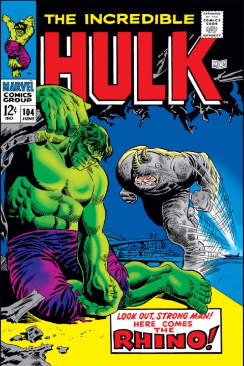
Incredible Hulk #104, Marvel Comics, June 1968 – Artist: Marie Severin.
Such a stand out cover here, great colors, great scene and great demand for this baby.
Young Love #104 is a must have and I liked the X-Men #104 from the late 70s.
A great comic book cover matching each day of the year, 1 through 365. Please chime in with your favourite corresponding cover, from any era.


Nooooo! Journey into Mystery #104 is so much more iconic and beautiful. Kirby in his prime draws classic Thor positioned against a white sky, dominating the cover while the ice giant and fire demon lay havoc below. Giants Walk the Earth indeed!
Captain Marvel Jr 105 is my early bid for tomorrow 🙂
A safe and understandable pick.
I looked at Young Love and knew that was right up your alley. If the composition had been a little more interesting I might have given it a nod.
For #105 no complete standout but I have to pick Blue Bolt, even though my personal preference is Jimmy Olsen. If Jimmy Olsen #98 is the bizarre extreme, #105 is the metaphysical apotheosis of Olsenity. The World of 1,000 Olsens is the eighth circle of Hell.
We can’t go with another Hulk I guess, but #105 is nearly equal to #104. After saying that I’m not a Cockrum fan, I am also again going to choose X-Men as a runner up. House of Secrets is good but the previously mentioned HoSs were better.
Superman is at it again, finally getting Lois to the Death House, albeit as bride of a convict. Kindly Superman shows his support by reminding Lois “in five minutes you’ll leave alone – as his widow!”
Finally, Adventures into the Unknown (Feb 1959) – Groot!
The problem with that JIM is the amount of real estate taken up by text and text boxes. Once again Kirby draws teeny tiny “giants” – the text box announcing “The Most Dramatic Hero of All Time!” is bigger than the fire “giant”. No sir.
I had a second look at JIM #104 and it is a strong cover, the Thor pose is spectacular and the yellow word bubble didn’t throw me off that much either. I think it was the lame old hairy giant that turned me away.
http://www.coverbrowser.com/image/little-dot/104-1.jpg
https://i.pinimg.com/736x/bf/87/13/bf871393bc1207c1aea5b7d843f5be9c.jpg
http://clzimages.com/comic/large/ce/ce_102605_0_WoodyWoodpeckerVol1104.jpg
https://i.ebayimg.com/images/g/meUAAOSwK2JckYav/s-l500.jpg
The point is Walt….Walt you miss too many Genres and titles to keep this interesting. A great Idea, But you miss too many opportunities to showcase St Johns comics, Harvey comics, Charlton,Dell and so on
Great concept…but too much of the same old same old from a guy like you who really has and seen it all
THE LONE RANGER #104
https://i.ebayimg.com/images/g/lmwAAOSwYNxaUTBH/s-l1600.jpg
Wow that’s harsh. “Keep it civil” is a commenting rule. I always try to deliver what tiny critiques I have in as oblique a manner as possible, as not to offend Walt’s delicate sensibilities. I wouldn’t be surprised if the therapy bills overwhelm Big B after that drubbing. For shame.
I think you are basically arguing that there are too many hero book picks. From my perspective I am going to argue the same way that I did to Walt early in this exercise, that “great image” is not the same think as “great comic book cover”. To me the comic book cover has to convey story and action, and do so with comic booky artistry. The Lone Ranger that you cite doesn’t do well with respect to any of these criteria, even though it displays great artistic skill. It looks to me like the cover of a boys’ adventure novel, and when I was a kid I wouldn’t have touched a comic with that cover with a ten foot pole. B-o-o-o-ring. This is not a critique of the art but of its place in the exercise. The Mona Lisa as a comic cover would be far worse still. (However Goya’s “Fight With Cudgels” would make a passable cover.)
The funny animal and funny kid books have a different problem in my mind. I see them as adaptations – in one case of animated shorts, in the other of comic strips. This already to some degree shifts them out of contention for “great _comic book_” covers. But the other problem I see is the “comic booky artistry” requirement. Many of these covers (including some of your examples) are cartoons, and the images are just too simple for me to consider them “great”. Where they are more than cartoons (e.g. the turkey book that Walt picked awhile back), they can definitely be in the running. Also a lot of the Harvey books fall down on my “tells a story” requirement, as they are just sight gags that live entirely in the moment. For #105 (I think), there was one of Richie Rich building a “gold man” rather than a snowman – it was clever and colorful, but I would not call it “great”.
As I have agreed with Walt on a lot of these picks, and I really haven’t seen it all, I think you have to admit that it’s more about proclivities and criteria. The exercise still remains very interesting to me and is really impacting my collecting/investing priorities. The same old might be the same old because it’s the stuff.
Funny but I’m finding picking favourite covers or best covers similar to picking favourite songs or best songs, it can literally change daily and looking back today I regret not picking certain books (though tomorrow I may not regret not picking those books…).
Dave has it right in one way, as much as I want to make this as broad reaching as I possibly can while, like Chris mentioned, staying within a mandate I will eventually favor my own tastes. I think this would be an excellent thing to sent to a psychiatrist – “Doc! These are the 365 covers I’ve picked, what the hell is wrong with me!?”
Hi Chris and Walt. All good points. Maybe you guys are right. But my concern is that by mostly picking a comicbook cover (a favorite song) you are denying yourself the world of comics (music) that you havent yet discovered or considered. I challenge you both to go through the original Gerber book and deny the Genius art of many of the Funny kid books. And the drama felt in a good painted cover, is the essence of true drama as it is in the real world. More film noir provoked then Superhero fantasy. Both fantastic, but unmistakeably different.
And no drubbing meant. I wish I could write comments like Chris and were half as smart as Walt. Respects Guys
“Denying yourself the world of comics (music)…” and this coming from a Huey Lewis and the News fan! But your point is taken Dave, I will attempt to take the blinders off and see what happens. And if I may add one more thing, anybody half as smart as me is in tough…
🙂