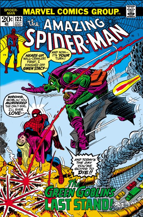
Amazing Spider-Man #122, Marvel Comics, July 1973 – Artist: John Romita.
Everything there was missing on the cover of Amazing Spider-Man #121 is there in spades on Amazing Spider-Man #122, the action, the drama, the villain, the girl, the scene set up, that light blue I seem to love so much, all there and visually satisfying. Amazing Spider-Man #122 is one of the most recognizable covers in comics partially earned by the shocking contents inside but mostly earned because it is a great cover.
I almost picked Ghostly Weird Stories #122, stellar stuff again from L.B. Cole and I almost picked Batman #122 for that famous Robin quote.
Wonder Woman #122 was interesting with the imagery, I thought Mr. Fantastic’s arm ruined the Hulk #122 cover, Avengers #122 is a great Avengers poster.
Hey how about Four Color #122, not sure why I liked that one but I did.
A great comic book cover matching each day of the year, 1 through 365. Please chime in with your favourite corresponding cover, from any era.


YES!!!!! Iconic, important and great.
There are some other interesting covers among #122,
I agree with the prior nomination for Superboy #122 for a Jimmy Award – the “lame” factor of some of the DC covers is astounding.
Detective Comics #122 captures that certain something that makes Catwoman a favorite “villain”..
Marvel Team-Up #122 has great imagery with Spider-Man and Man-Thing.
X-Men #122 has a powerful Colossus cover.
Captain America #122 – talk about bad cover angles.
Well, the Henry cover of Four Color #122 is as opposite a choice as you can get from Spidey. Henry never says a word, that’s his thing, while you can’t shut up the Green Goblin or Spidey. They talk their way through every battle. The Henry is also interesting as an example of Dell creating new work using iconic characters previously only reprinted from strips. Its representative of Otto Messmer’s wonderful Felix the Cat work, the original Popeye stories in the late forties, Peanuts by Schulz in the early fifties…
The Wonder Woman #122 is fun, glad you drew my attention to that. Shades of King Kong and Attack of the 50 Foot Woman.
But the Ghostly Weird is a gem, just an absolutely amazing work. Unusual use of yellows, scary, bold…. it might be my pick, but they can’t all be Cole. I like it far better than your previous Cole.
Avengers #122 I would dismiss as cliched, seen it before and since. Now the Batman, thats classic. Unlike Superman, Batman rarely was seen in “getting married” covers, and to Batwomen yet. And the lovely, underplayed cover art by Curt Swan and Stan Kaye was a highpoint for not only this, but many covers on Superman, Jimmy Olsen, World’s Finest. My god, what a contrast to those sad, silly and badly drawn Batman covers by Shelly Moldoff or whoever was ghosting Bob Kane just a little later than this. Thank goodness for Infantino and Anderson when DC management assigned them and Julius Schwartz to take over Batman, beginning with Detective #327, the first “new look” Batman. Now there is a run of wonderful covers…
Bud, thanks for the shout-out to Detective #327, it can use all the help it can get. It is one of those important keys that seems to have no traction with the broader collector base.
Okay Derrick we all see your Bronze Age Marvel fanboy t-shirt. We are putting you on a no-Marvel (especially Bronze Age) diet.
In my opinion ASM #122 is a pretty run-of-the-mill superhero cover. I am down on Romita but that is not a bias, that is just because I don’t appreciate his work. There is nothing wrong with this cover, but also nothing that makes it stand out. What I think is going on here is emotional memory. The cover is associated with a general fond memory of the first encounter with the book and the story line. This feeds back into the assessment of the cover art. I experience this with the picture frame JLAs and early Byrne X-Men, and knowing this I am consciously trying to be more objective about these books. I believe that emotional memory is what generally drives ASM prices. I am not arguing against it in general – it is nice to have an object that triggers good memories – but I think that this sentiment is misplaced in the context of this exercise.
Four Color is very pleasant but I can’t see it being called a “great” cover.
I almost mentioned Wonder Woman, but I found Andru’s rendering of her face to be unpleasant.
I am also glad Batman got some discussion. I don’t think it is possible to get past Robin’s quote, but I am a huge fan of early Swan, before his style became somewhat ossified.
Even at #123 the quality of selection is if anything increasing. I certainly didn’t expect this. I am going with the safe choice, The Flash, not because of the importance of the book, but because of the creativity and composition of the cover. This cover has been swiped a zillion times not because of the story’s importance, but because it is such a memorable image.
Others worthy of mention:
Blade of the Immortal – just gorgeous, although not doing much from the perspective of my criteria
Falling in Love – immaculate art, beautiful colors, great composition, tells a story
Ghostly Weird – the polar opposite to Falling in Love but equally great
Hellblazer – a really creative way to tell a bleak story
Tomahawk – horrifying and this close to being my pick except a) we already had two, b) the brown scheme reduces the impact
Some others:
Adventures into the Unknown – in case DC wasn’t fully satisfying your giant hand needs
Blackhawk – here we go again
Heart Throbs – jeez, this book should have been re-titled Heartless Cads
Romantic Story – love love love the no good swinging phoney – if only I had hair I would be working on that ‘do right now
Roy Rogers – do you think that ‘do would go with this shirt?
Secret Hearts – now we’re talking! Put your ____ where your mouth is! Or just put your mouth… Also would be a prime headlights cover if not for that disorienting dress.
Yeah, Cole was probably the best choice but we’ve seen sooo many… Like I said before it’s not just about the artistic merits of the cover and that caveat allows me to explore a bit more, important to an exercise like this lest we all become art critics.
Those early Four Colors are so important to the history of the hobby, collecting often defaults to the allure of the cover material but I wish more reverence was given to the early run as a whole.
Well, despite being a Cole fan, this is the cover choice for me. I think this cover is imprinted on the minds of a whole lot if comics fans and not just Spidey collectors. This cover has transcended into an icon of Spider-man, the Bronze Age, and comics in general. It’s often linked as the line between the silver and the bronze, the innocent times and the grittier times and definitely changed comics history.