Daredevil #179, Marvel Comics, February 1982, Artist: Frank Miller/Klaus Jansen.
Frank Miller and Klaus Jansen combine to make this visually stunning, and alarming if you are a Daredevil fan, cover for Daredevil #179.
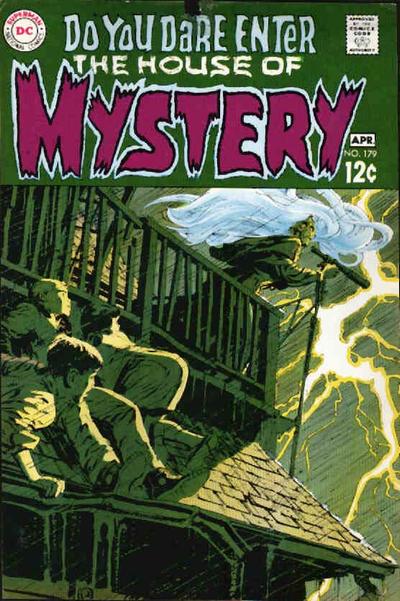
Beast mode for Neal Adams on House of Mystery #179, great use of hues, lighting and tone on this cover .
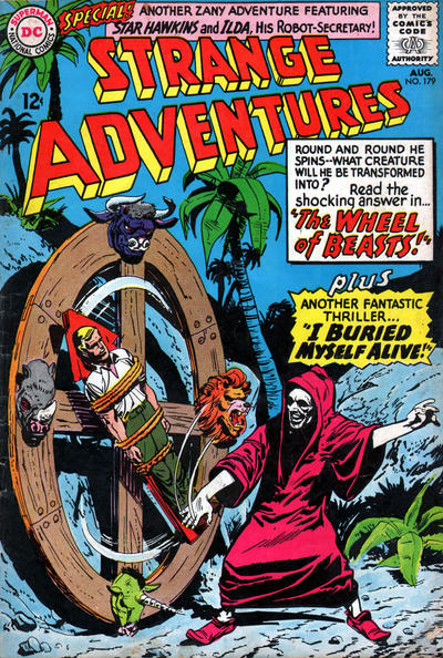
I too was smitten with Strange Adventures #179, the cover really draws you in, and it has that damn blue background I seem to be so fond of.
I have to give props to Amazing Spider-Man #179 with that great Golbin cover and for a second I thought Tarzan #179 was a Turok cover!
Also, I’ve included Strange Tales #179 to get people’s opinion on the infamous rubber Spidey leg from Smith, is this good enough art to make the cover?
A great comic book cover matching each day of the year, 1 through 365. Please chime in with your favourite corresponding cover, from any era.
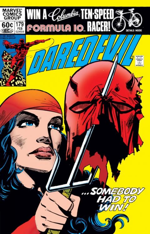


I don’t like your choice but I can see that others might agree. Miller’s distinctive art really worked for me in Dark Knight, but on this cover I find it too simple and crude. Miller is a master of composition but hardly a master of portraits. I find Electra to be verging on grotesque in this drawing, and I don’t think that’s the intention. I think the blame can be laid some with Jansen for not doing good finishing, but mostly with Miller for liking Jansen and wanting him to do the finishing. Aside from this it is also a static cover, although like yesterday’s pick the prior action is implied.
I also perused that Tarzan and had the same thought. I took a second look at the ASM and I agree that it is good but not good enough to make the short list. The Strange Tales is a solid comic book cover, but hardly a shining piece of art, and I certainly wouldn’t call it “great”. It is the flip side of some of those Fairy Tale Parade etc. covers that display high artistic skill but have no comic book panache.
For #180 there is a fair number of solid choices, but few that I would call “great”. Luckily Detective is “great”. I think you could complain about the story element – exactly what is happening here? – but otherwise this works on so many fronts. The logo in the background, the Joker Money in the foreground – great composition. A quick review leads me to propose that this cover is the best of the very scarce 1950-56 Detective period.
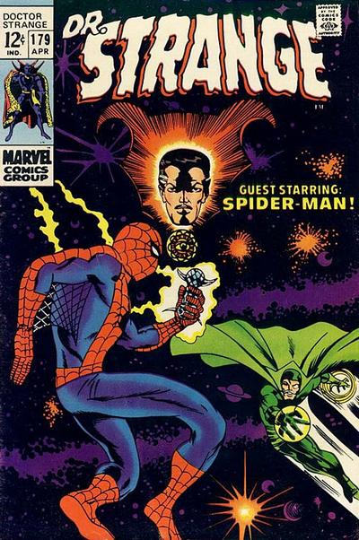
Some others: Batman Legends of the Dark Knight is a “modern” cover, but great in many ways; Captain America is cool art and really makes you want to read the story; Dr. Strange is great as far as a poster-esque cover goes; House of Mystery is more impeccable art by Adams, although I think it is a bit hard to figure out at first, so that detracts; I love Star Spangled War, these 70s Kubert war covers should be getting more props here; Thor is a great mayhem cover; World’s Finest is more great Adams art with big splashy figures and a compelling story.
Blackhawk continues the tradition of awfulness by lamely introducing “The Son of Blackhawk!” “But what can he do?” Indeed.
Superman isn’t quite a JOWA but it is a fun contrast to day #178: “I never dreamed it could happen! For the first time in my life, I’ve been beaten by a girl!”
I agree with Chris, Millers storytelling and the way he changed Daredevil and his history is unparalleled , however I have not always been enamored with some of the artwork and believe Dark Knight was far superior most of the time to DD. Some of his stuff… and this may very well be Janson’s input… it seems a bit awkward. Still… its an instance where the storyline is compelling enough to forgive the visuals. I have to give a nod to that Strange Adventures… the mire I look at it the mire I like it and it was way better then the previous issue in the series which would have been a good candidate for a JOWA… just awful!
My choice for day was the Jim Starlin’s Warlock cover of Strange Tales #179, which was mistakenly cited in the article as Dr. Strange #179. This cover, and the ones to come on the Warlock title, are fantastic representations of Starlin raising up the character of Adam Warlock to be THE nemesis to Thanos throughout coming storylines.
As to the Dr. Strange #179 cover, as a Spider-Man fan I collect Spidey covers across other titles, but I just cannot bring myself to buy a copy of Dr. Strange #179 because when I actually hold a copy in my hand and look at it, the “just plain awful”ness of the cover makes you slide the issue back into the box.