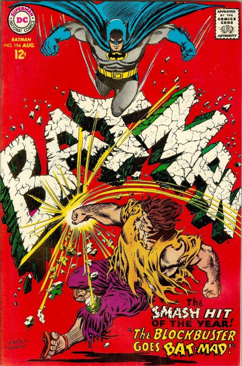
Batman #194, DC Comics, August 1967. Artist: Carmine Infantino and Murphy Anderson.
I picked Batman #194 for the same reason I picked Flash #174, I really like the way the Batman banner works visually, big fun impact.
I met Erik Larsen in Toronto a couple of years back, we shared a beer at a Fan Expo party, he didn’t know who I was and truth be told I didn’t know who he was, someone told me later… Nice man and a pretty good artist as we can see on the cover of Savage Dragon #194.
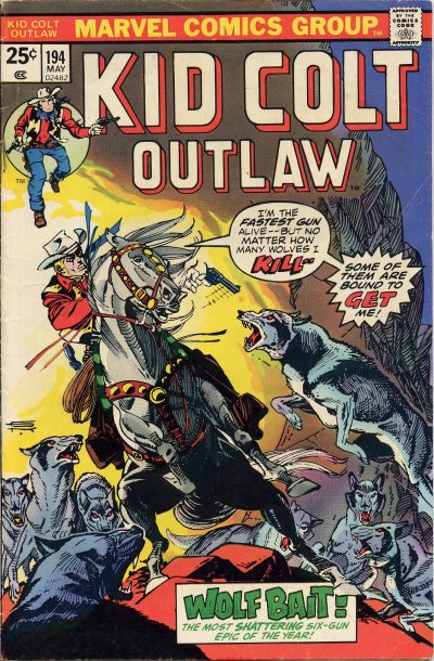
I mentioned in past posts that Gil Kane can draw a mean horse. On Kid Colt Outlaw #194 not only does he draw a mean horse he also gives us a great overall composition.
Amazing Spider-Man #194 has a strong cover and there is another big hand alert on Strange Adventures #194.
There has to be a JOWA today and it has to go to Superman #194, you know if it was a girl they’d say she’s beautiful.
A great comic book cover matching each day of the year, 1 through 365. Please chime in with your favourite corresponding cover, from any era.
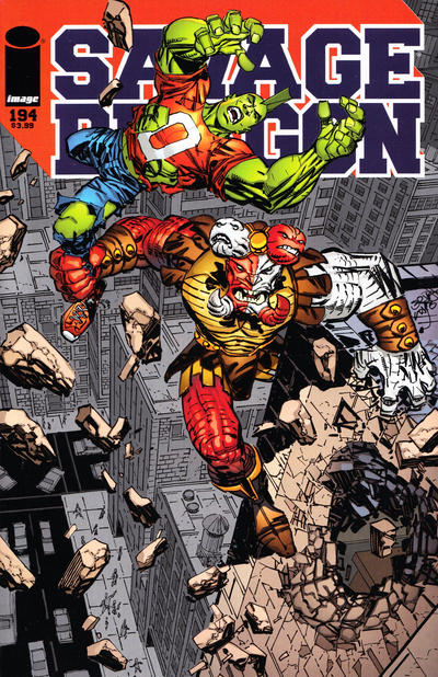


Hey Walt….I love Mr Larsen’s ode to Kirby. The roof top battle. That’s gotta be Mangogs son eh? Maybe he hooked up with Jane Foster after Thor dumped her?
https://1.bp.blogspot.com/-hia-Q0x6gUc/WRPBaItYUnI/AAAAAAABKnY/848St2dZka43oOMKbi7pET3MNxm5w1vdgCLcB/s1600/gog9.jpg
As a youngster I didn’t like Mr Gil Kanes art…..until I loved it. His story telling and covers won me over and I’m now a true believer.
Batmans great too, but I wish they hadn’t included the cover blurb ” The smash hit of the year…”
Tarzan of ,Tarzan: the Grand Adventure Comic …vols 1 and 2 (62 issues) and changes to Tarzans adventures vol # 3 is a UK comic. (339 issues)
Thus Tarzan adventures,vol 6 # 13 would make a terrific cover , and unlike any you’ve ever seen, for tomorrow as issue# 195 in that great comic series.
https://comicvine1.cbsistatic.com/uploads/scale_large/0/3125/6666712-tar613.jpg
see http://www.erbzine.com/comics/uk1.html for more info on this great comic series 🙂
Another fine choice. I remember when that Batman was published, buying it off the spinner rack. The TV show undoubtedly had some influence on this imagery, its in the “camp” school, but Infantino pulls it off beautifully. I want to point out some influence from what Eisner (and the Quality Group artists) liked to do with logos on The Spirit and in early Quality titles, but this is a new take, I think. Infantino was the #1 cover artist for some time at DC at his best.
Superman doesn’t rise to a JOWA for me, its a good story idea but poor Lois looks very sad and unattractive in stone. The connotations of carving the face of your loved one in a mountain are pretty weird, if you think about it. Fun to see Superman’s son in costume, I first thought it was another meetup with Superboy.
I read a Jimmy Olsen #57 just last night, I have slowly been putting together a run up to the mid-sixties, for the first time. The Ray Burnley art in the first 35 or so, followed by Curt Swan’s work, is really fine work. That got me started. So now I’m starting to read ‘em. This features an imaginary story of Jimmy unknowingly marrying Supergirl, actually Linda Danvers, after Jimmy accidentally wipes out her memories of being Supergirl with red kryptonite. Written by Jerry Siegel, the illogic and the convoluted, twisted plot is just terrible. It’s a JOWA winning story, from start to end.
Was he writing for six-year-olds? Poor Siegel, reduced to this. I can’t imagine him being happy putting out such drivel. That said, its still kind of fun to read it as a sixties artifact, for my first time. I’ve long neglected reading Jimmy’s early stories, so slowly making up for that. Like the early Superboys, say up to #100, a little goes a long way. Superboy featured some similarly awful writing every so often, but they still hold some charm for me, locked in their own time period, in a remote corner of the DC universe.
I don’t feel like investing in Jimmy Olsen readers so I sure wish they’d be reprinted. I have a b/w reprint of the early issues, the crazy “The Amazing Transformations of Jimmy Olsen”, and reprints of the Kirby issues. I’m not aware of DC publishing anything else.
#195 has no shortage of candidates but the choice isn’t easy. I had the chance to poll the family this time and the vote is for Wonder Woman (1987). Really original and beautifully executed by Hughes.
Avengers is great but just too busy. Batman is very simple but extremely engaging. Flash is another great piece of work by Adams but no action and I think #194 beats it. House of Mystery almost took the crown but it’s too visually confusing – my wife really liked it but at first didn’t understand it was a crouching guy getting attacked by the giant bat. Spawn is objectively up there but too brutal for my tastes. I like Superman – the action is subdued but you see Superman is about to keel over, and the colors are great.
Young Romance gets special mention for both being in the running and for being a JOWA candidate. Another fantastic DC brunette, and the guy is every man’s idol for his multitasking.
World’s Finest could take the JOWA but Batman! “No guns!” Instead it goes to Famous Funnies. The cat fight looks intriguing but the foreground… Kids back in the day would buy guys in scarves fighting with electric fans?
Good choice Walt… and Infantino must have been channeling Eisner in 1967 with this and Flash 175! I am afraid I never warmed the Savage Dragon… Larson is capable but I always thought of the character as just another strongman with a better mohawk. Yes… Gil could render those horses well… but no matter how good he was it couldn’t save the genre. I do collect westerns by the way… but the majority of what I do collect are from Magazine Enterprises which may have not made the cut for great covers against the competition but had some great western comics back in the 50’s with an abundant amount of talented artists… including Powell, Ayers, Guardineer, and Frazetta!
Chris, while I agree with you on the Famous Funnies… I believe the scarf would have been referred to as an ascot back in those days!
Great choice, Walt. This is one of my favorite Batman covers outside of the key issues, and carries the appropriate wallop!
Gerald, I love those ME books too. It’s lucky for us collectors there is so little interest in westerns these days. I’m closing in on having nearly all of those. I even like ME’s Straight Arrow run—Fred Meagher was a very good artist and did all of those. His Tom Mix Ralston giveaways, 12 issues, are brilliant books…they used to be very highly collected but also today can be found easily and not very dear.
Fred Meagher also worked on Gulf Funnies Weekly for many years, circa 19387 or ‘38 on, on a one-page-a-week heroic fantasy strip, 190 issues worth. Wings Winfair, a Flash Gordon-type adventurer in lost lands, etc. Very good stories and art. Never reprinted to my knowledge.
But my favorites are Atlas westerns, lots with Maneely covers and stories, John Severin, who did a surprising number of great covers and stories Jack Davis, just a few but all must-have. The occasional Crandall or Al Williamson. And of course, the Kirbys before they all went to reprints.
I’m happily upgrading all mine into really nice copies (well, for me, that’d be fine or very fine); a few dealers get aggressive on these, mostly on the tougher early Kid Colt, Two-Gun and Rawhide Kids. But the mid-run issues are cheap, $20-$50 or so, late 1950s and early 1960s. Gunsmoke Western is a very good title.
Looks like an almost consensus on this one. You are a trooper Bud, slogging your way through those tough to swallow issues.
Thanks for your endorsement Bud! I have been looking for some of the Timley/Marvels as well that still had the “A Marvel Comic” logo in the western category!
If the background wasn’t red, I don’t think this Batman cover would stand out at all. It’s poorly staged, and the Blockbuster guy looks like he’s sliding and about to fall. Meanwhile, both of them are expressionless. I say nay. ASM with the intro of Black Cat is much more enticing, and very hard to find without spin color loss due to the black cover. Savage Dragon? Never liked it, nor the “Larsen Look”, but that’s subjective. The Daredevil ‘axe cover’ is more interesting. Anyway, looking forward to the next round of cover(s).
What bugs me about that ASM cover CK is the heavy white line is not consistent with the spot light and I feel it was placed there simply to keep the characters from being absorbed into the background. Perhaps a gradient in the background would have helped better.