Batman #230, DC Comics, March 1971. Artist: Neal Adams.
I’ve always liked Neal Adams’ cover to Batman #230, hard in grade with that black background.
Captain America #230 wasn’t far behind, strong cover from Ron Wilson.
I’m also digging the Jose Luis Garcia-Lopez cover to Wonder Woman #230, Cheetah and Wonder Woman in full effect.
And for C.K. I threw in Amazing Spider-Man #230, kind of reminds me of that Wonder Woman Egghead cover but C.K.’s WWWP deserves a bone!
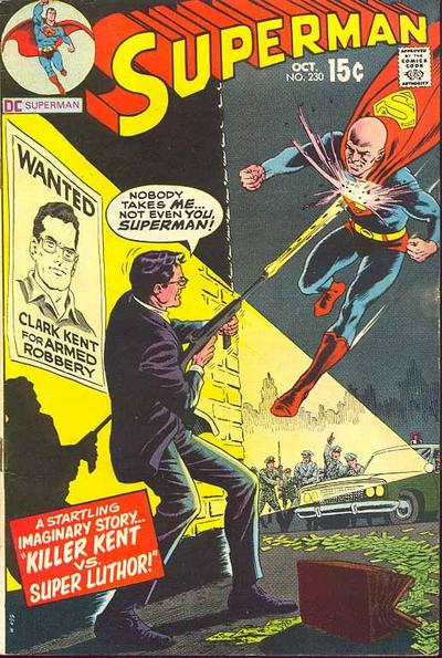
JOWA has to go to Superman #230.
A great comic book cover matching each day of the year, 1 through 365. Please chime in with your favourite corresponding cover, from any era.
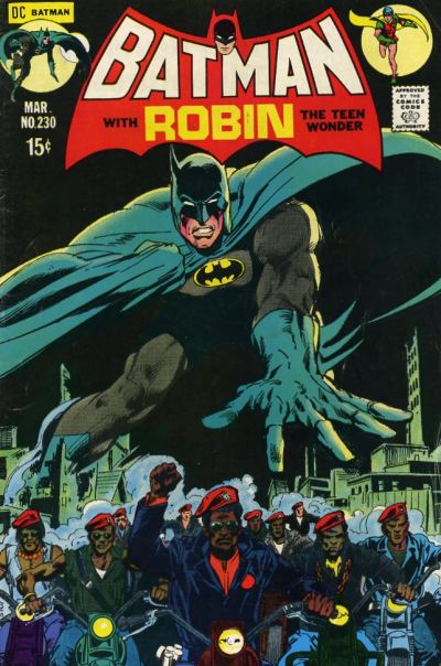
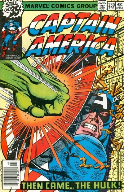

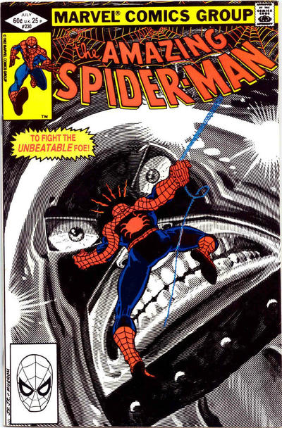


Ok… a few criticisms! The figure of Batman is great… but as CK pointed out yesterday… The bikers are riding on the gas tanks! Clearly the Cap artist needed someone to hold their hand in a fist to draw as they clearly have no idea how a fist directs where the fingers are located… I frankly buy Kirby’s four toed feet over that fist! The Juggernaut on the Spidey cover reminds me of one of those cars from the animated Pixar movies…ooOooo… scary…. cough..!
Of this group the Superman and the Wonder Woman are best but you clearly didn’t note Incredible Hulk that Chris mentioned yesterday! I think this was our worst day of picks so far… and NOT your fault Walt… I lay it all in the laps of the bikers…. errrr…. creators!
You guys can tell those bikers that they are riding wrong. I’m not going to.
If I can believe a ninety-eight pound weakling can turn into a green behemoth, I can believe that his fist anatomy changes a bit as well.
Simply put, the ASM is bad.
JOWA to Superman? What are you talking about? I want to read this story! And beyond this the art is great! And with that Blackhawk out there?
The WW doesn’t measure up to the previous day’s, which was still only passable from the perspective of the art.
For #231 I am going with Superman – overflowing the cover, BIG action, nice Swan/Adams pairing although I don’t like the simian arms on Superman. These are one of few persistent shortcomings in Adams’s work.
Daredevil is simple and good but again you need to know what is going on in the story arc. I don’t normally pick Disney covers but I do like Four Color both for the art and the colors – this one does well against my criteria with both story and action. As a kid I use to like Mike Grell, but now I pretty much avoid him, but I would say this Superboy is about my favorite of his work at this point. X-Factor is another great Yardin, but very similar to the earlier pick and not as good.
Batman is well done from an art perspective (of course, because it’s Adams), but the concept is too much in the JOWA camp to be a pick.
Captain America – forty years later and no improvement.
Wonder Woman – this is a Code book???
JOWA to World’s Finest for taking the Batman and Robin question to stranger realms.
How come they always give away that it’s an Imaginary Story on the cover of things like this Superman. Isn’t that kind of like spoilers that it didn’t really happen or defusing the “wow, what!!!???” factor for picking it up. ASM has a certain “startling” impact that would make it stand out on the rack. I see what you mean about the green fist, had to look at mine. Bikers without, they just have the handle bars and front fender…
Since I have no reference, Chris’s comments always make me wonder what’s coming tomorrow.
Did you mesn Batman 230, Walter? 231 also has a black cover.
I know I’m early but Superman 233 has to be the shoe-in.
Even though his shield stopped Hulk’s punch, the sheer force of the hit should have pushed the shield into Cap’s face, crushing his head flat. Think about it, Hulk punching you with all his might and all you have to save yourself is a fancy garbage can lid. (:
Typos corrected, apologies, I thought I loaded the post last night but something didn’t save properly and I only noticed close to noon.
Who says JOWA picks can’t have good art ?
Thanks Walt! I see the Egghead reference now, which I hadn’t thought of before. Klaus I was thinking the same thing when I was looking at it yesterday, however, his shield is supposed to be vibranium or some such metal that distributes the impact away and back if comic lore is to be believed, and the Avengers movie battle with Iron Man/Thor/Cap. JOWA to Superman? Yeah I can see that, but Blackhawk was way worse, but due to the excessive stupidity/ridiculousness that would guarantee that title winning too frequently, it has to be let off the hook sometimes.
For 231 I’m going to give it to X-Factor for it’s Civil War alternate take, and the ‘shattered glass’ effect. Superman is good too, and similar in the heavy hitting composition, just not a fan of the word ballon. Kinda ruined it for me. I also like Daredevil with it’s “Kingpin’s Severed Head” box. Who knew that shading could cause such confusion?! Hulk is funny to me, I keep hearing the start of a joke, “so this green giant steps into a bar……”. To Chris Meli’s comment about Mike Grell, the problem with that Superboy cover is the arms. Everyone else has normal arms, but he drew Supes with some oddly shaped/proportioned arms for sure. I still like him, but more his paintings and less the line art. “JOWA to Batman?! Blasphemy!” or so I thought until I saw that cover. Nicely drawn but a crappy concept. For those who want a reference point for all the covers, go to comics.org and just put in the issue number of the day in the search field, then narrow the search to ‘issue number’ and choose the american flag under ‘country’ for the issues that relate to that number issue. Have fun clicking the titles to see the covers~
WWWP?
Thanks for explaining the comics.org search to the folks C.K.