Batman #232, DC Comics, June 1971. Artist: Neal Adams.
Day 232 is a banner day !! Who said things were going to dry up?!
The obvious pick for Day 232 is, of course, Batman #232, that cover that you can see from clear across the other side of the convention floor. I’m wondering if this key issue would have the same value with a lame cover? I’d say not.
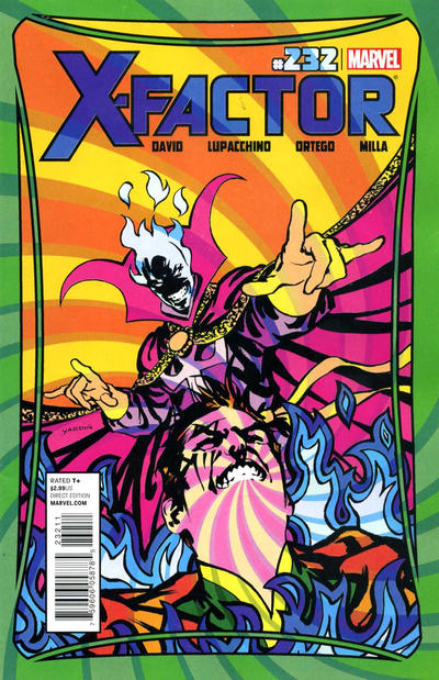
To be honest I didn’t want a mutiny on my hands today so I had to relegate my guy David Yardin to second place today. Like I’ve been saying over the past week or so, this kid is good. How fun a cover is X-Factor #232.
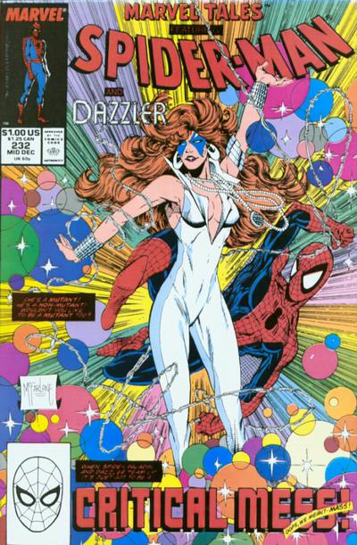
Honestly, I should be a curator at an art gallery somewhere, I mean what better complementary piece to Yadrin’s beauty that Todd McFarlane’s bubbly Marvel Tales #232. Don’t listen to the naysayers, this would be the busiest area of the gallery.
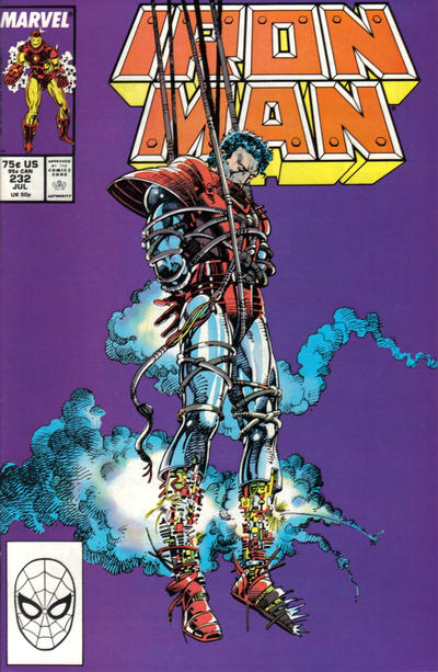
I really like Barry Windsor Smith’s cover to Iron Man #232.
JOWA goes to Four Color #232, how is this even close to being funny?
A great comic book cover matching each day of the year, 1 through 365. Please chime in with your favourite corresponding cover, from any era.
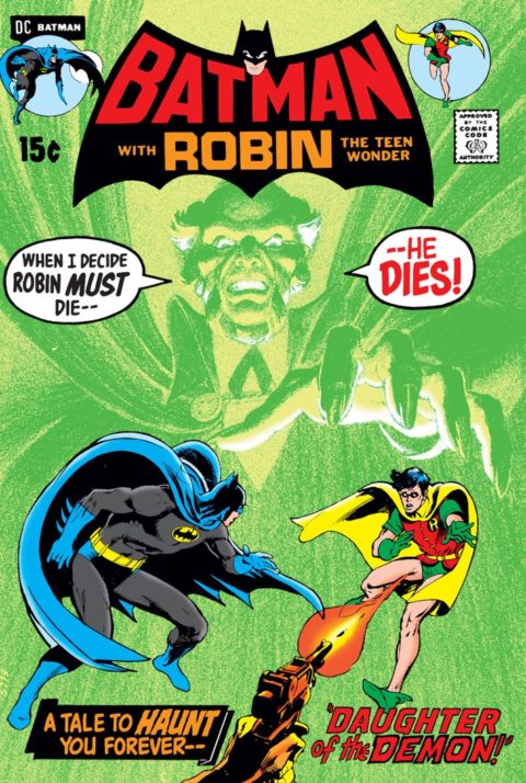
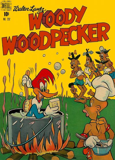


There is no doubt that Batman #232 was the choice for the day, but I think it is a contender for the best Adams cover across any title. I am not sure I could ever rank it above Tomahawk #116, but given the importance of Batman #232, the nearly perfect cover introduction of Ras al Ghul as a lead in to the really outstanding story that unfolds in the pages of the issue, the eye-catching colors, and the storytelling element, it has to rank near the top of the Adams portfolio.
But despite the dominance of Batman #232, I thought there were several other issues that deserved some consideration.
• Iron Man #232: I agree with Walt’s choice, as Barry Smith offers a fantastic cover image.
• X-Man #232: Although I am not big fan of this era of X-Men covers, I think the “in-your-face” Brood cover works very well.
• Daredevil #232: A really evocative cover image that fits the dark imagery surrounding the character of Daredevil.
• Amazing Spider-Man #232: I really like this Romita Jr. cover depicting the transformation of Mr. Hyde.
• Strange Adventures #232 – Although the banners and text really dilute the effect, the image of the space monster could have been great if it had been given the full scope of the cover.
Despite my love of Spidey and fondness for McFarlane, I can’t quite bring myself to like the Marvel Tales #232 cover. Dazzler always seemed seem one of the least exciting Marvel characters to me, and part of what I didn’t like were the light “bubbles” – what kind of superpower is that? – and the McFarlane cover highlights that feature.
No surprises here, and well it shouldn’t have been. Batman just is iconic. Derrick I looked at that Tomahawk cover, and while it’s a excellently drawn cover, the overwhelming use of brick reds and browns just blurs out the wonderful imagery too much. I still think that the Fantastic Four cover is a better than the Marvel Tales cover, but to each their own.
For 233 I like Daredevil with it’s imagery of DD hanging onto Cap’s shield for help. My runners up are the iconic Superman, though that ‘kryptonite no more’ tag line is dumb given everything we know. Also enjoying the Uncanny X-men where Collosus seems shocked that the Brood is throwing a car at him! Another good X-Factor cover, but a trope’ if ever we’ve seen one. Avenger’s is intriguing, but small in appearance since 50% is taken up by ‘the barrier!’
JOWA belongs to World’s Finest. Umm…..super speed disarms the women, saving Bats and the one-eyed monster goes down. Never understood why they kept trying to make Superman weak on the covers, but inside he just tears it up. Batman 233 almost gets JOWA for it’s ridiculousness. Strange how it see-saws so much on this title, especially when 234 is really strong again.
WWWP?
We have to salute Walt’s total objectivity and devotion to the cause as he blatantly slaps a paying customer who simultaneously supported a moribund Spotlight pick. Nevertheless he remains wrong about Marvel Tales.
Honestly I always liked that Iron Man as well, but it again is a hanging around cover. Also it is like a better version of X-Men #198 that came up on that day, so kind of derivative.
How were _most_ funny animal or Harvey covers even close to being funny?
Derrick, re X-Men, I don’t dig it as it is just a gratuitous monster face that is a lot easier to draw than human figures interacting. DD is okay. I chalk up your ASM mention to your bias towards SM and people named Romita – it does not appeal to me. I am more on your side with Strange Adventures – I have fond childhood memories of this one – but it is just a better monster cover – in this case I liked the original version more.
Of course Mr. Adams takes #233 with another uber-classic. I have a four foot poster of this one on my wall.
For runners-up, #233 is not as thin as #232. Avengers might not appeal to everyone but I really dig it. Notice the touch of The Vision’s hand. Detective is very clunky but another uber-classic that has great panche. Spectacular Spider-Man is fun – is this really Sal Buscema? Like yesterday I will cite Superboy as one of my favorite Grells (amongst a small percentage of tolerable Grells). Wonder Woman probably gets my vote for second place for the day with its crazy in-your-face composition and excellent rendering of Wonder Woman – have we had a Gray Morrow pick yet?
See, that’s how the double image of the Hulk/Rhino/Samson cover a few posts back should’ve been done, like this Batman. Clear image that pops and grabs your eye. Did Neal Adams invent this look?
Terrific Iron Man. I’ve been thinking of buying BWS cover comics. Dazzler, well, it’s one way to get an almost naked woman on a comic, her right arm looks like it bends funny. Back in the forties and fifties this would have been funny (have a look in WECA comics) but see how we’ve evolved, now it’s cringe worthy. Well drawn cringe worthy. WW was always a favourite, especially the animated cartoons.
I join Chris in my admiration of Mr. Adams #233 contribution – I have the same poster on the wall of my comic room with a copy of Superman #233 resting on a shelf just below.
I had to look up what moribund means, not nice Mr. Meli.
Naturally Batman… the X-Factor better then the previous one and the Ironman is good as well and reminds me of BWS later work on X-O ManOWar. I am not going to criticize Dazzler as much as McFarlands distortion of Spidey…so yes I am one of the naysayers on that cover! I agree with the lack of humor on the Four Color for several reasons and the theme was used over and over… there is a Howdy Doody cover with the same scene… sad they were both nearly from my life time.
Batman 232 is coming up for a DC facsimile reprint issue like Marvel’s recent True Believer $1 reprints.