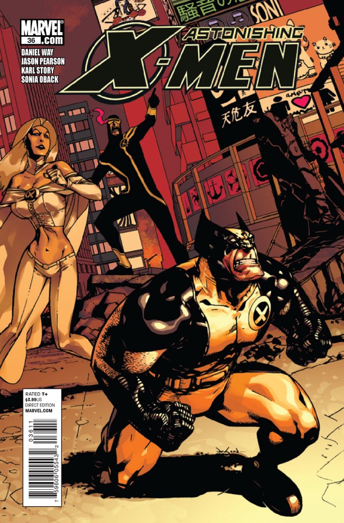
Writer: Daniel Way
Penciler: Jason Pearson
Inker: Karl Story
Colourist: Sonia Oback
Letterer: Cory Petit
Cover: Jason Pearson; Michael Kaluta and Dave Stewart (variant)
Publisher: Marvel Comics
Iiiiiiiiiit’s baaaaaaaaack…again. Yes ladies and gentlemen, the series you’ve long forgotten is in fact still very much alive. I was surprised too. With a new team behind the book we’ve come to know only by the frequency of its delays, will Way and Pearson be able to keep this book on track where Ellis and Jimenez couldn’t? We’ll have to see. In the meantime, let’s have a look at issue 36.
Synopsis
Astonishing X-Men focuses on the X-Men universe founded upon a less continuity constrained premise. Typically featuring Cyclops, Emma Frost, Wolverine, Armor, Beast, and Storm, the stories offer the opportunity for writers to offer their own take on the X-Men universe.
On a ship in the Sea of Japan, Mentallo looks over the ship deck’s guardrail towards an island as he talks to a crew member. The crewman tells him they’re spooked, Mentallo replies that they should be as they inch closer to Monster Island.
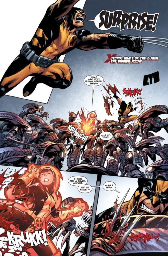
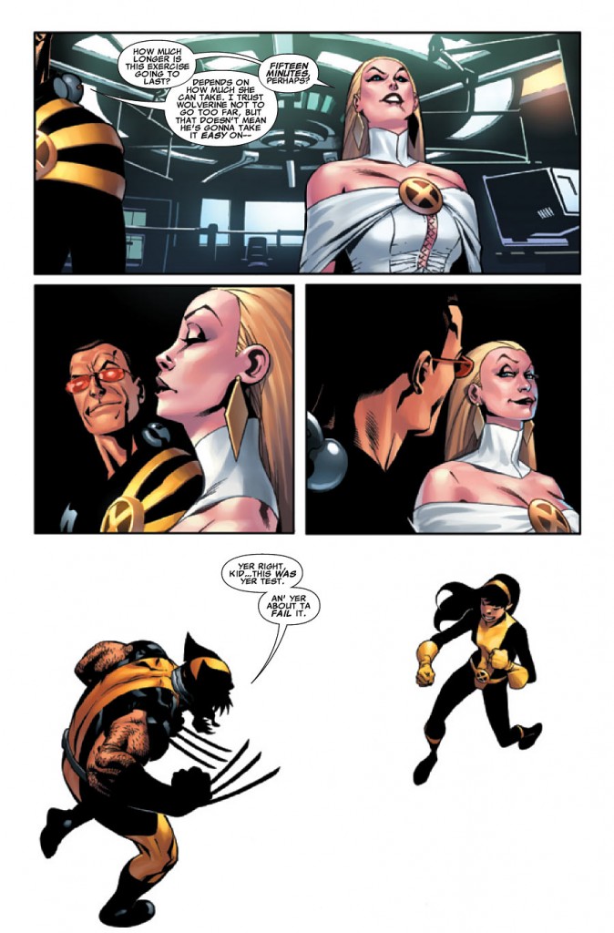
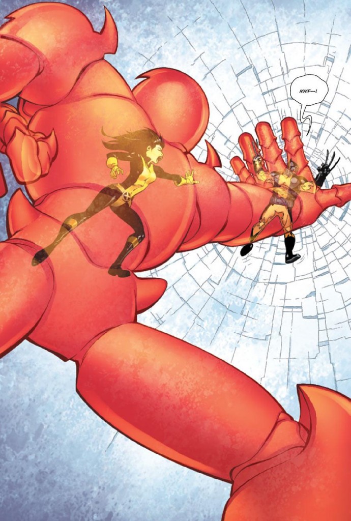
On Utopia, Wolverine and Armor train inside the Danger Room, fighting off hordes of Brood while Scott and Emma look on from the control room. Eventually Armor pastes Wolverine into the Danger Room floor, but receives a phone call soon after saying, “Oh, no. Someone is calling to tell me…I think someone died.” We’re shown a quick scene of a monster attacking some soldiers, followed by a tearful scene featuring Armor where she tells Scott, Emma and Wolverine that her mother and brother are dead. The four quickly get onto the Blackbird and fly off for Japan.
Interspersed between scenes of monsters stomping soldiers on Monster Island and Mentallo doing his business on the nearby ship, the X-Men arrive in Japan. Armor goes off with her father, Scott and Emma presumably explore the Japanese nightlife, and Wolverine hails a taxi and asks to be taken to the nearest bar. Once in the cab, the cabbie tries to make small-talk but is interrupted by the large monster in front of him that’s making its way through the Japanese downtown core. Wolverine steps out of the cab and suggests Emma take a look at the monster through his eyes.
I’m not sure where to start here, so the character models are as good as any. Pearson’s style is very cartoonish, and that comes across positively and negatively in how he pencils his characters. His non-X characters feel rather normal looking, so it’s not until he begins to draw his X-Men characters that we begin to notice the differences in his style. The four main characters in this story all have distinct, different body types. Scott is drawn in such a way that his “Slim” nickname applies. Armor is drawn well as the younger, more petite member of the foursome. Both of these depictions are quite good. I’m not a fan though of his depictions of Wolverine and Emma Frost. Where Frost is concerned she’s drawn as more of a barbie doll than usual with her barely non-existent waist and abnormally large chest by our own usual standards. I’m thinking Power Girl proportions here, considering scale of course. Her face also comes off as hardened and rigid, unlike other depictions of her in comics like Uncanny. As for Wolverine, he is cartoonishly stocky to the extent that his arms are the size of Scott, Emma, and Armor’s combined. Wolverine is supposed to be short and stocky, but Pearson does so on unrealistic levels. It’s a hallmark of his style, and I applaud him for trying to differentiate the characters’ bodies though. It just needs to be toned down ever so slightly, and I mean that not to sound sarcastic. I look at Wolverine’s arms and I see tree trunks.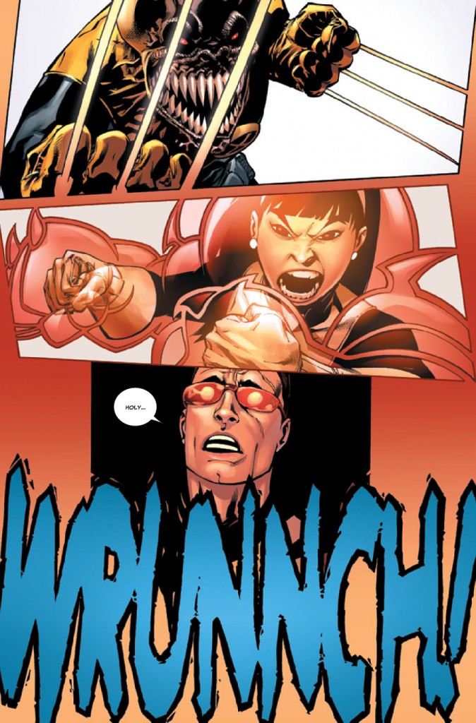
Models aside, Pearson does a fantastic job throughout the book of creating amazing and diverse pages, thriving on highly energetic stretches of action. It’s here where Pearson’s art really shines in this issue. I like all the little touches to the Danger Room sequence with Wolverine leaping onto the page and into the fray as he yells “surprise!” while a horde of Brood attack he and Armor. I like how he paces the pages, and I like how he cuts the panels. In one of the more hilarious scenes in the book, Armor flattens Wolverine into the floor just after Armor is referred to as more of a defensive member of the team by Scott considering her power set. Sticking with Armor, I liked how Pearson drew her initial mourning period, when her face clenches up while tears stream down her face. You can actually see the pain and anguish in her face, which is no small feat. His monsters are also quite fantastically pulled off, in that his style does offer the additional capacity to create those models and not have them look utterly ridiculous. They look cartoonishly awesome, and it’s a benefit to his style.
The one other thing I think worth noting is the amount of white space around the art, which I thought was perhaps too much. It’s glaring more in the Danger Room pages than any other, but I feel it was overused. As a whole though, Pearson is solid and his style definitely fits with Way’s writing for better and worse. It’s hardly as bad as Bianchi’s work on the early half of Ellis’ run. It’s more lighthearted and comical than Cassaday or Jimenez, but endearing nonetheless.
Even during Whedon’s run on the title, Astonishing X-Men has typically been an inconsistent title in terms of its publication. I had honestly forgotten this title was even still being published, and there’s frankly much to be said about a title that has produced 11 issues in two years or so. Hopefully, if you’re a fan, Daniel Way’s arrival will offer a consistent hand on the writing duties along with Pearson’s artwork. What I am seeing at least in this first issue are similarities between this title and Way’s work on Deadpool. The book has been injected with a comedic element that at the very least has been lacking since Whedon’s run save for some snarky dialogue from Emma Frost during Ellis’. I got a good chuckle from Wolverine being flattened by a little girl, and that’s definitely something that Way’s fingerprints are all over. The script seemed solid for the most part, but I did notice one minor gaffe. Perhaps I’m not familiar with Armor’s past, but it’s very peculiar and nonsensical with no set-up to correlate a phone call indicating somehow that a family has died. That was a huge editorial gaffe and made no sense.
The writing was otherwise strong. It’s a huge departure from Ellis’ elaborate concepts or ideas that I felt really bogged down his entire Astonishing run. Way’s first issue really feels like a “getting-back-to-basics” X-Men story that I’d like to see continue and hopefully the team can put the book out at a timely rate. Coupled with Pearson’s cartoonish artwork, it’s a lighter read than the past 10 ten issues; it changes both the pace and tone of the book, freeing it from Ellis’ overwrought, dense concepts. Because of that, I feel like this is the best this book has been since Whedon left the title.

