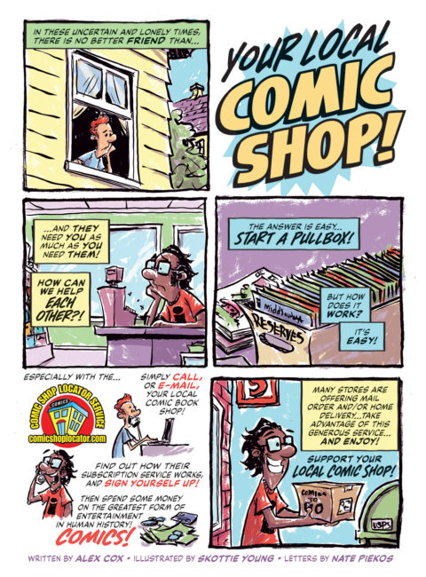
Came across an interview with Fantagraphics co-founder and co-publisher Gary Groth about their publishing efforts. This quote got me thinking.
![]() “One of the things we try to do with most of our books is to create beautiful objects. I think that gives us an advantage in terms of people wanting to buy the physical book rather than digital,” Groth said. “There are probably going to be more and more people who find the digital version adequate—who just want to sit down and read it. But I think there are always going to be readers who want a beautiful object in front of them and who can appreciate the aesthetics of that object. Right now, we’re looking at a future where they coexist.”
“One of the things we try to do with most of our books is to create beautiful objects. I think that gives us an advantage in terms of people wanting to buy the physical book rather than digital,” Groth said. “There are probably going to be more and more people who find the digital version adequate—who just want to sit down and read it. But I think there are always going to be readers who want a beautiful object in front of them and who can appreciate the aesthetics of that object. Right now, we’re looking at a future where they coexist.”
I just finished reading a selection of Mike Mignola Hellboy comics on my iPad and was left feeling unsatisfied. I love Mignola’s work and his design sense, but those beautiful splash pages did very little for me in a digital format at that size.
It beckons to the reasons one reads comics in the first place. Some read for the story, some for the art, and hopefully most read for the blending of the two into this medium. Those who read comics for the story probably don’t mind whether the format is 6×9″, 10×15″ or across their 10″ iPad screen: the words are available in all sizes. As is the art, but art fans like to get as much detail as possible and large format print makes that possible. Yes, zoom is a key function of digital comic reading but skews the experience. And there’s the option to rotate your 27″ monitor to profile and read comics at that enormous size but then you’re sitting at a desk staring at a fixed screen.
Comics are frequently referred to as sequential art and for me the art has always taken precedence. As I got older and was able to fully understand and appreciate what was being written the beauty of a well structured and produced comic became apparent. The text shouldn’t describe the image, and the image shouldn’t visually produce the text: one aids the other, creating a story through text and image.
Back to Groth and his point above. I enjoy books. The feel, the heft, the smell, the paper quality, the binding. Design and presentation can be deftly handled or ignored, but eye-catching endpapers and snappy spine graphics make my day. I want to hold that book in my hands, resting in my lap as I sit down in my favourite chair and just drink it all in. It’s a tactile, physical connection with the words and pictures presented between those covers. IDW’s Artist’s Editions excel at providing this physical experience, in no small part to Randy Dahlk and the other designers.
My iPad always feels the same: sleek, metallic, cold. And no matter the content it’s the same experience. Are we stopping to admire the design on the credits page? No, we’re breezing past it. On tablets and electronics devices we’re consuming content; blogs, websites, emails, videos. Scant thought is given to where we’re getting it or how it’s packaged.
Digital comics should be designed from the ground up to be consumed only as electronic media, and every digital opportunity taken that’s provided from that.