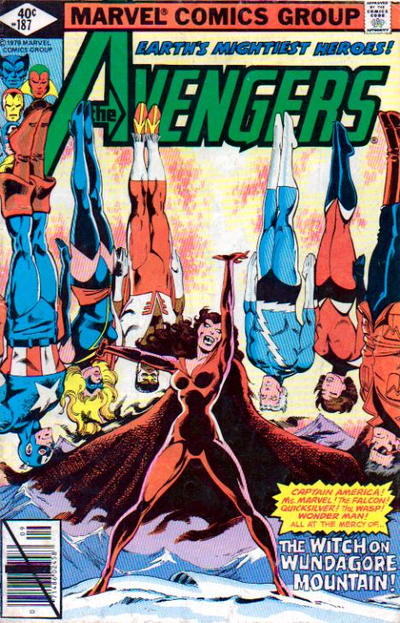
Avengers #187, Marvel Comics, September 1979. Artist: John Byrne.
I lined up a bunch of great covers including House of Mystery #186 and Amazing Spider-Man #186 but none were as visually impactful as John Byrne’s great cover to Avengers #187.
Superman Family #187 caught my eye with it’s cool Superman’s super balls effect.
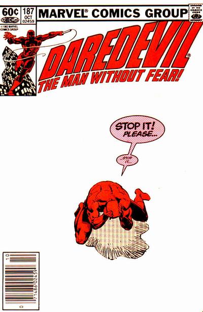
I remember when Daredevil #187 came out with it’s blinding white cover, it was impossible to find a clean copy in Hamilton Ontario, it was years later before I grabbed myself a copy that I was happy with.
A great comic book cover matching each day of the year, 1 through 365. Please chime in with your favourite corresponding cover, from any era.
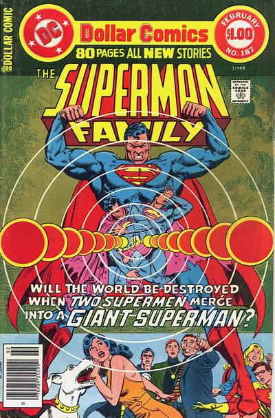


That is indeed a great Avengers cover, I concur on your choice. But the Superman is way to busy…I think they could have made it work without all those silly circles. Its like some fell in love with what they could create in photoshop, but of course the is from long before that. Odd.
Daredevil is amazing, innovative, but The Avengers still is more exciting. Did Frank really get full cover pay for that, or was he late and they just lifted a panel out of the story? Sorry, I’m being cynical. Alex Toth would approve of this one…simplicity was his motto, strip out all those non-essential details and just move the story forward.
I was thinking Adams did something like this, with Deadman on his knees in agony…but not finding it in the first Deadman covers on Strange Adventures #205-216. But Walter, you have some amazing candidates for your picks in that run. Oh, man!
Glad to see books I actually have! That Avenger’s is a classic. Daredevil is maybe even more interesting to me. It’s showing how ‘white noise’, get it, is driving DD crazy. Conveyed oh so well with the subtlety of a ‘simplistic’ cover. Now to wait and see Meli complain about the Avenger’s being a ‘hanging out/standing around’ cover. 😛
This is an effective use if negative space on the DD cover. Yesterdays Bambi cover wasn’t as effective and would have been much better if they had had a gradient in the color.
Levitating upside down counts as action so I’m not complaining. House of Mystery might not have the same impact but I just can’t get over it.
Shades of Superman #125 (“Superman’s New Power!”). I hope he has a way to put them back.
I see no “great” covers for #188. At best I think you are going to pick a good cover. Avengers #188 wins by default for me.
Good ones Chris!