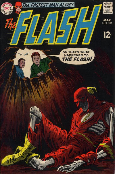
Flash #186, DC Comics, March 1969. Artist: Ross Andru.
Ross Andru packs a visual wallop with his cover to Flash #186. This book has always stood out in the Flash run.
Adam Hughes keeps working his magic with Wonder Woman #186.
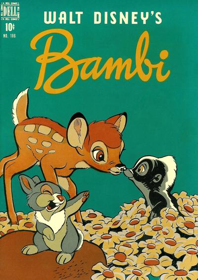
Four Color #186 brings wholesome goodness with gentle and pleasant aesthetics from the masters at Disney.
I couldn’t pick a JOWA winner but I did get it down to Strange Adventures #186 and World’s Finest #186.
A great comic book cover matching each day of the year, 1 through 365. Please chime in with your favourite corresponding cover, from any era.
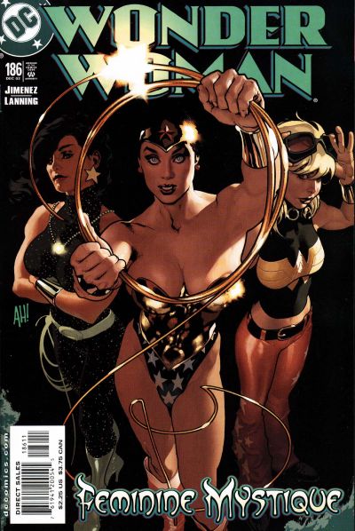
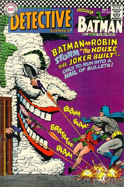
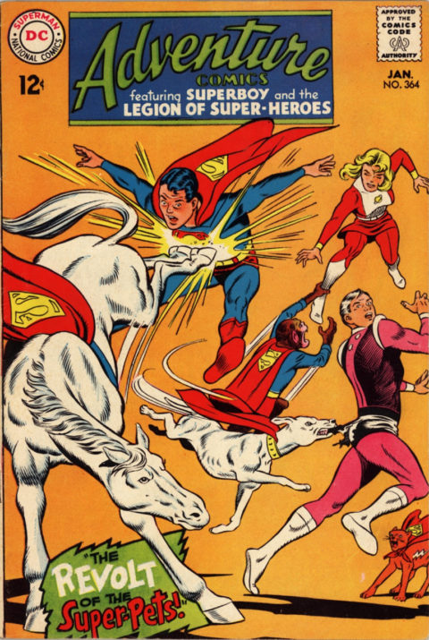
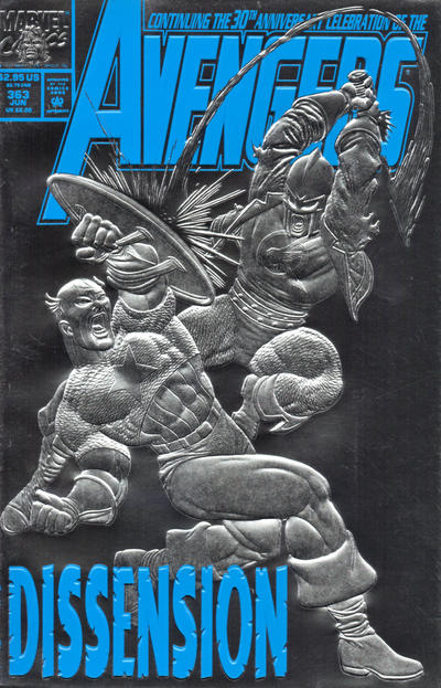
Wonder Woman has some very nice standing around, but at the end of the day that’s all it is.
For tomorrow, Adams returns to top form with House of Mystery, and that’s easily my pick. ASM is a good solid cover if not original; Avengers is one of a million great Byrne covers; Thor is up there – if I had been old enough it would have been hard for me to pass this one up on the newsstand; Unexpected has great art and composition but the theme has been used a million times before.
I don’t see any JOWA but if you thought World’s Finest #186 was a contender, I guess you should give it to #187 as they managed to drag the story out for a second issue.
Not an big fan of Andru, but I do think Flash is a great choice. Good work. Kids would love that, and it sucks even me in. Guess I could dig mine out and see how they pull this one off…
I think there might be a better Bambi cover, but still worth a mention. A few years ago a couple fans published a string of zines, 12 issues or so, with all the Four Color covers in nice large size. In full color.
It was an eye opener, covered far more ground than Gerber. So many fine books, Dell /Western was a powerhouse, and its partly because they sold so well that today the supply actually outstrips demand on so many books. I keep grabbing up the odd ones. Even offbeat titles like Maverick, King of the Royal Mounted, Sgt. Preston, and all the Zane Greys are actually very readable. Good writers.
I still like HoM 186 although as Chris pointed out yesterday, this Flash and the Batman are both macabre enough to be appealing. If there was a chrome pole in the background I would know exactly what Diana and friends were up to. Also I agree with Bud, there must be a better Bambi cover… not that this one is bad…its simply dull.
Not only were the Zane Greys readable Budd they also had some very strong covers with great use of shade. I like the simplicity of the Bambi cover, I aslo like the title mast and green background.
Walter, looking again at Bambi, I have to agree with you now. As you say…The simplicity of the logo, the green background…it does grow on me.
I think we have to step back on covers like this and consider them from the eyes of the intended audience…most likely younger kids, under ten or 11 at most, and their parents. And in that way, you’d have to consider this pretty iconic, in fact.
Its hard not to compare it to all the wonderful other Dell covers, particularly Walt Kelly work, but yeah, its a good one. Fresh eyes today! But Gerald, thanks for the support. I bet it looks nice in glossy high grade…
Four Color #12 is a good Bambi, too. It edges out this one, for me. Surprisingly, there are not so many as I thought. Now Snow White, there are some GREAT FC covers, too.