House of Mystery #193, DC Comics, August 1971. Artist: Bernie Wrightson.
I can’t think of a better hand off than Neal Adams passing the torch over to Bernie Wrightson on the House of Mystery run at issue #193. I personally like Wrightson better on the horror/macabre stuff.
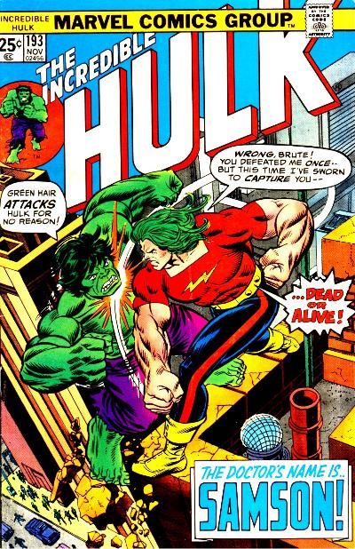
I’m a sucker for battle covers and Gil Kane gives us quite a battle on the cover of Hulk #193.
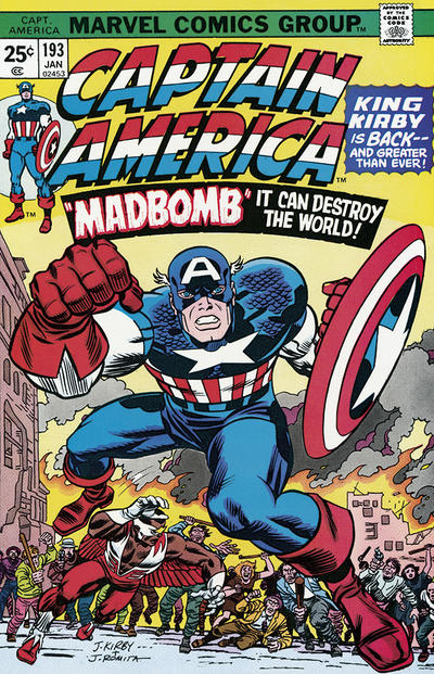
Question. Is there such a thing as too much Kirby? Cap #193 just might be too much Kirby.
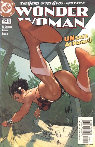
Wonder Woman #193 (2nd series), really DC? We gonna let the artist go there?
World’s Finest #193, the latest in a line of dreadful JOWA worthy WF covers.
Young Romance #193, I want Lonnie’s pants! I already have a pair like the ones on the guy doing the talking.
A great comic book cover matching each day of the year, 1 through 365. Please chime in with your favourite corresponding cover, from any era.
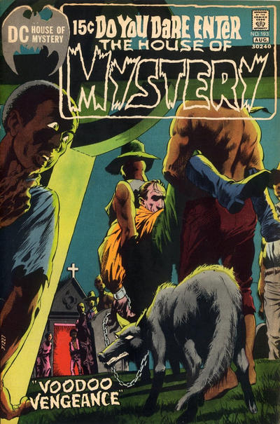


Oops it was such a good hand off that I thought it was still Adams.
I just finished that Creepy/Eerie Wrightson compendium that was recommended to me (by Scott I think?). That gives me some more recent context to respond to your point about Wrightson vs. Adams for horror work. Another recent point of reference is Basil Wolverton’s Plop! #1 art appearing in Heritage’s big summer auction. That leads me the equation Adams + Wolverton = Wrightson. Of course not exactly but my point is that even Wrightson’s most grotesque stuff seems to have a cartoonish whimsy, while Adams’s doesn’t, and that leads me to give the nod to Adams for impact. Importantly this is not a comment on Wrightson’s craft – many of those Creepy/Eerie pages are absolutely extraordinary.
The Hulk cover is good but not great Kane – I thought it was Trimpe – I think Kane is much more comfortable handling svelte gymnastic characters than these blocky steroidals.
Too much Kirby??? Maybe possible when he walked the Earth, but not now.
Because I always try to take the high road. your Wonder Woman comment didn’t even occur to me when reviewing the covers, I only thought that it was all-around awkward and relatively bad Hughes. If you move that Babe #2 at that price, the message is put a chunk of the profits into a bunch of Wonder Woman #193s.
Here’s a collecting/cosplay strain – best guys’ clothes on DC romance covers, then tracking these down in vintage shops for use (or even sale?) at cons. Might energize the romance back issue inventory.
—–
Wow. Wow. I was really starting to give up hope – we’re down to about two-and-a-half pages of covers in my GCD search. But #194 is so good that my faith is restored (at least for another ten days or so…). For #193 I charitably had three candidates – for #194 I have twelve. So you will forgive me if I gush a bit.
I really don’t want to do this, but I have to put my objectivity glasses on and pick Batman. This goes to my point of picking a _comic book_ cover. This is one of those “lost world” covers from before my time that made such an impression on me. I can give half a dozen serious negatives about this cover, but when I line it up against all the other contenders, my pupils dilate when they fix on this one.
What do I really want to pick? It is a toss up between Flash and Strange Adventures. Flash is a just awesome Adams cover but there isn’t a lot of action and the colors are drab. Strange Adventures is also lacking in action but man oh man it is cool.
I want to devote the next tier to a single title, which is Kid Colt. While I wasn’t a big fan of Hulk #193, this 1975 cover took me back to Covered 365 #131, Hopalong Cassidy from 1958. Kane’s style much more pronounced in the later work, but the composition and figures demonstrate that he can still deliver an extraordinary “Call of the Wild” cover.
Now the long list of honorable mentions. Obviously ASM, but really this just makes the cut. Captain America – still too much Kirby and I love it! Daredevil misses on a number of my criteria, but Hannigan did a fantastic job with the composition and figures, and the colorist brought this one home. Fantastic Four might not be on everybody’s list because it is dark and the purple vs. purple is unfortunate, but otherwise a top notch Perez. You want me to agree on a funny animal pick? Then give me Four Color #194. G.I. Joe – too dark but it had to be, otherwise pristine art. House of Mystery – here my complaint is the opposite, it would have been better with less fluorescence, but otherwise it is pure Baltimore Wrightson. Young Romance executes a welcome break from JOWA tradition and provides a cover with a strong message.
Two more that deserve mention are Our Army At War, with a nice Kubert try to give us some French Boy Commandos. (Who thought the North American audience would take to this?) Unexpected follows on the previous issue, apparently publishing one after the other homage to PCH and thumbing its nose to the Code symbol next to the image.
No JOWA for the exalted #194 – it wouldn’t be fitting.
That WW cover is something else. I guess Adams figured he’d give us a reverse angle shot.
Yes, Bernie’s cover is light years ahead of your other examples. I think DC’s exceptional coloring helped both Bernie’s and Adams’ work in this period, circa 1971…and who gets the kudos? The artists or an unknown staffer—there are no credits to the colorist in Grand Comics Database.
I don’t even think the Hulk cover is good. Crowded, cliched, and it does look more Trimpe than Kane, I agree with Chris there. Sorry, but never much of a Trimpe fan, but think I recall Marie Severin might have inked some of his work that I liked.
I agree with Walter on the Kirby, been there over and over. I think Jack phoned this one in, sorry to say.
Oh vey, that Wonder Woman cover….that is indeed bad in every way except Adam Hughes did render it well. But with a story “Games of the Gods,” you think they’d come up with a better image. Whatever is happening with that floor? And who cares? Really, really awkward and unflattering WW pose, but perhaps Hughes deserves credit for trying something so awkward…. still, gets my JOWA vote, too.
I meant Adam as in Hughes. Too many artists named Adam-Adams these days. (:
I’ve got to mention what no one else has. That Young Romance cover is truly horrid. Forget the fashions. It looks like the whole thing was but and pasted from a bunch of unrelated images. Heads are out of proportion. Legs more so. Poses are ultra stiff. I like a lot of these covers that don’t get much love these days, but this one is scarier than any Tales from the Crypt.
Robin is immune to the hypnotic pants! When I look at the cover I can only see… the pants… the pants!
Robin you are a warrior, a true champion for being able to get past the pants. If I cover the pants and look at the rest of the art I do see that you are right but once I uncover the pants…
Glad to see I’m not the only one questioning that Kirby over Bud, sometimes too much of a good thing isn’t a good thing. It’s kind of like when Frank Miller does too much Frank Miller.
This isn’t too much Kirby…its sub par kirby. Jack was older then his age. He really served in the theatre of war in Europe…unlike Stan, who protected Americas coast. Kirby really was the real deal, the king, and the true champion of all thing Marvel.
Amen Dave.