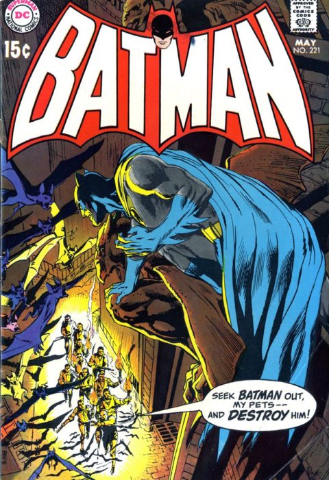
Batman #221, DC Comics, May 1970. Artist: Neal Adams.
I thought Batman #221 was the runaway winner today (I should have used that line on a Flash win). This is quality stuff from old Neal. I have a feeling we’ll be seeing more of Mr. Adams in the coming days.
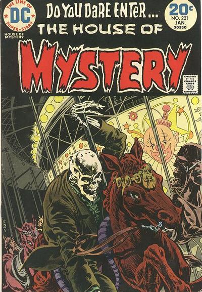
More of the same from Bernie Wrightson on House of Mystery #221 but that is not a bad thing, this is actually a great cover.
I’ve always loved the Ed Hannigan cover to Avengers #221. Who will the new Avengers be? Look inside to find out! I remember hoping it was Dazzler and the Surfer.
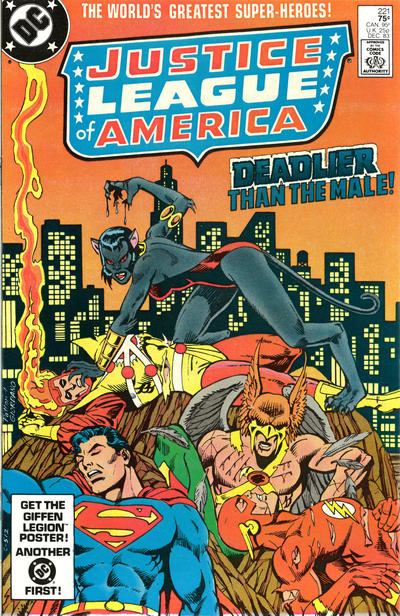
JOWA has to go to Justice League, did she just beat our heroes by scratching them? Is Superman asleep?
A great comic book cover matching each day of the year, 1 through 365. Please chime in with your favourite corresponding cover, from any era.
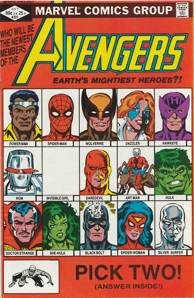


That Avengers cover certainly looks dated, but the idea is a brilliant one. Good choice.
And the Adams is absolutely wonderful work, he really nails the same brooding, threatening Batman we first saw in the earliest Detective Comics, before that darned Robin came along. It was so cool seeing him with those longer ears and packing a gun! Ha! No wonder those issues are solid gold for collectors.
House of Mystery—no cigar for me. Just doesn’t ring my bell.
Batman #221 has always marked a turn for me in the way that Batman was viewed, and Adams nails it perfectly. These covers offer the “over shoulder view” of Batman (a perspective Adams uses often in his Batman and Detective covers) which takes you into the moment with the Batman – you feel as though you are with him on that ledge. Most comic covers treat the reader as an observer viewing the action as a third party, but Adams pulls you in and allows you see it as the hero (or occasionally the villain) sees the action. The art is great, but its the perspective and composition that also sets it apart.
This perspective that Adams offered also shaped the character – how much more effective is Batman’s inner dialogue when you aren’t just watching but actually participating as the viewer & reader.
And the cape – Adams also used the cape to make everything better. As you scroll through his Batman covers you can see how the cape became a major feature, and was used define movement or motion, offer cover & protection, and to menace. It has become an essential part of Batman, and these covers were the moment in time which really brought that feature forward.
But how did the “Fatso-Superman” cover of Superman 221 not earn a JOWA? I agree with Chris, the art is really very good, but the concept and the banners (“the two-ton Superman”) are more than worthy of a JOWA.
Although there were no real challengers to Batman 221:
– X-Men 221 is a rare example of Silvestri cover that I actually liked.
– And how good could the cover to Spectacular Spider-Man 221 be with good inks and color.
The Avengers cover reminds of the Brady Bunch, for some reason. (:
I am not on board with runners up. To me the Avengers is hokey and I would have been badly disappointed in this if I had been reading the title at that point. House of Mystery strikes me on the low end of Wrightson’s output, and of course (like the Avengers) scores poorly in terms of my “great cover” criteria.
For #222 I think Batman is as close as we come to a great cover, although it is a step down from #221. Of course the Adams art is a notch above as usual for this period, but I think it is really the colors that make this cover stand out. The fluorescence of the album cover and the logo contrasts nicely with the rest of the image, which is also not too dark.
Kid Colt, Tarzan, and Wonder Woman are all very good but I wouldn’t argue for great.
I have an affinity for images of Batman perching on a gargoyle, tell me if I’m wrong but I think maybe Neal was the first to do that. What I really love about this composition is the yin-yang of equal light and dark. Balanced and eye popping, a great Batman cover from the master. Saw Neal at San Diego this year and he’s still a virtuoso.
Great Batman! It’s funny DC and Marvel didn’t do “Gerber” books of their covers as they went along, one for each decade. It’d make a nice encyclopedia either by all the output or character specific. I should have paid more attention to comics when I was learning how to draw.
Besides the Unexpected I mentioned yesterday I did look at the Justice League and think it might have been a runner up! Bernie phoned the HoM in as far as I am concerned. Avengers looks like a cheap t-shirt image and the real joke was the blank box for the Invisible (Woman) Girl! Really they were calling a woman who already had a substantial history and a child a girl in the 70’s?? It gets points off JUST for that! The Adams Batman is a good choice… he had a great run on that title… until tomorrow… its my JOWA… always a cheap shot including the Beatles to sell a book (although I am guessing based on the time of publication it would be the last time…sigh…then we are stuck with KISS in the future)! So unfortunately I am leaving it up to the rest to come up with something tomorrow…it was bleak searching for me.
Tim, DC did these thick pocket books of covers for Action Comics and Detective I think, they looked like glossy Big Little books and each page had a color image of a cover sequentially presented.
Derrick you are right re the fatso Superman for the JOWA, that should have been the one!
I liked your picks toady Walt, though JLA was confusing to me. Tomorrow, Tarzan 222 , four color 222 and Loony Tunes 222 is my personal favorite as whats better then Bugs and Marvin the Martian? Whats up in space Doc?
Sorry I called you Toady today Walt. You’re every gals frog prince !!!