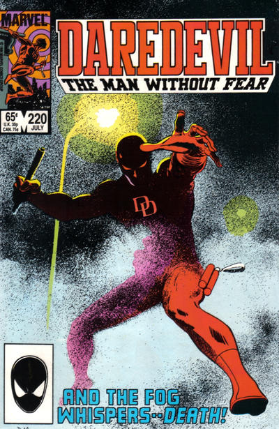
Daredevil #220, Marvel Comics, July 1985. Artist: David Mazzucchelli.
I really like David Mazzucchelli’s cover to Daredevil #220. There are two effects he’s going for here with the haziness of the light in the fog and then the fog itself.
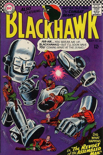
Did I just put a Blackhawk that wasn’t a JOWA in the post? I did. Dick Dillin be illin’ with this cool cover (or is it chillin’). And there’s a giant hand.
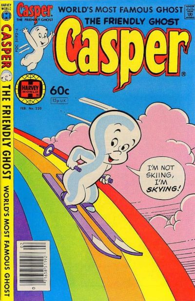
Rainbow alert on Casper #220, I need this on a t-shirt.
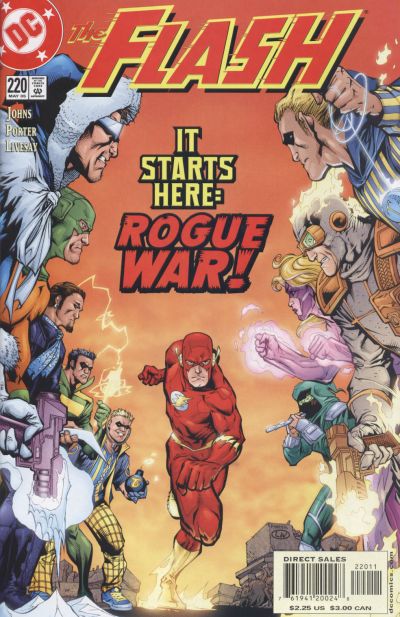
Howard Porter packs in the Rogue’s Gallery onto the cover of Flash #220 isn’t it worth the price of admission.
I liked Strange Adventure #220 but thought the monster weak, Thor #220 had a strong cover too.
A great comic book cover matching each day of the year, 1 through 365. Please chime in with your favourite corresponding cover, from any era.


I think that I tend to view each day as a single-iteration game while you seem to look at the whole exercise as a multi-iteration game. My call is what I believe to be the single best cover that day, while yours seems to be what is most striking given what we’ve already seen. I would be happy picking Adams ten days in a row if each day I judged his cover to be the best of the lot, but I think you are giving a handicap based on new/different.
So: I did look at the Daredevil but regardless of the cool technique, it doesn’t give me much of what I want out of a cover. It is a crouching around cover of a single figure with no story (other than something ominous implied by the text). If I would pick this one, there would have been a lot of Sam Keith covers that I would have picked – very cool single figure drawings, but no other elements. The Thor might be standard but I stick with it because it has all of the elements I am looking for.
On the other hand I can accept the Blackhawk as a pick, but I’d still pick the majesty of the Thor over Blackhawk’s craziness.
Similarly I saw the Casper and wasn’t surprised that you noted. I was just in Target last night and it seems like a back-to-school theme is rainbows and unicorns, so said t-shirt would be quite with the times. If you could get the rights for that I think that a pop-up shop selling these and other substances at Whistler would be a hit.
The Flash is obviously a homage to #155 and in that light I didn’t think it held up too well.
Not much for #221 but we have the aforementioned Mr. Adams to save us with Batman. My only complaint is that the torchlight illumination was mishandled – if the arms carrying the torches are yellow, why is the ground (much further from the flame) white? But hey, this is a comic cover, I have no problem with Schomburg’s German or Japanese enemies labeling everything in English, so I should relax a bit.
Again I really appreciate Kane on Kid Colt, but I don’t think this rises to the level of greatness. There is a lot to like about Our Army at War but in my opinion it somehow doesn’t come together with the intended impact. Later Kubert gives us Unknown Soldier, which also falls short in my estimation because of the seemingly indecisive response of the Soldier to the situation. Superman is similar to yesterday’s Flash as being a good cover and a JOWA.
Today was an eye opener for me. As I browsed the covers and started checking off the ones I really liked, I included Strange Adventures, Sgt. Rock, and Unexpected all by Joe Kubert. Once I realized the commonality, I took a second look which only confirmed my appreciation. I think Chris described this column’s effect a few days ago as “sensitizing” us to covers and artists we may not have fully explored or appreciated previously, and that has been my experience with Kubert over the course of the past week.
That being said I also really liked the standard bearers of:
• Neal Adams’ Batman #220 – The cover almost tells its own story, and offers 2 great Adams images of the Dark Knight.
• John Byrne’s Fantastic Four #220 – An FF team photo in a moment of action.
• Gil Kane’s Thor #220 – I am willing to nominate this title as the best source of outstanding covers in the Marvel universe.
Daredevil had a nice effect and I understand the choice, but it would finished out of the medals on my scorecard.
As Conan fan, I also enjoyed Jim Lee’s over-the-top cover of Conan #220.
Speaking of sensitizing, Derrick, I had to go back and look at that FF. Sure enough I liked the composition when I first looked at it, which was the Byrne tip-off. But in my opinion letting Sinnott ink these early Byrne FF covers was like painting a Porsche with house primer. Imagine if Terry Austin had inked this cover. The next problem was the monochrome – probably a big red cover helped to sell a book to the less discerning, but I would rather have a black-and-white than this. So it still wouldn’t make my list, but I support your appreciation.
I have been a Blackhawk fan since the sixties, even putting up with many lame DC issues. But the costume change ended it for me. I just hate them! Plus this cover reminds me of that goofball Captain Marvel rip off, who yelled “split” to makes his body parts separate. Aughh, this cover still gets a JOWA in my eyes. The notorious Myron Fass published two horrible issues of Captain Marvel in 1966, remembered only as the lowest low point for poor CM.
http://www.internationalhero.co.uk/s/splitcap.jpg
It looks like a slim-pickings day. DD is effective at first glance, but they didn’t quite pull off the fog transition. Nicely rendered, though, like those glowing eye slits. It is still best out of the four covers you picked to show us.
I go with Chris on the Flash, a new take on Infantino’s original concept. Okay, its got its appeal, I just wish Flash wasn’t so bulked up and grimacing, too. Its a trope of modern comics that every hero must look like a weight lifter AND be grim, teeth clenched. That’s one nice thing about the youngster as the TV Flash, it escapes that particular cliche and seems more like the original Barry Allen Flash to me.
I wouldn’t notice Daredevil 220 in a long box of 50 centers Walt. Just meh. Harvey covers were great in the 1950’s and 1960’s but few in the 70’s or 80’s deserve notice. Flash serves homage to an earlier great era and cover. Blackhawk’s cover is cute and interesting. I think Derrick’s and Chris’s suggestions are better. A rare down day of cover picks Walt. Must be Serbian picnic day in the big smoke. Why wasn’t I invited to enjoy the scenery?
Personally, I like Walt’s pick. It’s moody and hints at the story enough to matter. Mazzuchelli did a good one here. Looking ahead, I have to agree with the Batman choice, though he’s just lurking/crouching. Runner up is Uncanny Xmen with Havok blasting Wolverine towards the viewer, a nice Marc Silvestri cover. I also like Avengers for it’s novelty. Can you really not smile when you see the empty box for Invisible Woman? Even if it is a SMH type of smile, you probably still do. Hulk is interesting, including a minor character I’ve always liked but never got anywhere.
While I am a great fan if Daredevil, this cover doesn’t grab me…the Blackhawk is the best of this grouping and that being said seems a leftover from Metal Men. I second the Byrne Fantastic Four as best 220. The Thor would have made it but suffers from what Chris criticized about DD from Smith a couple days ago… Sif is devoid of detail… and THIS is a situation that calls for it! I also agree the Harvey covers were better in the 50’s and 60’s… thumbs down on the rainbow!
Tomorrow I actually like Unexpected 221…an unexpected cover from Kubert! A JOWA to Spawn…homage or simply lack of an idea for that month! I frankly don’t care for ANY homage to AF 15… but thats just me!
Agreed I pass over AF 15 homages by default, way overdone.
Dave, I don’t invite you because you always get lost in the scenery when you go to those things, I always find you somewhere deep in the bush.
Chris, I think I go in streaks, I’ll hit a vein and mine it until I notice and try a different approach. I’m liking the multi cover approach as I can mask my biases a bit.
These later numbers are making us all work a bit harder and in doing so we all seem to be discovering things about our tastes that is making this exercise worth our time.
I agree Walt, we all have our biases and support your decisions on covers. It gets us all the ability to express our own and exposes us to even more examples which we might not have considered!
The pink blotch on DD’s midriff kinda bugs me, maybe a bit more fade at the edge or some stippling would have helped. Looks a bit like a marker scribble on a colour separation acetate, however the rest is very moody and striking.
Runners are usually more slender aren’t they but I do like the drawing overall on Flash, though I have no idea who the villains are.
You can have the Casper rainbow shirt Walt. Avery makes a very good ink jet print iron-on-film to use on dark colour fabrics. Works great, much improved over the 1970’s material on shirts of the day.
Its interesting…some covers I don’t like, but hearing others argue otherwise, sometimes I do see it differently…This cover thing is a worthy endeavor. I enjoy the dialogue more then the covers actually 🙂