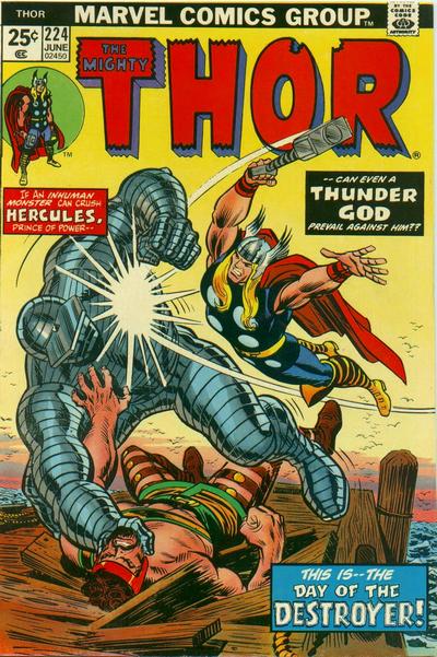
Thor #224, Marvel Comics, June 1974. Artist: John Romita.
I’m gonna officially come out and say it, Day 224 was the worst day of the year so far for covers. Being the eternal optimist I’ll also add that it will end up being the worst day of the entire year.
I like Thor #224 the best, I think John Romita draws a terrific scene and I really like the colour scheme.
I also really like Mike Zeck’s impactful cover to Captain America #224, strong cover.
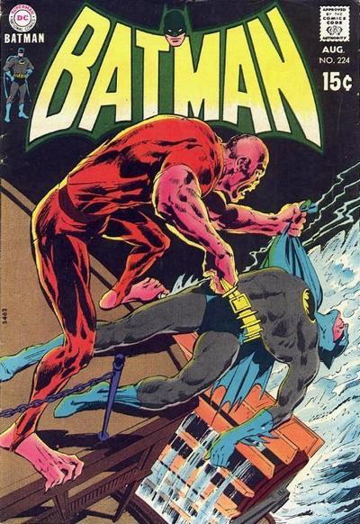
I’ll add Neal Adams’ Batman #224 to round out the day, strong composition and perspective but the bad guy is meh.
A great comic book cover matching each day of the year, 1 through 365. Please chime in with your favourite corresponding cover, from any era.
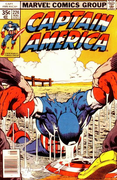


Three of the best covers so far…colorful and impactful. Certainly I look at them and think I’m seeing something for the first time… I loved Mike Zecks work. He seems like a great artist from 1980 to 1990 and I wish he would have done more work.
I will reuse “meh”. Romita rarely delivers anything that appeals to me. I have to credit this exercise with suggesting that this is my ingrained response, and it probably explains why I never bought Spider-Man in my formative pre-collecting years. I have to give some props to Romita’s conceptual representation of birds in the image – minimalist and yet evocative.
I think we are now unquestionably into the cover desert, with so few titles running 225 issues. I don’t see anything great for tomorrow. Of the lot it is neck and neck between Daredevil and Tarzan, and I am going Tarzan because he deserves more love around here – also there are no feet in the image. A lot to like in the Daredevil – clever title style/placement, cool angle, wing breaking fourth wall, but at the end it is just a bit too familiar to me. Batman and Marvel Tales also get a mention. The Live Action Spider-Man Holodisk of Spectacular Spider-Man is, of course, spectacular, but you had to be there.
Walter, I would have picked the Captain America for top cover. Beautiful rendering on Cap, reminds me of Kirby and Steranko, if not our 1940s-era Cap. Timeless scene.
Zeck’s work in Spider-Man, 1987, “Kraven’s Last Hunt,” still brings powerful images to mind. That was collected into an early Marvel Graphic Novel, well deserving.
I agree on the underwhelming Adams’ Batman…what’s with those giant clawed feet on our protagonist? I assume this guy is a mutant or something, looks like Manbat feet. Honest, I don’t have a foot thing, it just jumped out!! Perspective doesn’t ring true with the buildings and water, either.
I concur with Bud, Cap by Zeck is stronger for the win, but I’m glad you at least had it in the line up. There are very few Zeck covers that I don’t like, from the composition to the excellent coloring, it just works for me.
When I looked at today’s selection, I thought there were several good choices among an ever dwindling and limited supply of covers. My first choice was HULK 224 – really strong and powerful image of the HULK.
The runner-up position was a close contest among Conan 224, Thor 224, and Captain America 224 – each were outstanding. For me, the only weakness in Batman 224 is the standard Adams set in his other Batman covers, but still a good cover.
Thanks to Chris for pointing out the McFarlane work on Marvel Tales 224 in yesterday’s comments. Unlike most, I remain a fan of McFarlane’s run on ASM and the Spider-Man series, so the Marvel Tales covers are a bonus. As a Spidey fan, I still remember the shock upon seeing McFarlane’s first work on ASM, and my reaction was enthusiastic as it felt as though McFarlane had breathed new life and energy into Spider-Man at a critical time – the wedding to MJ, the arrival of issue #300 and the introduction of Venom. The comparison of the issues prior to McFarlane’s arrival are a testament to how much his art and vision of Spider-Man meant to the character.
I am also in favor of the Cap cover! While Destroyer covers are universally good, this one is not on the top of my list. Tomorrow I am favoring the DD cover…yes its almost a Spidey cover but not quite and Tarzan looks a little too beaten on the Kubert cover… but I agree with Chris that they are the better covers for a dwindling supply of knockouts!
Not buildings and water on the Batman, that’s a sternwheeler riverboat. Took me a couple of minutes to comprehend it. Don’t know what the story is about but the villain looks slightly oriental, with weird feet. “Kirby-ism” seems to have influenced a lot of Marvel artists, I like it except for the chunky legend boxes. Maybe Cap is a bit too bright for context of the scene? Or maybe that would bethe cliche, dark gloomy lighting.
Were covers given a bit more time because it had to sell the comic, were there revisions or multiple concepts where one was chosen?
Joining Bud, CK and David on applauding the work of Mike Zeck, particularly the “Kraven’s Last Hunt” storyline and covers.
His cover image of Web of Spider-Man #32 is one my all-time favorites.
So the consensus seems to be Cap #224, I won’t argue that.