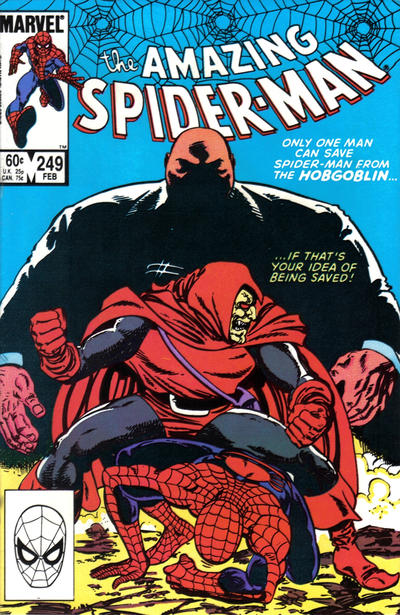
Amazing Spider-Man #249, Marvel Comics, February 1984, Artist: John Byrne.
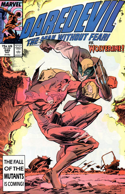
Remember those old urban legends about the female secretaries winning weekly football pools because they picked by jersey colors? Well today I had it down to Daredevil #249 and Amazing Spider-Man #249 and you all know I love my sky blues. John Byrne gives us a nice composition on his Spidey cover.
Had Rick Leonardi’s Daredevil #249 had a blue background I would have been in real trouble, I’ve always liked the Daredevil #249 cover.
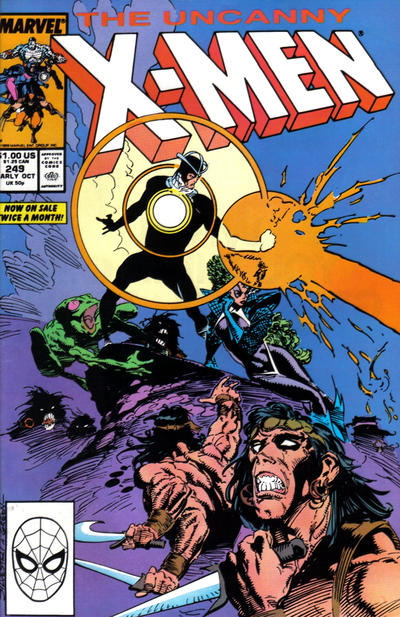
Marc Silvestri delivers with this nice cover to X-Men #249.
Speaking of busy, John Byrne is a busy boy as he gets another #249 applaud for his Captain America cover, the cover is busy but I like it.
A great comic book cover matching each day of the year, 1 through 365. Please chime in with your favourite corresponding cover, from any era.
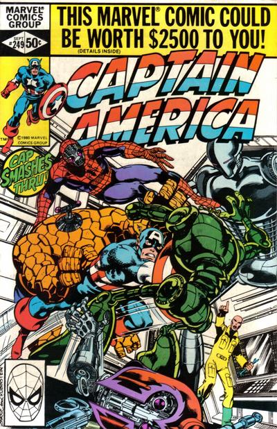


Despite any detractors, I think this was a day of some dynamic covers. There is also Fantastic Four as well… however I never could figure out how Gladiator stole Dr. Strange’s Cloak of Levitation… at least it LOOKS like the same cloak… or at least a close relative. Tomorrow not so good… but a JOWA to Captain America!
I like all the cover choices today, and would generally never complain about Spidey getting a top prize, but (sorry Spidey) my vote would have gone to the Gladiator cover of Fantastic Four #249.
I also like the cover of Superman #249 – that is one mean looking horse about to pummel the Man of Steel.
I was really surprised to find out that ASM was Byrne. To me a really weak Byrne – the composition is cool but otherwise very basic. I don’t think the solid background shade is too meaningful an argument, but I guess if concentric circles, bubbles, krackle does it for you, then why not?
I prefer the DD, but Wolverine’s face and DD’s out-of-proportion upper body send that one to the showers. Similarly Silvestri’s weird grimacing guy in the foreground makes that one a non-starter. Reiterating in line with Derrick, I can’t understand picking any of these over FF.
Tomorrow we arrive at the anniversary day of #250, but my pick doesn’t go to any of the weak anniversary covers. Again I will go with Byrne for FF #250, which aside from text overlay doesn’t make any reference to the anniversary. I love the characters, the color and the action – maybe not a Schomburg but still my idea of a classic comic book cover.
Superman is runner-up as a very Tomahawk-esq Adams production. (Derrick is right about Superman #249, and I would have picked it if Superman had been handled differently on that cover. ) I also really like Tarzan as the worn-out Kubert hands it over to Garcia-Lopez, who delivers a truly great cover. If I hadn’t been spoiled by so many great Kuberts before this one, it might have made my pick for the day.
I noticed that Mickey Mouse #250 was a reprint of that Four Color noted yesterday (albeit with worse coloring). Does that mean some of the other Gladstone Mickey Mouse picks should have been attributed to other originals? (I’ve noticed that one unspoken rule of this game is to not pick a cover if it’s a reprint.)
While it’s a fairly bad cover, Avengers #250 might hold the all-time giantest of giant hands record.
I don’t even know what a concentric circle is but I do like bubbles.
Pinhead/giant thighs DD and W has really weird feet. I like some parts of each of these but not the whole.
That was a bit flip of me. Leonardi was trying a difficult action pose and maybe didn’t have time to refine it or was rushed, so good attempt. Don’t think I could pull off something of that nature.