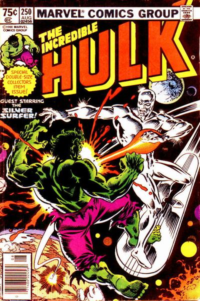
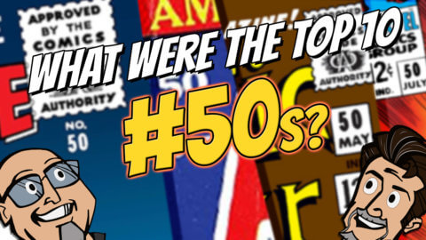
Incredible Hulk #250, Marvel Comics, August 1980, Artist: Al Milgrom.
I mentioned this in the comments of Day 248 but I thought I’d put it in the body of the post for the big Day 250. With the cover selections getting harder as our options decrease I’m finding myself analyzing the covers in many different ways, I’m seeing a lot more in covers that I did in say Day 10. I think about going back now and starting from #1, I’m sure I’d be picking differently.
Two battle covers vied for top spot and I went with the Hulk Surfer battle on the cover of Hulk #250, Al Migrom set it against a jet black backdrop which makes glossy high grade copies of this book things to behold.
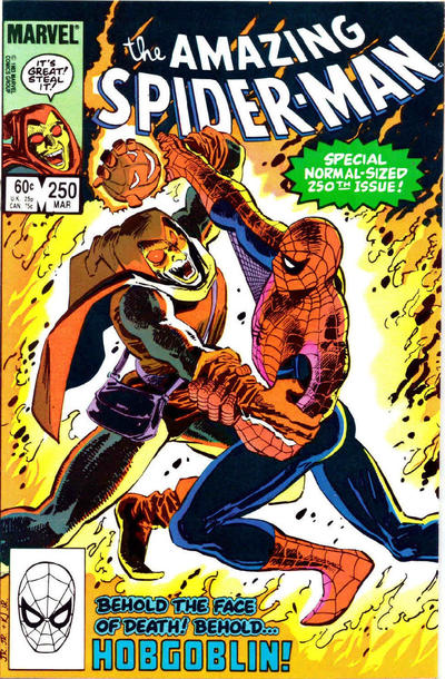
John Romita Jr. follows up John Byrne’s awesome cover to ASM #249 with this epic battle scene on ASM #250.
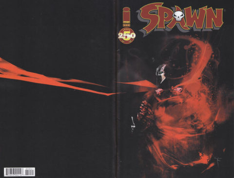
Wraparound cover alert, I like the effect Mark Simpson gets on the cover of Spawn #250, there were a bunch of Spawn #250s to choose from.
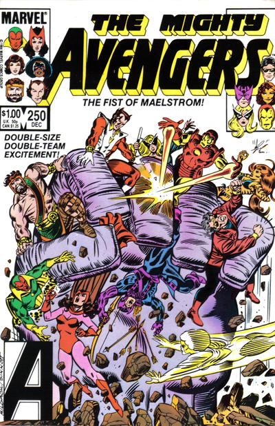
Covered 365 commentor Chris ruined his early Christmas present by mentioning the giant hand on Avangers #250.
A great comic book cover matching each day of the year, 1 through 365. Please chime in with your favourite corresponding cover, from any era.

The image subtitle is wrong, looks like you copied from yesterday.
I am not a fan of any of the picks – I compare them to work done in from the forties through the eighties and I find these to be too crude. I am especially down on Milgrom as I said before. That Hulk might be impressive for its colors, but the art looks like it was done by a high school kid. JR Jr. better but not much – I used to like him but I haven’t seen much during this exercise that has reminded me why. I would still pick him over Sr. because I like his more abstract style.
For #251 I can’t find anything that beats the hyper-obvious choice. However I won’t be surprised if Walt picks FF because of its psychedelics. A warm and fuzzy (hairy?) JOWA to Action.
Subtitle corrected, thanks Chris
Al Milgrom started strong in Capt Marvel….but Gosh, his art sucked by the time he was penciling the New Avengers and such…he obviously quit caring early in his career
Well… I don’t find them SO bad… maybe not great great but definitely serviceable . The only one I question is the Spawn simply because your not getting any payoff with the wrap around… a bit of cape is not enough reason to look on the back of the comic.
Well not my top pick, but a nice cover. I like the corner box, it makes me smile. I actually think that JR did a better job on Daredevil’s cover for composition though. Top spot for me would have been X-Factor Clay Mann variant. Yes it’s ‘busy’, but there is so much to see and just stare at for a long period of time to find some hidden characters and it’s colorful. Meli’s pick of FF would have been nice to see here too. It’s the first official appearance of the X-Factor title after all. Little did they realize it then though.
Cover 251 gives the knod to Neal Adams again on Batman. Classic cover instantly recognized. For runner’s up I’ll go with Byrne on Captain America and FF (the psychedelics work for me too), Adams unusual monster cover on HoM, Michael Golden on Hulk, ASM is nice as is DD.
JOWA has to go to Action. He’s flying, why the cane?!
WWWP?!
I meant the corner box on ASM. That Hulk proves that Milgrom was better at inking himself than Sinnott in his later years.