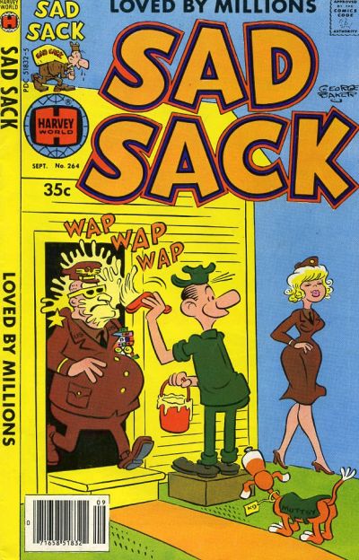
Sad Sack #264, Harvey Comics, September 1978, Artist: George Baker.
Well at least I found one little gem on Day 264, George Baker’s eye catching cover to Sad Sack #264 belongs in every collection and should be looked when you need a smile.
Mick Zeck channels Alex Schomburg on the cover of Captain America #264.
When I saw G.I. Combat #264 I thought it was G.I. Joe! The cover drew me in though, well done.
Is that really a Frank Miller cover to Hulk #264? It’s terrible!
A great comic book cover matching each day of the year, 1 through 365. Please chime in with your favourite corresponding cover, from any era.
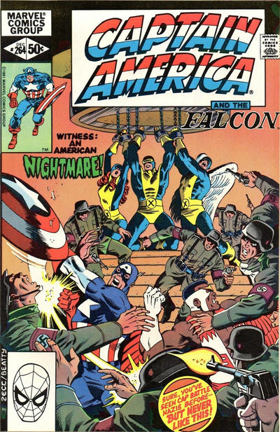
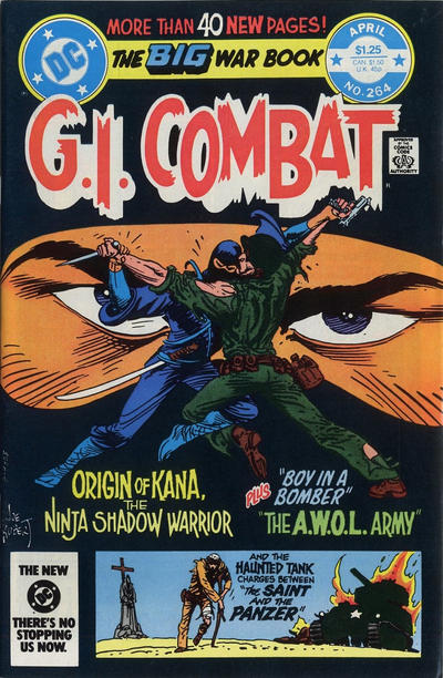
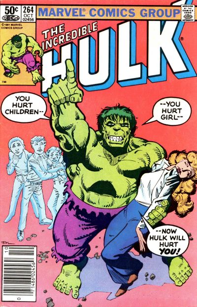


Wow…this must be the worst day yet. Sad Sack is a lazy gag, even by Sad Sack standards (it seems like you picked this out of protest anyways), the Cap is busy and confused, not helped by logos and captions all over the place, the G.I. Combat is striking (I’m a Kubert fan), but there’s more logos and titles then art, and Frank Miller should be ashamed of himself with that Hulk. Not your fault, Walt…there wasn’t much to choose from. Hopefully there are better days ahead!
While I like the cartoon it is way outside my bounds for this exercise and it’s not at all original – I’ll take Junior #10 from 1947 for this gag, for at least two reasons.
Channeling Schomburg just provokes the very unflattering comparison.
I have become a big Kubert fan through this exercise, but he produced both quality and quantity. This G.I. Combat, along with most of the recent Kuberts that I’ve run across, goes into the quantity pile.
It’s shocking that Miller lived down that Hulk to later produce one of the key works in the history of comics.
Can we do better tomorrow? I think so. #265 has two really good covers. My pick is Daredevil. This is in the same style as earlier Jr’s in the series, but it’s just – better. I don’t know the story – points off for that – but Jr’s abstraction really works for this setup and the b/w art and color scheme are both beautiful.
House of Mystery is the other pick, but this clearly would not exist without Startling Terror Tales #11 (there is a CGC 6.0 on sale for $6350 if you’d like it). If it were a simple swipe I would dismiss it out of hand, but it is actually a completely new piece of great art working on the same theme, with the same color scheme.
ASM is solid but not great. I guess you have to pick Four Color (especially with that bit of blue sky background), but no. For some reason I like this Superman – I think it is because of how Cardy handled the rain and puddles – I probably would like it even better without the figures…
Flash earns a solid gold JOWA for having his “second honeymoon” at the by-the-hour Hotel Hideaway. I guess if you can vibrate yourself into another dimension you can get away with this down-market approach.
Oh and this post is showing up under the wrong category.
That’s funny, I used to read some Sad Sacks, thought they were hilarious. Not great but it brings a nostalgic smile. I’m with you Chris on Kubert, been appreciating him more through this column. He could say a lot with his sketchy style, I might have to pick up some.
As a kid I loved the Sad Sack covers but was always disappointed at the interior art. As far as the choices for this day… we all knew these tough days were coming way back in January!
Fixed the post category, thanks Chris.
Yes, its been a rough few days but it ain’t over til its over.
I loved the Sad Sack cover Walt…Hot blondes and their effect on uniform personal and otherwise is a constant in our Universe 🙂
Thanks for posting something a little different