World’s Finest #283, DC Comics, September 1982. Artist: Rich Buckler.
Rich Buckler’s cover to World’s Finest #283 wins hands down simply for the novelty. Is there another cover that attempts to create a half Superman/half Batman character.
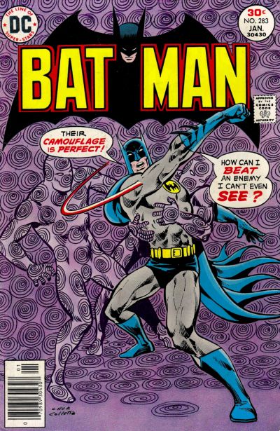
I wanted to like Ernie Chan’s cover to Batman #283 more than I do, I think it might be the background colour, had it been sky blue…
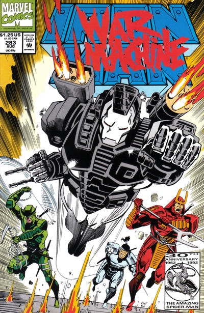
Kevin Hopgood continues where he left off with a strong cover to Iron Man #283.
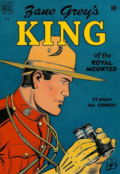
I did mention this before, I believe as a citizen, I’m required to promote Royal Canadian Mounted Police covers, like the one Jim Gary did for Four Color #283.
A great comic book cover matching each day of the year, 1 through 365. Please chime in with your favourite corresponding cover, from any era.
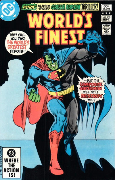


Well, your World’s Finest choice may have other merits, but the “novelty” of being a cover that creates a half-Superman, half-Batman character isn’t one of them. Curt Swan did it for the Composite Superman’s first appearance in World’s Finest #142.
Fully recognizing your duties as a citizen (and mine), I have to say that this Four Color cover is far from the best of the Mountie genre.
Great info Bob, thanks for sharing.
Hey Robin, I know, but I was afraid to leave it out so close to an election.
Poo-Poo on all. Just look at that mounties chin! Duddly Dooright wants it back! Composite Batman/Superman is plain dumb looking. Batman is the best of the group, but stupid in the word balloons as I pointed out yesterday for my vote as it being today’s JOWA. Let’s try this again.
Day 284 has Captain America on top, literally. Mike Zeck does it again. That’s all I’m putting up here. I can’t speak for any other cover.
WWWP? Probably World’s Finest again with the Godzilla size composite SuperBatman atrocity.
Hey… as New Yorker I love that Mountie! Yes there may have been better BUT not in our current numbering sequence! The WF I find interesting… not super great… plus I agree the color choice is not great but over all not a bad cover…the Ironman was better… albeit a poster cover… better then an average cover but not Great!