Superman #317, DC Comics, November 1977. Artist: Neal Adams.
Hey! Day 317 had some strong covers, nice to see this deep in.
I had to go with Neal Adams’ cover to Superman #317, so dramatic, so Adams!
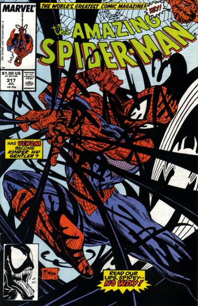
Todd McFarlane’s cover to Amazing Spider-Man #317 could have just as easily won, it gives you a different look as the same problem for Spidey.
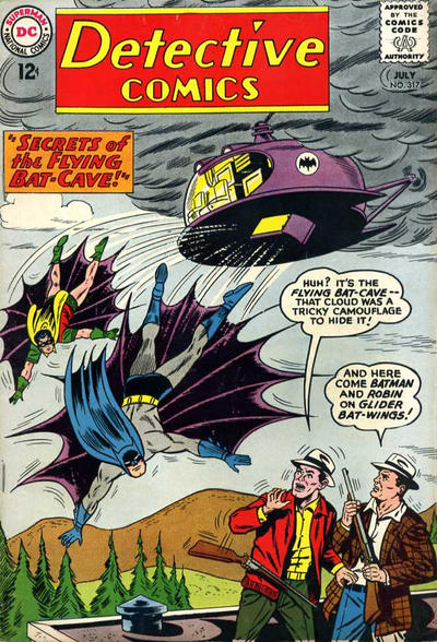
And how about that funky Sheldon Moldoff cover to Detective #317, it’s a great cover for fans giving us Batman and Robin in action and giving us lots of Bat gadgets.
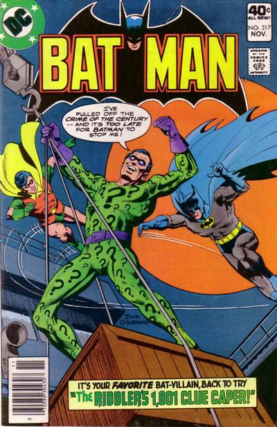
John Byrne’s cover to Batman #317 can only work on titles with classic heroes and classic villains, we eat these up on Batman but not so much on Metamorpho…
A great comic book cover matching each day of the year, 1 through 365. Please chime in with your favourite corresponding cover, from any era.
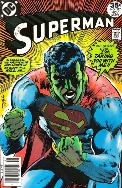


Yeah! The Superman 317 cover gave me chills whrn I first it on the stands. Only Neal Adams could have produced such power and drama. Glad you decided to go with it.
I was so excited about today’s pick, I couldn’t even write the first sentence coŕrectly. It should have read ‘when I first saw it on the stands.’
Home Run for Walt! Great choices, and I agree with the order of selection.
The Superman #317 is fantastic – and I have it and #233 sitting side by side on the wall board at home.
Dick Giordano did the Batman cover shown. When I looked at it, it was immediately clear that Byrne didn’t draw it.
Thats a dramatic cover on Superman! ASM is pretty wild and the Moldoff campy Batman is ok too! The one that does nothing for me is the Batman… not one if Byrnes finer moments.
Thanks for the clarification C.K!!
Yeah, that Sup cover is strong.
Good catch C.K., I had a Byrne cover that I didn’t used as an option and got my wires crossed.
I missed a day and I am not going to review all the covers, so just based on above, I would say only the Superman qualifies for this topic – I think the other comments generally bear that out. That said, I have to say that Adams’s decline is already evident as of 1977 – in particular Superman’s face is not what we would have seen in, say, 1968. Something happened to Neal in the mid-70s, and to me his work was never the same. His indie stuff from around this time was still the old Adams, but when he returned to DC just to do some covers like this, he was no longer “my Neal Adams”. This has slowly but progressively worsened. For me, looking at his current work is like listening to Frank Sinatra’s recordings of the late seventies or early eighties – it just forces unflattering comparisons. If I had never seen his earlier work, I would probably think the later work is great.
Moving on to #318, Batman is the clear choice. Four Color is pretty good for a funny animal cover, and Uncanny X-Men is one of the best standing around covers out there.
After a hiatus we finally have a solid JOWA in Superman. I would have to agree that even Superman might find being vomited on by a pack of dogs to be too much.
Hey Chris….by the late 1970’s main stream comics were colored differently, and the framing was often different too. I think all comic covers have suffered in quality since that time.That’s why Neal Adams quality on the independent stuff still shows his work in a better fashion.
Kirby’s art suffered in the late sixties when they changed the size of the art pages, drastically changing his style of work too.
Oh, and Epstein didn’t kill himself 🙂