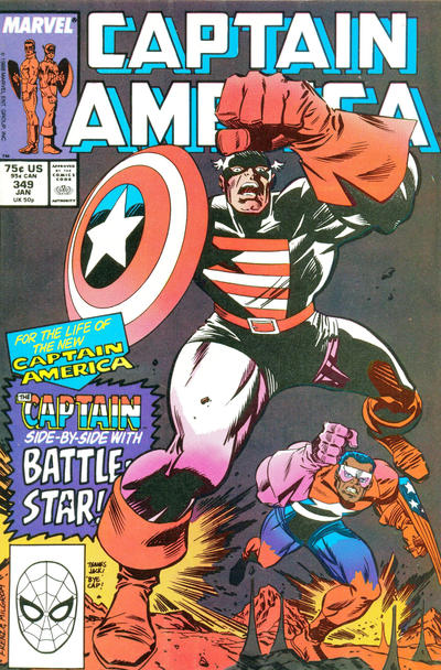
Captain America #34, Marvel Comics, January 1989. Artist: Ron Frenz.
A great comic book cover matching each day of the year, 1 through 365. Please chime in with your favourite corresponding cover, from any era.
I found day 349 to be a weak one, for me the best of the lot has to be Ron Frenz channeling Jack Kirby on the cover of Captain America #349.
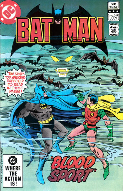
Ross Andru’s cover to Batman #349 has all the right ingredients, the mysterious mist, bats, menacing eyes etc, yet I still feel it doesn’t deliver.
Walt Simonson forgot to call the colourist on the cover of Thor #349, the cover is so so but I didn’t have many options today.
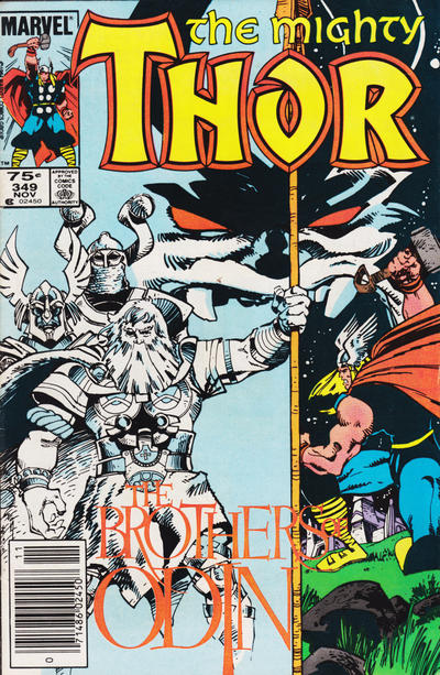


Walt (or maybe we can blame his editor) called in the WRONG colorist. Could have been the winner today. I thought of a bad pun about those guys being washed out…sorry. I wonder what Walt would say about this today. I bet this isn’t what he was going for.
The Cap, though, boy, when does homage become just a swipe? Sorry, Ron, but I think this one got phoned In. Could have been better and still a homage. It seems like a bad echo of Kirby. Easy to be a critic, eh?
Yes, a tough day…
The only thing lacking on the Frenz is some Kirby crackle in the background! Don’t mind that Thor is colorless on one side but that tiny head on Thor… so what is Simonson REALLY trying to say about the Thunder God??
I tried to draw some “Kirby like” figures at one time (without just tracing Kirby). It’s quite challenging to get all those extreme angles, poses and anatomy looking like they still hang together as one person and look “right”.
Thor, the Mighty Tiny Head – an upcoming MCU movie?? Or is this Loki’s trickery in the story?
Odin Looks like he is A head of the Game…. Maybe thor and not Loki is the real step son ? 😀
I think what Walt Simonson was trying to convey on Thor is “Past and Present”. The former being in a dream-like pale blue, with the latter being in Full color. The bridging piece being the large floating face top center. His father and uncles faced this menace, now he’s facing the same menace.
For 350 I’ll go in alphabetical order. DD has a nicer cover with big heads of Stick and the ninja gang, FF with a musical quotation on it’s cover,
Walt will probably like Flash as he says ‘goodbye’ for about a year before rebooting like typical comicdom, Hulk gives us a face off face off face off,
and Thor has some thundering good times about to happen.
Disturbing cover award goes to Woody Woodpecker with his moose killing ways. Not far behind is the Uncomfortable award to Adventure for what could be construed as a ‘incest’ cover since everyone is coupling up, but they kick out Superboy and Supergirl who look ‘coupled up’.
The true JOWA goes to Sgt Rock again for stupid.
WWWP? Besides the Flash, I don’t know. 🙂
We like bad puns Bud, don’t shy away.
Good comments today gang.
Most of what would be my comments are above. Aside from allowing for a Kirby tribute, the Captain America is very weak. The other two are also weak. I can’t figure out why DD was overlooked.
#350 is our last anniversary date, and sadly it is totally underwhelming. Sorry C.K. but Sgt. Rock is the pick of the day – Kubert really making something out of this concept – not a JOWA. I really like the hook of Action, but because it is a standing around cover I can’t make it the pick. Thor is a nice poster, but that’s it.
Totally agreed that Four Color is truly bizarre, and so that is rightly the JOWA.