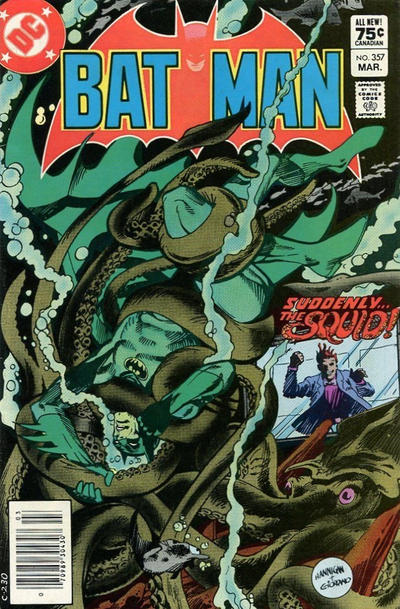
Batman #357, DC Comics, March 1983. Artist: Ed Hannigan.
A great comic book cover matching each day of the year, 1 through 365. Please chime in with your favourite corresponding cover, from any era.
I think Ed Hannigan’s cover to Batman #357 is pretty good, it’s atmospheric with a nice dose of peril, well executed.
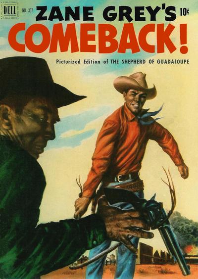
Zane Grey covers! I wish Four Color had more of them because each new one is a highlight.
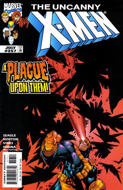
Covered 365: is not supposed to be harsh on artists and apologies to Chris Bachalo for comments made a few days ago. I like Chris’ use of light and chaos in his cover to X-Men #357.


The pencils and inks on Batman are good but the colors, while realistic, ruin this. This is a comic book cover, not intended to be realistic. I love octopus (and squid) covers, but this one is near the bottom of my list.
You know that I made a 180 on the Gollub Four Colors this year, but this cover doesn’t live up to the standard. Both the good guy’s pose and the bad guy’s expression are off.
I think your original criticism of these 90s-style covers was on point, and you and I are entitled to our opinions. These cartoony covers didn’t work for me then and still don’t work for me. Yes superheroes are unrealistic, but that doesn’t mean they need to be cartoony or silly-looking. This is a variant on the Batman TV approach to comics that I don’t appreciate. So still a no on X-Men.
#358 far better than #357, and it was a close one. I am going with DD – it might be a standing around cover, but it is an extremely cool one. The text font definitely helps, this Mysterio is very Dr. Strange-like, and the use of black inks is amazing. Against my inclinations I have to say Hulk is runner-up. He’s apparently still having the same fight as on the last cover – no other story here – but just a great piece of art with a very angry Hulk face. Thor is next – a spare but beautiful Simonson with a nice big Titanium Man.
Some others: Action’s art is fantastic, but this is a standing around/downer cover; Avengers is good but Epting’s bulky people are not my favorite; finally Detective may not be to everybody’s tastes, but it is a nice companion to the (superior) #356.
Superboy is an unusual reverse steal with “The Hunter”. Come on.
JOWA to Superman’s Father Nature.
I like octopus covers as well! It may be Chris’s criticism stems from the fact it takes you a few minutes to figure it out but once you do it makes sense to me! I love painted covers but agree the poses are awkward. The X-Men… meh…not feeling it!
My vote went to Batman #357 – always liked it, and the cover matches the interior story perfectly.
But it had to beat 2 other covers I also liked:
– FF #357 – a Thing v Torch cover has been done a thousand times but I like this one as well.
– HULK #357 – Not a classic HULK brute cover – more of monster cover – but it caught my attention.
And I echo the thoughts regarding a distaste for catoonish superhero covers.
Sorry Walter, but with the Four Color, the anatomy and perspective on that central figure seems all wrong.
But I like the Batman a lot. I think its very well designed and executed.