This week I thought I’d highlight the artists that the commentors mentioned on this week’s ‘Time to Collect: Artists’ post.
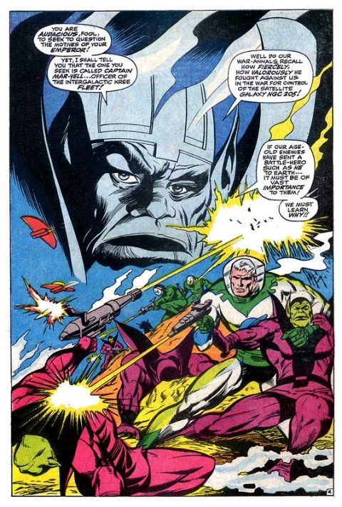
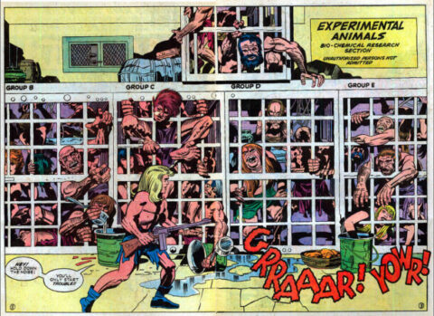
Gene Colan came up in the discussion, we were disputing whether he is a truly great cover artist. I know one thing for sure, he was a great splash page artist. Check out this splash from Captain Marvel #2, 1968.
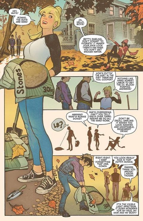
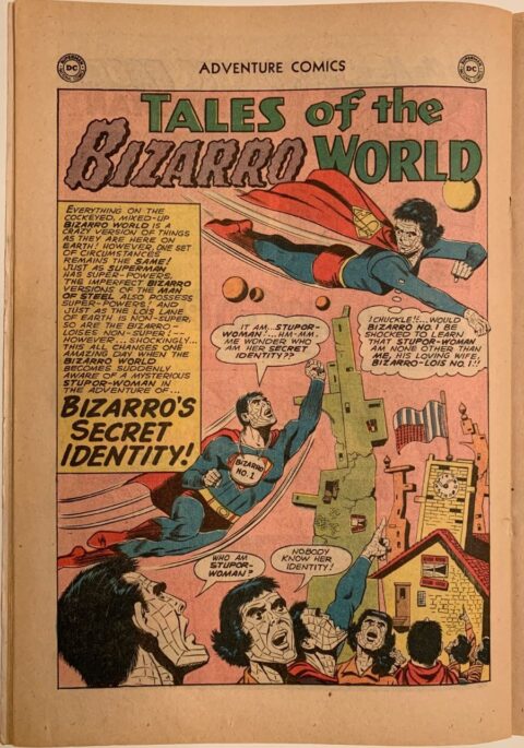
Adam Hughes came up, his work on Betty and Veronica particularly, check out this splash from his work on the 2016 Betty and Veronica series.
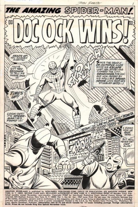
John Romita’s name came up, this splash from Amazing Spider-Man #55 is better than the cover in my view.
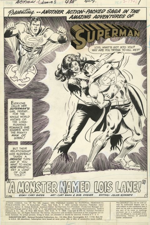
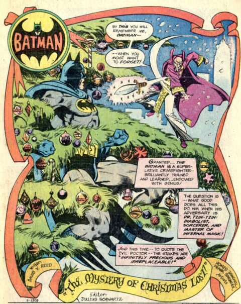
Did somebody mention Curt Swan? They did! Swan’s splash from Action Comics #438 is actually very similar to Nick Cardy’s cover but the differences are obvious to Swan fans – I can tell those Swan legs a mile away.
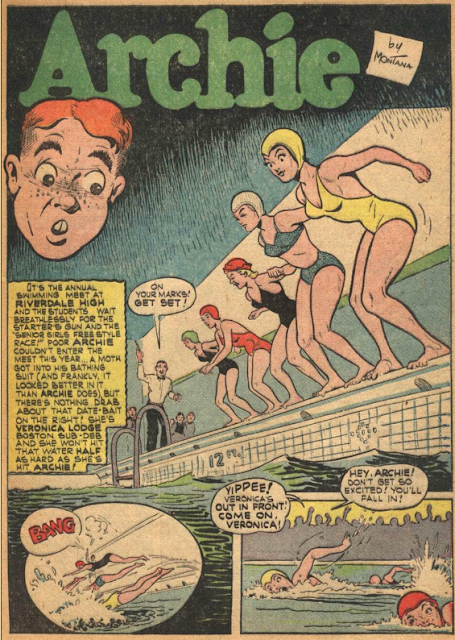
I think Bob Montana was the first artist mentioned, I dug up this very early Archie splash from Pep Comics #31, July 1942, Betty looks great in yellow.

A great selection of artists. Curt Swan was best with George Klein inks. Oxner put too much of his style in his inks. I never noticed Hughes before. Man, is his stuff nice.
Gene Colan masterful covers Walter….dozens and dozens
http://strangersandaliens.com/wp-content/uploads/2012/04/IM_IronMan_001.jpg
https://blogintomystery.files.wordpress.com/2011/06/det556.jpg
http://www.coverbrowser.com/image/daredevil/23-4.jpg
https://i.pinimg.com/originals/43/76/7f/43767f46eb0e1932b6c5242a190925eb.jpg
https://i.pinimg.com/originals/63/a8/17/63a817e5d7eae7ebeb178e66dfe6e939.jpg
https://i.pinimg.com/originals/39/94/15/3994150f9f1bc76b5dfa23b2fabd4e87.jpg
https://tse2.mm.bing.net/th?id=OIP.rD55CwSj8tL_HPjP-JaWYwAAAA&pid=Api&P=0&w=300&h=300
https://i.pinimg.com/originals/96/55/b0/9655b0edbd5c0774b7d1f818587a2937.jpg
https://4.bp.blogspot.com/-4roXayLl51I/TvIg2VPwhOI/AAAAAAAAAhM/4hm_CjYAgsk/s1600/TOS+077_cd_HK.jpg
https://i.annihil.us/u/prod/marvel/i/mg/6/30/57221da3bc929/clean.jpg
https://i0.wp.com/www.mangaforever.net/wp-content/uploads/2014/08/captain-marvel-01.jpg?fit=507%2C750
http://www.coverbrowser.com/image/sub-mariner-1968/22-1.jpg
Nuff said?
Great spread of covers in response to our prior mentions! You are the greatest!
Dave…I did some looking around and found some great Colan covers as well! But I will say…it was those interiors that are by and far the best! One of my all time favorites!
That is a great splash by Colan but it will take a lot of convincing to get me on the Colan train. I think for every good one I can find you a bad one. I am not a Marvel fan-boy which I think is the core of the problem. The funny part is that I have very high grade copies of a couple of the books Dave Mackay noted, bought mainly because I thought they were screaming bargains. I think that means if you believe that people will catch on to Colan, now is the time to buy.
The Hughes, on the other hand, is fabulous – but does that really count as a splash? So nice to see him doing something other than voluptuous women – not that those aren’t also fabulous – but it’s somehow unfortunate that demand for that subject has crowded out his time to show his versatility.
Solid work by Romita but I’ll bring up the Marvel fanboy aspect again. I think most people like Romita because of nostalgia, not because of his artistic merit. When I read comics with his art I feel like I’m reading a Mary Worth comic strip.
I am a DC fanboy so I like later Swan admittedly because of nostalgia – but post around 1972 I really have to work hard. I am not too enamored of this one.
The Archie is pleasant but that’s about it.
Just like Covered, 365, this exercise is opening my eyes. What I’m especially digging are the primitive splashes that still manage to impact due to the artists’ sense of composition. like that Alexanian Black Commando from a few weeks ago.
Hey Chris
Your comment about Romita really hit home with me because I was never a huge fan. I grew up on Ditko’s Spider-man, and, when he left, I was horrified that they would pick an artist I had always thought best-suited for romance comics alone. I still feel that to this day, and it gets me in no end of trouble from Romita fans. I’m not saying he’s bad, I just think the man has no place in hero comics. Mary Worth is spot on!
As for Adam Hughes, I think it’s such a shame he is mostly relegated to cover art. The man is an artistic genius and can, surprise, surprise, write a damned good story too. The Betty and Veronica mini series is a lovely tribute to those characters and a fine addition to the Archie canon. If you want another fine and fun example of his work, check out Fantastic Four #5 from the latest run of that title. Just beautiful!
Thanks for this rehash Walt. Now…let the Romita fans tear a strip out of me. They always do!
so long for now, mel
I am not too sure what to say here. I think that Romita’s art is perfect for Spidey of that time period. Isn’t Peter Parker’s life a little like a Mary Worth comic? Aside from the odd appearance of Doc Ock or Mysterio, he has always had lots of drama, which really lends itself to the Mary Worth-ness of the title. However I think his style IS more dynamic than a Mary Worth title, which, in turn, makes for a great early Spidey title.
As for Hughes, I have to say this is amazing. Any solid comic artist can make a dynamic splash page. But here, Hughes creates a wonderful Fall day where he uses line art and dimension to get your eye to move around and follow the story without even needing to read the word balloons. Sadly most of the time is style is overlooked because he is amazing at the cheesecake, and no one notices his amazing layouts.
The Swan is okay. Let’s be honest here, the Superman image at the top left is really unnecessary.
The Archie, well I agree with Meli here in that, yeah, it’s pleasant. Although Betty does look good in yellow. But again, much like the Swan, what is Archie’s head doing there? It doesn’t add anything to the page. I mean, I guess he is watching?
And yeah the Colan is good, but there are better Colans out there.
Most of these splashes I haven’t seen so kudos for showing them to us! While I will agree most have better splashes these all do the trick and we can each go out look for better examples ourselves and possibly expose ourselves to even more great art we haven’t seen before!
On a completely different note guys and gals…does anybody else follow the jack Kirby museum on twitter? what a joy..
Take a look at Jack Kirby’s DC Thor…..pre marvel Thor…but certainly part of the evolution. It begs the question..Did Stan actually create or co create anything with Jack? Almost everything Jack did with Marvel is paralleled in his earlier work.
https://t.co/zpwZbzgs7F?amp=1
Enjoy