I’ve been thinking a lot about comic book covers lately. I’ve been trying to figure out, in some measurable way, what makes a comic book cover work, what makes it sought after as a collectible.
As most cover connoisseurs know too many comic covers fall into the “yawn to meh” category with some even falling below this and into the “why?” realm. Great covers are actually scarce things when taken as a percentage of all covers. Again though, what makes them great? Obviously, it’s not one thing, it’s different things but it could also be the same things in different eras. You ever notice most of the great battle covers come from eras with relatively narrow date ranges? I hope you’ll prove me wrong but show me some great battle covers from the late 1950s into the mid-1960s, there’s a decade there filled with meh at best.
Great covers aren’t just some battle covers, they can be subtle and elegant, they can be simple yet powerful, they can be a sight gag that really works, an innuendo that everyone loves, a colour scheme that you can’t resist or something you just can’t put your finger on. Like all art comic book covers are subjective and their greatness is in the eye of the beholder, I recently talked to a guy who thinks the cover of Amazing Spider-Man #50 is meh, in many ways he’s right but I and much of the collecting community thinks he’s wrong.
Chris Owen and I are working on a new cover project that we hope to have launched this spring; stay tuned here for updates.
Here are a few tidbits I found in the “to eBay auction” pile.
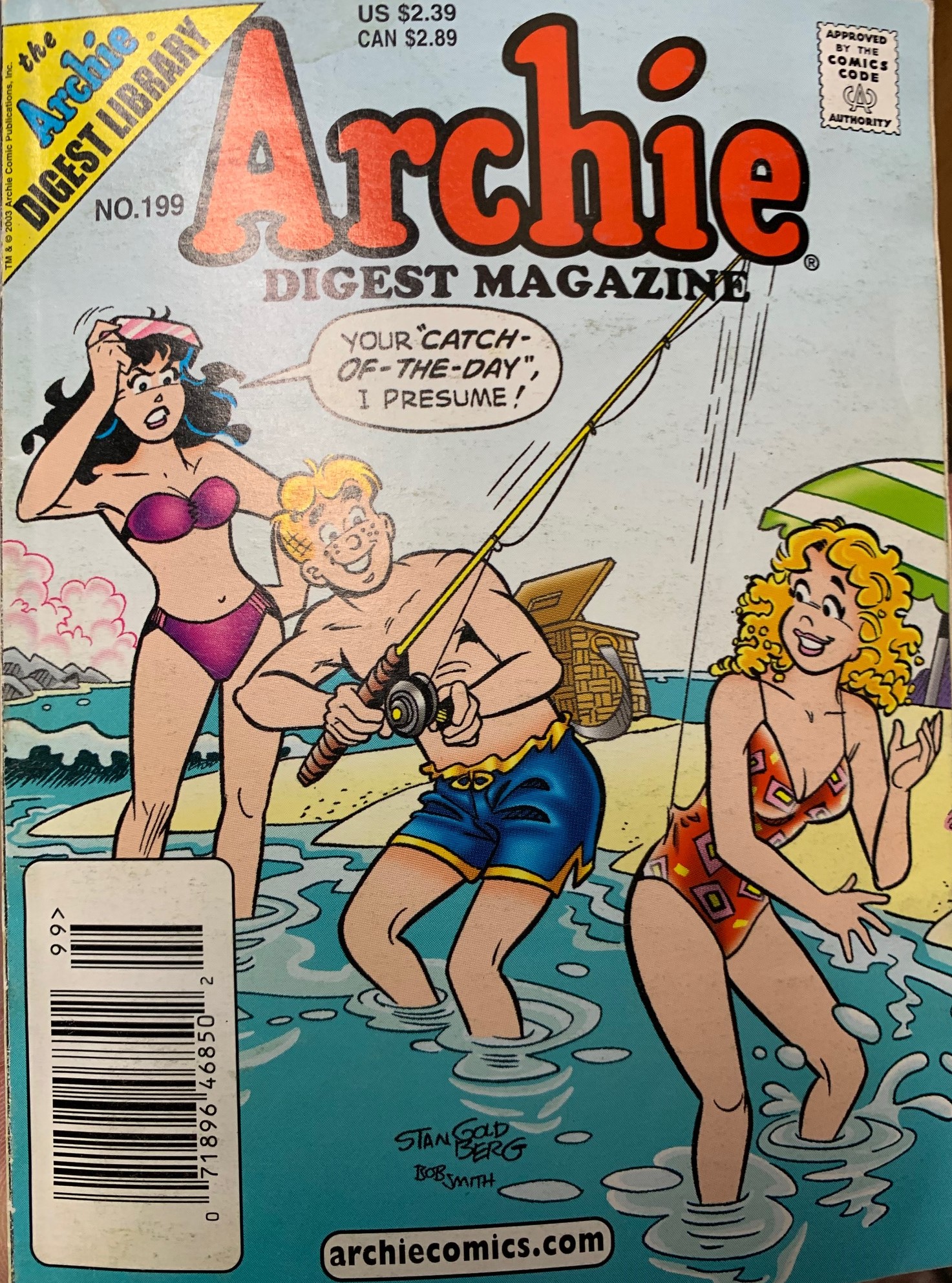
There was a nice stack of Archie Digests that I’ll bundle together into a lot. If I want a good price for this lot I think I’ll have to put issue #199 on top. Gotta love those Archie covers!
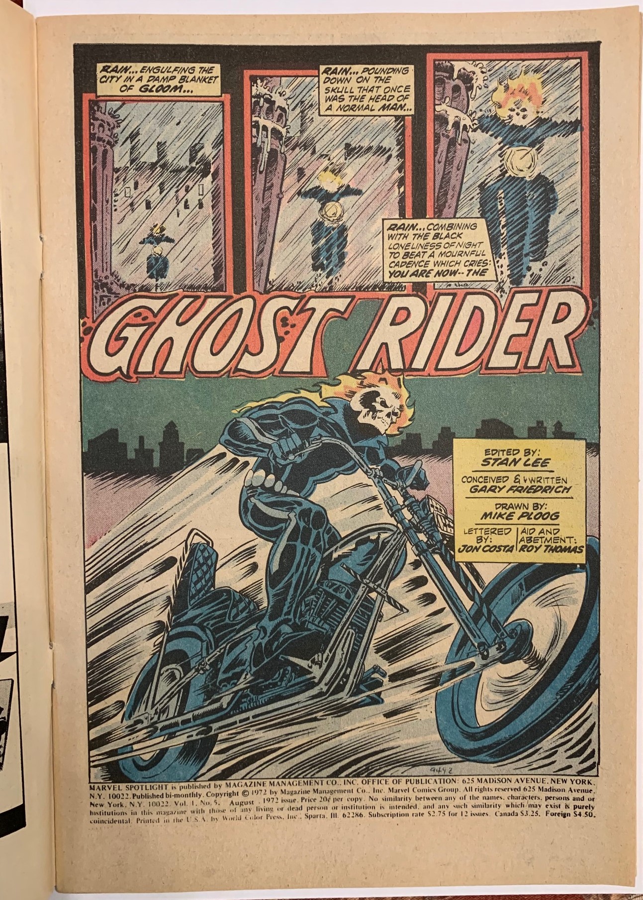
The splash of the week comes from Marvel Spotlight #5 featuring the first appearance of Ghost Rider, it’s drawn by the great Mike Ploog. Ploog left comics in the very early 80s I believe moving on to work Hollywood storyboards etc. I think in a way this worked out, he was certainly an artist of a time, and he shone with that early 70s style.
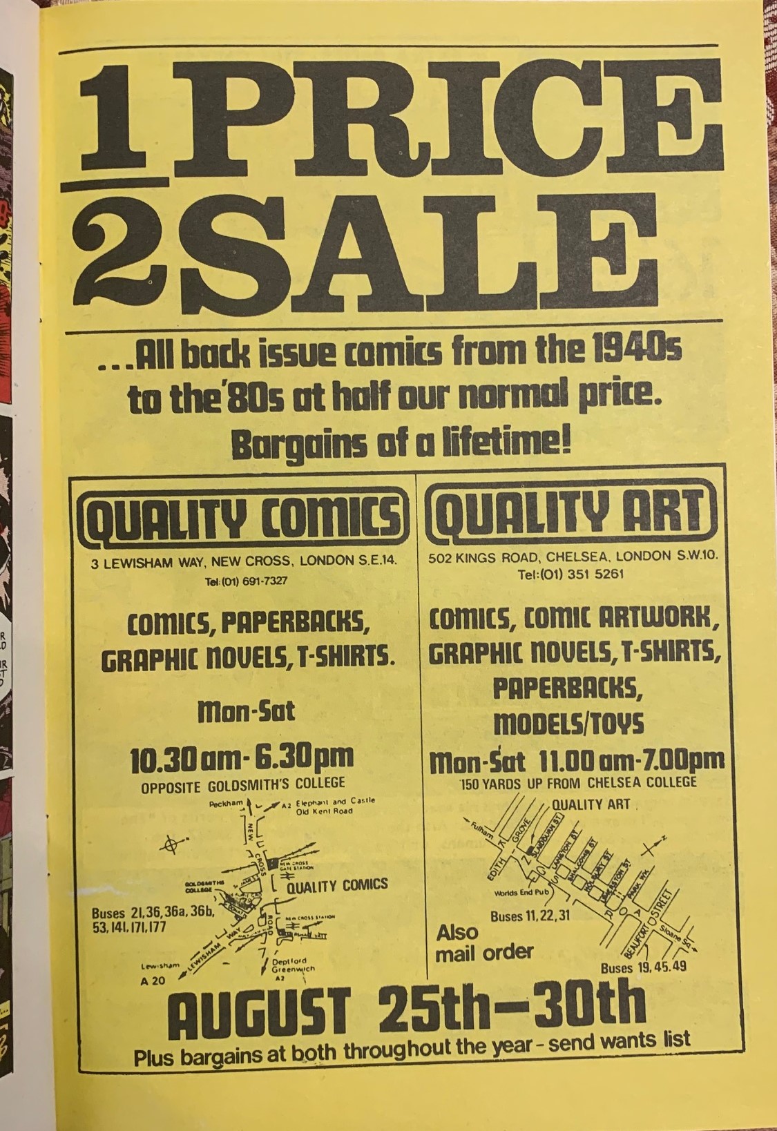
I leafed through our copy of Sam Slade Robohunter #1, from Quality Comics, October 1986, in hopes of seeing what kind of ads a young upstart company like Quality Comics would be running. Unfortunately, all the ads turned out to be house ads hustling the publishers’ other titles like Judge Dredd, Dan Dare and Rogue Trooper. I did find this interesting ad though inviting us to come down to their two shops in London, England to take advantage of a half-price sale on back issues from the 1940s to the 1980s. I wonder what kind of stuff was available, was it all British Pence copies? I’m thinking this would have been a very cool event to go to.
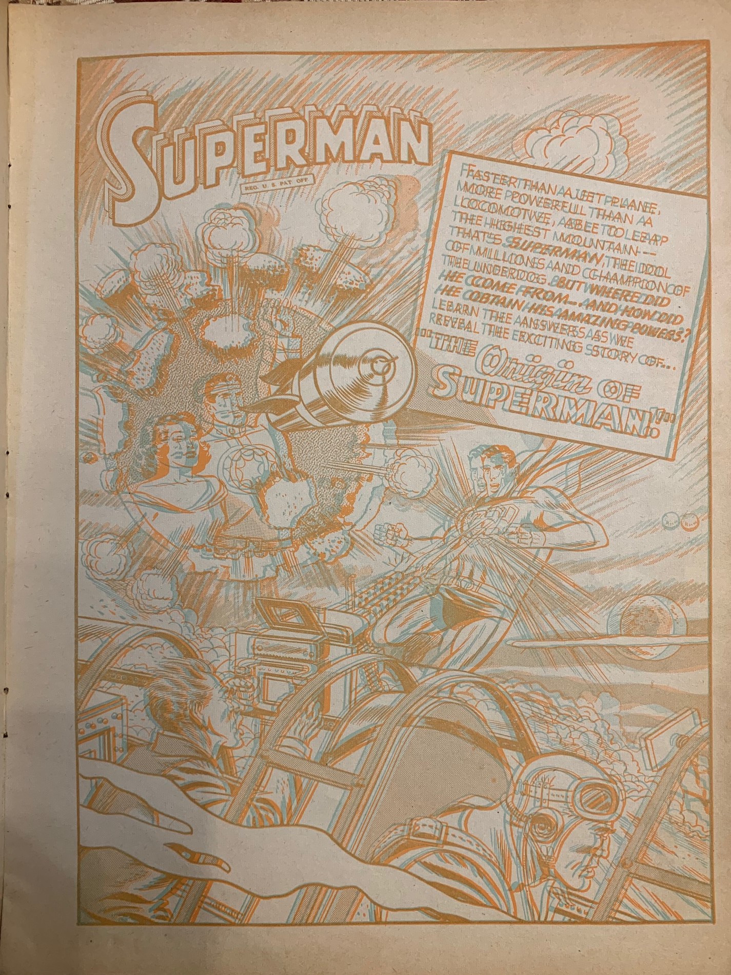
There was a massive 3D movie craze in the 1950s and that craze spilt over into comic books. I think it’s safe to say the 3D comics didn’t really work, perhaps the product wasn’t good enough, and the effects were not cool enough to compensate for the headache you got after reading a comic. Here’s a copy of Superman Three Dimensional Adventures from 1953
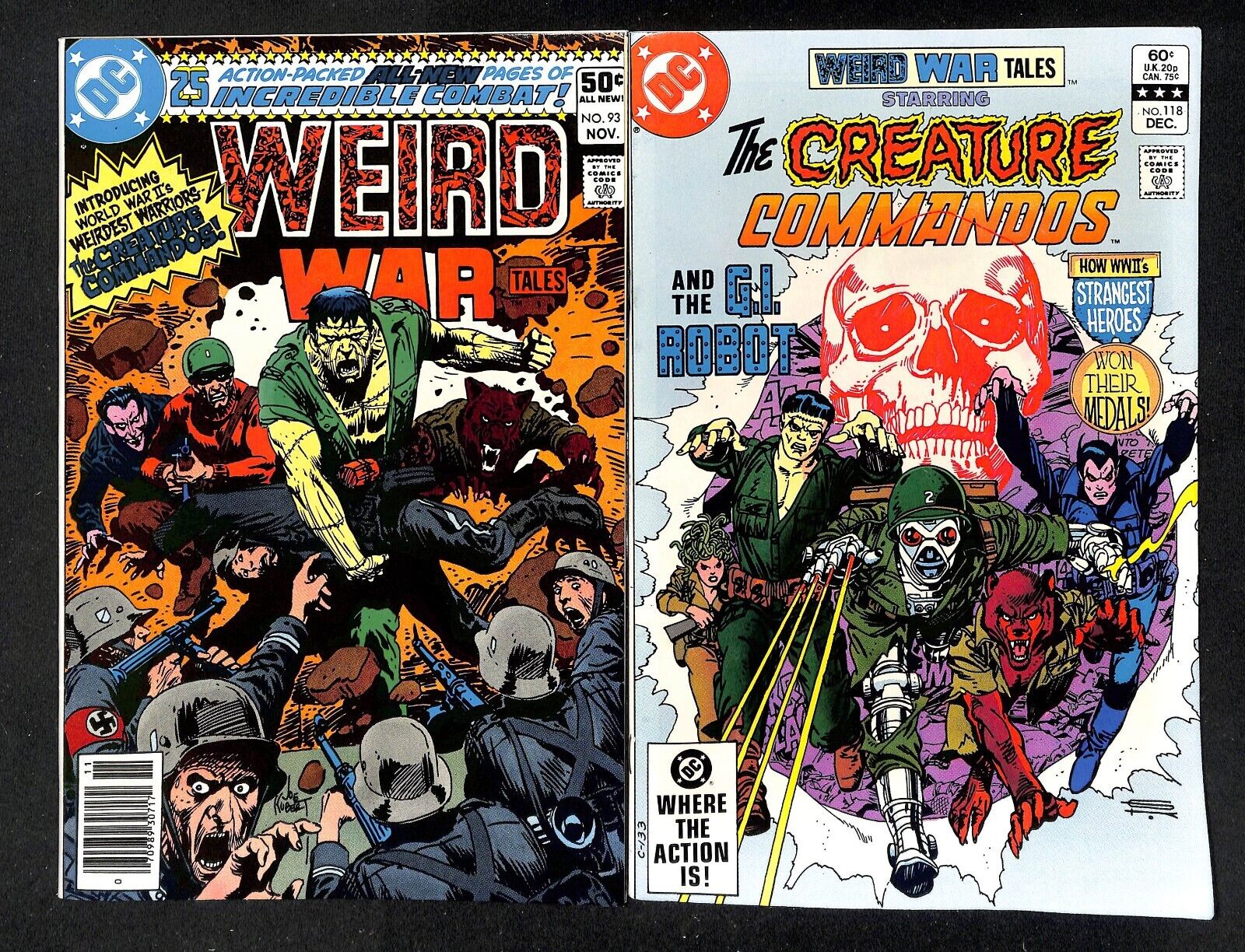
Our weekly icecollectibles eBay auction ended on Sunday with some eye-popping results. High-grade raw copies of Weird War Tales #93 and 118 featuring the first appearance of the Creature Commandos fetched a healthy $465 USD. A recently graded CGC 9.4 of #93 sold for about $500 so these books are hot. I’m thinking there might be a nice warm press waiting for these books to arrive.

In thinking about covers, I think you have to use Biro to test you maxims. In general he did it exactly wrong, but still managed to produce a host of classics. Teeny-tiny figures, absolutely pedestrian men and standard good-looking dames, gobs of text and boring environment detail. However, the scenarios and the gore – over the top. Some of the most appalling covers ever – because unlike most PCH, generally plausible scenarios.
I think Ploog’s early 70s style was exactly what didn’t work for me. Back in the day people were crazy about his Man-Thing, but I didn’t find his Man-Thing very impressive. Maybe my personal experience has given me outsize expectations for Man-Things.
That 3D gives me a headache. No more please.
Creature Commandos with a 50-cent cover price? Advantage seller.
I’m a sucker for exciting background colour: the orange fade of Giant Size ASM#5, the red of Hulk 181….or better still Marvel Team-up #103 with the Taskmaster (the green of Avngers #196 is pretty good too)…Gil Kane’s towering Magneto on Avengers #110…the darker reds of ASM#50…I even prefer the Marvel Tales reprint of ASM#129 with the red background!
You know with all this self inflection of what visually stimulates me..perhaps I should be called Bull instead of Spider.
(I’ll just leave that line open for Walt to have fun with)
Yes Spider, I just picked up that Marvel Tales, I agree. What people don’t know is that in that case, the direct edition is a lot rarer than the newsstand edition, because the direct market was a small minority at that point. Spread the word.
Oh Dear! Now you just KNOW that I have to reply to Meli’s criticism of Biro’s covers! Biro did “produce a host of classics” & did it EXACTLY RIGHT!- that is one of the reasons why Gleason was such a top-flight publisher back in the Golden Age. Legend has it that Stan Lee would pester Lev Gleason for the secret of telling good comics stories, because whatever it was, Gleason & Biro had it nailed down perfectly and it started with the covers! These busy little covers are just another take on the orchestrated mayhem on a Timely cover by Alex Schomburg- the same precision, dynamic composition & clean drawing style. I have said it before & will not belabor the point- Gleason produced some of the best written & best drawn comics of the Golden Age. Many of these stories still hold up today. I am not the only one who feels this way as Gleason books have spiked lately & do not appear to be suffering from any price corrections. You can read many of these stories for FREE on DIGITAL COMICS MUSEUM or COMIC BOOK PLUS & I recommend that you do so!
Ploog’s style worked perfectly for me & I loved his Werewolf by Night when I was a nipper. His style has that lovely ’rounded’ quality that reminds me so much of classic Bob Powell art. Ploog was a trained animator & ended up drawing storyboards & concept art in Hollywood once he was through with comics.
I don’t mind reading an occasional 3D comic for the heck of it, but I could not handle too much of this. It was just an interesting 1950’s fad. I can recall a local TV channel [City TV ??] advertising an evening of 3D movies way back in the 1980’s, promoting it heavily & many variety stores sold 3D glasses for about a month ahead of time for the event. The movie broadcast was either House of Wax or The Mad Magician [ both with Vincent Price- that is why I can’t remember!] and I think both of the Three Stooges 3D shorts- ‘Spooks!’ & ‘Pardon my Backfire’. It was a hoot & I was glad I could experience this ‘live’ on TV.
The cover to ASM #50 is ‘meh’, yet it is an iconic cover. How can it be an iconic cover, yet be ‘meh’? It is iconic because it has a memorable composition & colour, but the art is not particularly well executed. It is ‘meh’. However, this leads to an interesting point & not one that I can take credit for- have you noticed that many vintage comics [particularly SA Marvel] have iconic covers that are etched into your brain? You walk into a crowded comic book convention & INSTANTLY, across the hall – you spot the cover of an Amazing Spider-Man #14 hanging on a wall ,or Fantastic Four #6 or an X-Men #12 and know EXACTLY what issue it is by just seeing a glimpse of the cover?? That is how powerful some old comic covers can be- when they had to fight for their lives on the comic book racks, fighting toe-to-toe with other competing books for every dime- they had to be recognizable and memorable or they would be swallowed up by the crowd and drown. No sale. Those compositions still pack a punch today & do not relax their grip on your brain! Today’s comics do not have to fight for their lives on the variety store racks any more it seems & their covers show it. There might be the odd cover that stands out in the crowd, but most just look generic -with a mass of computer generated colouring making long distance recognition impossible.
Remember that ‘lame’ Ace Comics ‘Katzenjammer Kids’ cover that Walt snickered over a few months ago? That cover worked back in the 1940’s- it wasn’t flashy, but it sure as heck called out to you from the rack when you were looking for the book with the Katzenjammer Kids in it! When I go to my LCS now, I cannot find anything I want on the rack and have to ask for help. All I see is a mass of multi-coloured sludge that says…..nothing! Confusion & chaos is what it says to me! Speaks volumes about the state of our hobby!
Re; that ad from Sam Slade Robohunter #1, from Quality Comics, October 1986
Don’t get too excited- Quality Comics was a British shop & probably had a lot of actual British comics from the 1940’s to 1980’s in stock. You guys are all thinking “WOW!- I coulda gone & bought an All-American #61 or a Showcase #4 at HALF PRICE!!!”…but you probably would have been disappointed had you been there. I am assuming that they would have had more stuff like BEANO. WHIZZER & CHIPS and DANDY in stock than Spider-Man, X-Men or Batman and if you were lucky, may have been able to get an EAGLE with Dan Dare in it or an early 2000 A.D. with Judge Dredd [by BOLLAND!!!] instead. They may have had some ‘Penny Dreadfuls’ or ‘Story Papers’ too…but these surely would have made your brains melt from 12 yards away as they are not really comics! North American readers are so delicate….probably could not handle a ‘Biggles’ story in a ‘Modern Boys’ Magazine if yer lives depended upon it !! Cor, Blimey !!!
Spider, if you’re more Bull then I must be a Moth, drawn to the yellow flame of the original #129.
I love Ploog and like I mentioned, I like the fact that he didnd’t stick around to make bad albums like Steel Wheels.
Meli, you’re right about the Biro test. Even within the Biro archives, even within his style, there will be covers that work and covers that don’t,. The one where the kidnappers are trying to lure the little girl with a lollopop, the content is strong but he doesn’t crowd the rest of the cover with anything and it works better than if it was one of his busier covers.
LF, the ASM #50 example is what I’m talking about, I want to explore that outcome. And I agree that the London shop probably had mostly UK stuff back in the mid 1980s, I don’t think collecting the American editions really caught on until around the mid 80s anyway.
Gerald, jet lag? I thought you left weeks ago? Anyway aproveite sua viagem para Portugal.
LF, regarding covers – you’re preaching to the converted brother – I’ve been talking about this for years, variant covers (manufactured scarcity) are not helping anyone, they are preying on the OCD mentality that naturally sits within the collecting community & further converting books into trading cards. Variant covers dilute the mind’s memory recognition of an issue, there will never be that firm connection built that ASM#50 has, red cover, back of Spidey = ASM#50…imagine if issue #50 had 10 different covers???
Chri$, It’s not often we agree…but in this instance we align! I’ll take a 1979/80 Direct stripe over a mid 90’s newsstand anyday! Love my direct stripes: I have the whole X-Men #122-130 in Direct and a lot of the #193-201 ASM run too.
Years ago I went to a convention armed with a copy of Sheena 3D and a copy of United Nations War Heroes (because I knew a certain dealer would be there who was very interested in acquiring Canadian Whites, and I thought he might also get a kick out of the 3D book). When I got to his booth, he gave me a quick hello, and carried on talking to a guy who was decrying the lack of WECA books at the convention. I tried repeatedly, to no avail, to interject as the dealer informed the guy that he was very unlikely to find any WECA books there for sale. I finally just gave up and walked away with my WECA book still in hand, and left them to it. So it goes. I still have that Sheena 3D (still for sale by the way) but sold the United Nations War Heroes through a local dealer for 500 bucks. The funny thing about 3D is that I really can’t see it and usually just end up cross-eyed, but that Sheena book, with just a few spine ticks, great cover and the glasses still bound in, was just too pretty to pass up! I also used to have the Superman and the Batman 3D books, but sold them for stupid money years ago. I could probably get even stupider money for them these days, but you really have to find the right buyer for 3D. Either you’re into it or you’re not, period.
Spider, I think we agree quite often, and we agree on variant covers. Unlike LF I love the artwork on many of these – objectively far more impressive than most of the past history of comics – but I think they are bad for the hobby in that people in many cases aren’t even opening the books. Without the years of prior character development, there would be no interest in this cover art in the first place. I don’t see any good solution to this – I think part of this is also the TikTok-ing of thought processes, as people don’t want to take the time to read a story, but would rather be wowed by a great cover and move on. Maybe this argues for a revival of the comic-based trading cards, not as blind packages, but rather limited releases (already CGC-ed?) that are only available through comic shops – that would bring people in the door.
Years ago I went to a convention armed with a copy of Sheena 3D and a copy of United Nations War Heroes (because I knew a certain dealer would be there who was very interested in acquiring Canadian Whites, and I thought he might also get a kick out of the 3D book). When I got to his booth, he gave me a quick hello, and carried on talking to a guy who was decrying the lack of WECA books at the convention. I tried repeatedly, to no avail, to interject as the dealer informed the guy that he was very unlikely to find any WECA books there for sale. I finally just gave up and walked away with my WECA book still in hand, and left them to it. So it goes. I still have that Sheena 3D (still for sale by the way) but sold the United Nations War Heroes through a local dealer for 500 bucks. The funny thing about 3D is that I really can’t see it and usually just end up cross-eyed, but that Sheena book, with just a few spine ticks, great cover and the glasses still bound in, was just too pretty to pass up! I also used to have the Superman and the Batman 3D books, but sold them for stupid money years ago. I could probably get even stupider money for them these days, but you really have to find the right buyer for 3D. Either you’re into it or you’re not, period.
Just returned Sunday Walt! My all time favorite cover is not and action cover but a standing around cover…FF#48! Kirby was able to put excitement into what you don’t see through the reaction of the characters… and that is what made him such a master!
Just returned Sunday Walt! My all time favorite cover is not and action cover but a standing around cover…FF#48! Kirby was able to put excitement into what you don’t see through the reaction of the characters… and that is what made him such a master!
Spider, I think we agree quite often, and we agree on variant covers. Unlike LF I love the artwork on many of these – objectively far more impressive than most of the past history of comics – but I think they are bad for the hobby in that people in many cases aren’t even opening the books. Without the years of prior character development, there would be no interest in this cover art in the first place. I don’t see any good solution to this – I think part of this is also the TikTok-ing of thought processes, as people don’t want to take the time to read a story, but would rather be wowed by a great cover and move on. Maybe this argues for a revival of the comic-based trading cards, not as blind packages, but rather limited releases (already CGC-ed?) that are only available through comic shops – that would bring people in the door.
Good comments Spider/Chris- I will admit that I am fond of older books, thus older covers. I enjoy beautiful pen & ink work, with or without some zip-tone or other effects & some simple but effective coloring. There is some solid talent in today’s books, for sure there is- but the work is usually obscured by heavy, over the top colouring & other computer generated effects. This helps the lesser talents to hide their lack of skill, but the better artists lose some of their work in the ‘muck’. As I have said, older books needed to stand out in the crowd, call out to the reader to pick them up & the covers can be very catching. Today’s books are pretty well ‘print-to-order’, they do not go into variety stores or other retail venues but directly into the collector’s pull list at the LCS. The covers do not need to call out to the reader any more. Very few covers make any noise at all.
There are many artists in the field today who know how to draw, they have the ability & have tools that Golden Age artists never had at their disposal. Yet many of these new artists have no spirit, no ‘soul’ evident in their work. A good example of this is Jim Lee, who has mastered his tools & honed his skills, yet the finished work seems sterile & mechanical. Maybe it is not the artists’ fault- maybe they are simply told to draw in this formulaic, sterile, mechanical ‘super-heroic’ style by the companies they work for. A few guys like Steve Rude [ a modern day Alex Toth !!!} & Adam Hughes are able to imbue their work with personality & spirit, but most other artists turn out generic, sterile, soul-less pap.
As I have said, most of us can recognize the covers of many classic Golden Age or Silver Age comics from across a comic-con hall, and instantly know what issue it is. Can you do the same with any book published in the last twenty years-Marvel, DC or Independent ??? I sure as heck can not !
As far as original art is concerned- I am a bit of a purist & still enjoy getting a page that is full inks over graphite or blue pencil, with hand lettering either directly applied to the page or pasted on. I am not keen to get a page that has just the pencils or just the inks as I feel that I am not getting ‘the whole magilla!’. I have some modern pages that I was able to get inexpensively, containing full pencils & inks but some of these have no word balloons or captions at all, as they were on an overlay or even applied digitally. I feel kinda ‘ick’ about this, but that is the direction original production art is going. I guess that I will continue to focus on older material as that is what I grew up with & what still calls out to me.
Hey Gerald
Years ago there was a guy who wrote a column for Comic Book Marketplace called something like “The world’s best comic book…for this month at least.” When he spotlighted FF #48 he commented on the commanding presence of Galactus on the cover!? Of course, one reader wrote in to correct this, and wondered why the editor hadn’t caught such an egregious error. The editor responded by simply crapping all over the reader, starting with, “I don’t know Galactus from Schmalactus!” and ending by telling the poor guy to “straighten up and fly right!” Unbelievable! But true!!!
Comic Book Marketplace was a well produced magazine loaded with great images & potential to educate & encourage people to collect & enjoy Golden Age comics. Unfortunately, it settled into a routine of focusing on the investment angle of collecting Golden Age comics and not much else. A typical article would have some yar-hoo brag about the great deal he just got on a rare book, how completely underpriced it is in the market and what a great investment it will surely be in the future. It essentially became a ‘WIZARD’ magazine for Golden Age comics. I had the first three years or so of this mag in my collection, starting with the first issue. After reading one too many articles in this vein, I gave up & sold almost every issue to my LCS who was happy to take them as they were actually selling well for them as back issues. I kept the Steranko/Shadow issue, an issue devoted to Lou Fine & maybe one other. All the rest left my life, with no regrets. Even back in the 1990’s, I hated & detested the ‘investment’ angle of collecting comics & would have nothing to do with it. This is not my world.
Comic Book Marketplace was a well produced magazine loaded with great images & potential to educate & encourage people to collect & enjoy Golden Age comics. Unfortunately, it settled into a routine of focusing on the investment angle of collecting Golden Age comics and not much else. A typical article would have some yar-hoo brag about the great deal he just got on a rare book, how completely underpriced it is in the market and what a great investment it will surely be in the future. It essentially became a ‘WIZARD’ magazine for Golden Age comics. I had the first three years or so of this mag in my collection, starting with the first issue. After reading one too many articles in this vein, I gave up & sold almost every issue to my LCS who was happy to take them as they were actually selling well for them as back issues. I kept the Steranko/Shadow issue, an issue devoted to Lou Fine & maybe one other. All the rest left my life, with no regrets. Even back in the 1990’s, I hated & detested the ‘investment’ angle of collecting comics & would have nothing to do with it. This is not my world.
LF
Well, I hope you kept CBM#80, the big EC special, with my article about the Canadian edition of Mad #1. I even managed to track down the wife of the original owner, who ran a cigar shop in London, to reminisce about his favourite comics. Even that article ran afoul of an editor who changed “the detective comics” (meaning cop comics) into “the Detective Comics,” making it sound a bit ridiculous when I mention that he also liked Batman. As well, he changed “new fangled” into “new finagled” for some strange reason known only to himself. “New finagled?!” It’s hard enough for a writer to get it right, without an editor adding his own mistakes!
I enjoyed the historical articles in CBM, but took a pass on the market reports.
Mel- I didn’t make it to issue #80- I only had the first 20 issues or so. I ready every one as it was issued & become more dissatisfied with every issue. I was tired of the bragging by these donkeys about the great books they just got, and now that they have those books in their collections how much of an investment they will turn out to be. One of their guys came into my shop back in the early 1990’s & bought an early 1950’s Detective Comics in impeccable condition from us [ raw NM- no CGC back then, folks ] and sure enough, an article appeared in a subsequent issue by him, crowing at what a great deal he got on a rare book & how it should really go up in value now that he’s got one! It rubbed me the wrong way & I got off the bus.
LF
Well, I hope you kept CBM#80, the big EC special, with my article about the Canadian edition of Mad #1. I even managed to track down the wife of the original owner, who ran a cigar shop in London, to reminisce about his favourite comics. Even that article ran afoul of an editor who changed “the detective comics” (meaning cop comics) into “the Detective Comics,” making it sound a bit ridiculous when I mention that he also liked Batman. As well, he changed “new fangled” into “new finagled” for some strange reason known only to himself. “New finagled?!” It’s hard enough for a writer to get it right, without an editor adding his own mistakes!
I enjoyed the historical articles in CBM, but took a pass on the market reports.
“No CGC back then.” Those WERE the good old days! And, not to split hairs, but, if you have the Steranko special issue of CBM, you made it to at least #28. I always wished they had just dumped the market reports, but I found some of the actual articles very entertaining, though I much preferred Gary Carter’s editorship to Russ “Straighten-up-and-fly-right” Cochrane’s. If Michelle Nolan’s collected articles were ever published in book form, I would be the first in line to buy a copy!
Mel- I didn’t make it to issue #80- I only had the first 20 issues or so. I ready every one as it was issued & become more dissatisfied with every issue. I was tired of the bragging by these donkeys about the great books they just got, and now that they have those books in their collections how much of an investment they will turn out to be. One of their guys came into my shop back in the early 1990’s & bought an early 1950’s Detective Comics in impeccable condition from us [ raw NM- no CGC back then, folks ] and sure enough, an article appeared in a subsequent issue by him, crowing at what a great deal he got on a rare book & how it should really go up in value now that he’s got one! It rubbed me the wrong way & I got off the bus.
“No CGC back then.” Those WERE the good old days! And, not to split hairs, but, if you have the Steranko special issue of CBM, you made it to at least #28. I always wished they had just dumped the market reports, but I found some of the actual articles very entertaining, though I much preferred Gary Carter’s editorship to Russ “Straighten-up-and-fly-right” Cochrane’s. If Michelle Nolan’s collected articles were ever published in book form, I would be the first in line to buy a copy!
Back to Walt’s original question…to me, the very best covers of the last twenty-five years or so are by Dave McKean on Sandman, Jim Williams on Promethea and John Cassaday on Planetary. Each issue of these series stood out from the crowd on the shelf with brilliantly distinctive covers. William’s and Cassaday’s tributes to great artists and genres are particularly appealing, and it doesn’t hurt that these books represent some of the best writing of that period too, from Neil Gaiman, Alan Moore, and Warren Ellis. It’s not every day that the entire run of any book has so much eye appeal! Collect ’em all, folks! Collect ’em all. And, puh-lease, read ’em, don’t slab ’em!
Back to Walt’s original question…to me, the very best covers of the last twenty-five years or so are by Dave McKean on Sandman, Jim Williams on Promethea and John Cassaday on Planetary. Each issue of these series stood out from the crowd on the shelf with brilliantly distinctive covers. William’s and Cassaday’s tributes to great artists and genres are particularly appealing, and it doesn’t hurt that these books represent some of the best writing of that period too, from Neil Gaiman, Alan Moore, and Warren Ellis. It’s not every day that the entire run of any book has so much eye appeal! Collect ’em all, folks! Collect ’em all. And, puh-lease, read ’em, don’t slab ’em!