
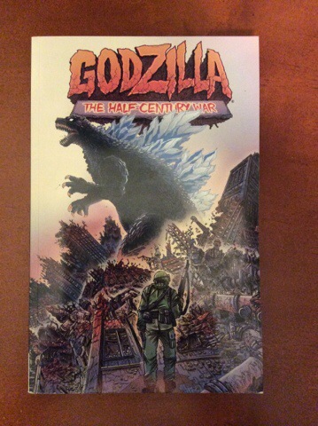
Written by Ben McCool
Art by Nikki Cook
Black & white
Image Comics, 2011-12
Image has been impressing me for several years with its willingness to give new horror titles a chance, from the stellar THE LIGHT by Nathan Edmondson and Brett Weldele to the tragically short-changed GREEN WAKE by Kurtis J. Wiebe and Riley Rossmo. MEMOIR by Ben McCool and Nikki Cook was another that showed promise, but publishing delays plagued the title, and thus it probably lost many of its readers. But now that the first arc is finally complete, does the title live up to its auspicious beginnings? Here I’ll argue that it does, but not as well as it could have.
The six-issue MEMOIR began in January 2011 and had all the hallmarks of a hit. The first issue sold out in a week, and Warner Bros quickly optioned the story with the intention of turning it into a television series. Then the publishing dates began to slip. First a month between issue #2 and #3, then 2 months between #3 and #4, then half a year before #5 printed in December. Then… nothing. Talk about a cliffhanger. Fast forward to September 2012, and lo and behold MEMOIR #6 shows up on the shelf, like the shadow of a ghost from 2011.
Perhaps it was worth the wait. All told, MEMOIR improved with each issue. Issue #6 is easily the best of the series, having shored up some of the weaknesses in earlier issues.
The book is full of interesting ideas. What if a whole town lost its memory? If you were trying to recover from amnesia, how could you trust anything you read or were told about yourself? What if you suspected some of the people in your town weren’t who they said they were?
Although the story’s concept is strong, Ben McCool’s characters are a little wobbly out of the gate. Main character Trent MacGowen is (at first) unlikeable as a person and unbelievable as a journalist. Why would a reporter seek out publicity before undertaking a shoe-leather reporting project? What television station would interview a reporter about an “upcoming investigation?” His true motivation for undertaking the project are somewhere between murky and non-existent.
I want to like Trent. Sure he’s young and full of himself, but so many great characters are. But the way he treats the whole world with disdain, especially the residents of Lowesville, whom he is supposedly trying to do justice with his reporting, is difficult to enjoy. It’s not until well into the series that we see an ounce of empathy from him, and it comes perhaps too late.
Eventually, Trent’s connection to Lowesville is revealed to be more complicated, and subsequent revelations about his past and current demons offer a reason to sympathize. While the setup feels a tad fumbled, the payoff is worth it. And as the backdrop mythology of Lowesville emerged, I began to find it more fascinating than the memory loss, and I hope that future books set in this world delve deeper into that.
Cook’s artwork is all unnatural shapes and heavily lined faces. The effect is disorienting, and I can’t help think that it was intentional. Black and white can be so effective in horror comics, but it’s not necessarily easy to pull off. It’s hard to stress just how much Cook’s artwork contributes to the creepy, unsettling mood of the book. While I reveled in the inky atmosphere, I did occasionally have trouble distinguishing between some of the side characters, and what is up with some of those people’s necks?
In some ways the arc wrapped up right as the place was getting interesting, but the best stories always leave you wanting more. Luckily McCool stated on his blog that more stories set in the MEMOIR universe could be on the way.
With such a strong concept, it’s unsurprising that MEMOIR received so much initial interest, but some shaky writing early on and publishing delays probably took a toll on its audience. It’s a shame, because the improvements between #1 and #6 elevated the book above many of its peers. I hope the series is collected into a trade paperback soon, because tracking down the floppies required a bit of shoeleather of my own, and I’m not sure many other horror fans will be willing to do the same.

So, I did go back to read your past reviews and I felt they were all very well written. The books you review are not the kind of books I’m normally drawn to but your write up has made me curious and I will most likely pick up a few.
I’m trying to understand for myself if you are deliberately selecting books with interesting back stories or if it’s your presentation that has me interested. I do like the tone of your write ups so find it difficult to objectively decide.
The only book(s) on your list I’ve read so far is the Massive and I look forward to comparing notes once I’ve had a chance to read some of the others. I like the spirit of DHP but it’s an expensive book so I actually stopped buying at issue #7. I missed the Massive prologue and found myself searching for #0 that you mentioned. Strangely enough, the stores I visited don’t seem to have any knowledge of it…and #0 doesn’t even show up on eBay. So, the hunt is on…
Rob Leifeld is a polarizing character, someone that we are all familiar with. But the way you describe him here shows restraint, and almost romanticizes what I consider to be a bad time in comics:
The original Rob Leifeld-penned PROPHET is an artifact from a different time in American comics, replete with boisterous dialogue and heavily exaggerated physiques.
I only mention this because it’s a demonstration of your ability. We often discuss story and art on CBD, but anyone who loves words can appreciate the nuances an assembled string of characters can convey. I’m curious, if you consider yourself an amateur and if it’s not too personal, what do you do during the day? What are your aspirations?
Looks like that MASSIVE issue was digital-only. And they just called it a one-shot. I’ll have to update that in the review.
https://digital.darkhorse.com/profile/2129.massive-digital-one-shot/
I am a graphic artist for a newspaper by day. I spend most of my days thinking about storytelling and design, so it should be no surprise that by night I like to read and write about comics, the ultimate medium for visual storytelling.
As for my aspirations, I’d like to get better at writing about comics. Perhaps even work in the industry, if the stars ever align that way.
A graphic artist… really! So am I. Kindred spirits you and I. Which newspaper? Doing layouts, ads, promos…?
Many similarities there are between design and comics…
• Both drastically changed by digital…
• Both looking to be understood by the public
• Both highly commoditized these days
Most of my work is corporate but I also did all that Grand&Toy stuff… If you think it’s crap, I’d be the first to agree with you. It was driven by an ad agency and the whole strategic direction is all wrong. They tried to turn the company into a lifestyle brand but even my 7 year old daughter understands that office supplies are a commodity, not objects of desire.
Here’s my reel:
http://www.youtube.com/watch?v=GVmHsfNM6bg&feature=channel_video_title
I don’t have a specialty but for some reason, I seem to be given a lot of branding projects. Even before the term “branding” became ubiquitous, I was doing identities… but, I like to think that I’m equally awesome in all areas ^_^ That’s a joke of course, but I guess my experience makes me confident… sorta like how Capt Kirk or James Bond is with the ladies. I’m the same way but only with colour, type… paper… but with much less love.
Very awesome… I’d love to see your stuff if you don’t mind sharing.
Lots of great work in that reel, almost too fast to see!
I work for The Bulletin in Bend, Ore.
Most of my professional work is news-related. I’ve done some marketing/branding stuff but that’s mostly on the side.
I post a lot of my news graphics work on here:
http://newspagedesigner.org/photo/photo/listForContributor?screenName=3b5kxd0k0pxql
Hmm, interesting… so you’re not local?
What good studios are out there? I used to keep better track of who’s doing what in the industry but after working in Asia for 7 years I stopped keeping track. Only Nike design come to mind… I used to freelance for their Hong Kong office which was the Asian HQ.
Are you familiar with studios like Steven Tolleson, Mike Mabry, Cahan, Hornall, VSA, Vanderbyl, Duffy… etc? I often fantasize about working the in US… I think you guys have the best studios in-the-world!… despite what the Brits may say. In particular California! The British think they are sooo sophisticated, and in many ways they are. But, design is an applied art, ie commercial, so despite being labelled as “cowboys” or loud by the Europeans, I think American design is far more successful.
Still, Europe has Wolf Olins who’s still active with Safron, although I wasn’t crazy about their 2012 Olympic logo, Brody of course in England… I have no clue what Mike Peters is doing these days…
The market in Canada is small… although it’s grown a lot from when I started. The top stuio in terms of creative is Concrete but the pay is crap. They prefer to higher juniors and squeeze it out of them.
http://www.concrete.ca/
The only person to really break into the international circle is Bruce Mau. Probably because of his associations.
Your work has a very “infographic” feel which is hot these days, however, I wouldn’t feel very secure working for a newspaper. I get offered a free subscriptions all the time but I always turn them down… It’s just a matter of time before the big 3 local papers consolidate or go belly up.
Can you believe that Chip Kidd wrote his first comic and not a mention of it on CBD! Mind you, it wasn’t that great but that’s beside the point… Batman, Death by Design has a lot of design jokes like Kemkoohaus… ha.
Are you bothered by the CBD logo as much as I am? Can you believe they still haven’t removed the black box around it left over from the previous design? You can lead a horse to water, but…
Any ways, great stuff! Thanks for sharing.
^_^