After a very long hiatus we’re back with another edition of Absolute-ly, a look at material that deserves to be in a gigantic art loving format akin to DC’s Absolute, Dark Horse’s Library or IDW’s Artist Edition.
Silver Surfer: Parable was a wonderful two issue mini-series from Stan Lee and Moebius. Yes, Moebius did some original material for Marvel in the late eighties by way of a meeting with Lee at a convention; of course Epic’s wonderful reprinting of his to-date material certainly helped to get this project published.

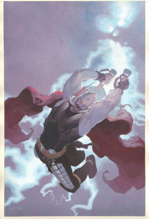
This is a completely different take on Galactus and his desire to feed; he comes as a deity and plans for humanity to destroy itself in his name, until the Silver Surfer breaks this religious hold. Of course it’s the visuals that make it a classic and a contender for Absolute-ly.
Lee provided a Marvel style script and Moebius did everything else: layout, pencils, inks, colours and lettering. The two issue mini series was published in 1988 on standard comic newsprint but was later collected in a hardcover and softcover with Baxter paper and clean colours: that’s what I used for the images included. As well it included a standard introduction by Lee but extensive notes on pretty much everything from Moebius.

When reprinting this material it’s interesting to decide how to present it: a combined volume of black and white, original colour and updated colour would be the penultimate edition, but would that stray too far from its intended look. Moebius had the following to say about the original material’s colour choices; perhaps a matte paper in the same vein as DC’s Jack Kirby Omnibus series would be a better fit.
 One of my motivations for doing this book was to experiment with the limited palette of the newsprint color comics. I have seen the reproduction of my graphic novel covers in MARVEL AGE, and I thought they looked different, but equally beautiful. I’ve always loved the softness, and yet garishness, of comic book colors. Maybe its nostalgia, but I think there’s a real beauty to it. It’s like a new medium.
Coloring THE SILVER SURFER that way was an enormous challenge. I didn’t fully understand how limited this palette is, and I’ve since gained a great deal of admiration for the American colorists, who can express full sentences and emotions with such a limited number of words. Of course, if I had been in New York and able to actually use the various dyes themselves, maybe it would have looked somewhat different. But I knew from the beginning that this was going to be one of the most difficult parts of the job, and therefore I don’t have any right to complain. One should always learn to face the consequences of one’s actions.

The main characters of Galactus and the Silver Surfer are two or three shades of purple and blue respectively throughout the story but it works so very well. Even with the limited palette the book is beautiful and deserves to have its art as large as possible.
Marvel has presented the original two issue series, the notes from the first collected edition plus the Marvel Age articles and Moebius’ posters in a new Marvel Premiere hardcover, but it’s only slightly larger than the original material.

Agreed. Surfer + Jean Giraud = Good Stuff! I’d buy one.
Is it over kill when a trailer has a teaser:
http://www.youtube.com/watch?feature=player_embedded&v=L18d1xlkOiY
Why stop here… why not a trailer for the teaser of the trailer for the teaser of the trailer of the actual movie? It’s like Inception…
4.5