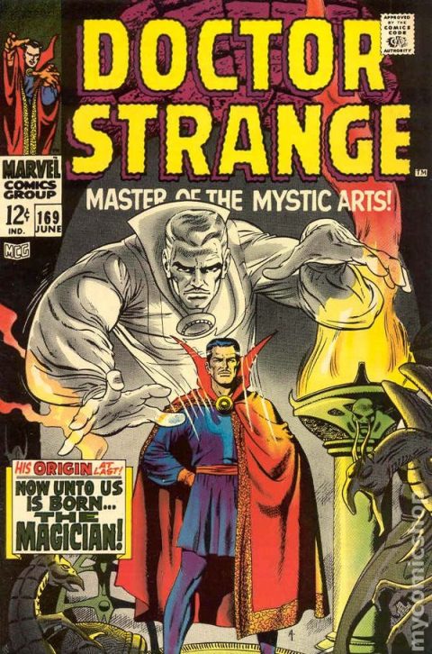
Doctor Strange #169, Marvel Comics, June 1968, Artist: Dan Adkins .
Nice to have Dan Adkins chime in again with this terrific cover. I know it’s a static cover like most of the Spring 1968 Marvel relaunch covers but Adkins does a terrific job with the colors, the setting and even the mood, it’s a strong iconic image and I think it does a great job at paying homage to Steve Ditko.
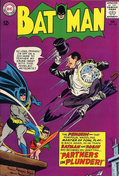
Batman #170 is a great cover (see pic), imagine a high gloss high grade copy if this!
Strange Tales #169 with Brother Voodoo tried to replicate this cover in 1973 with mixed results. I like Ghostly Tales #169.
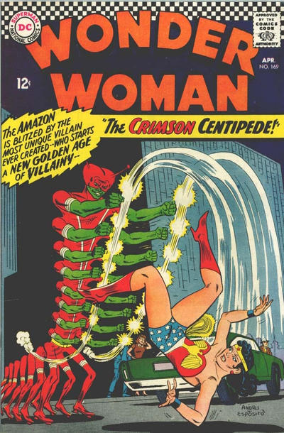
JOWA? How about Wonder Woman #169 (see pic), what the heck is that?
A great comic book cover matching each day of the year, 1 through 365. Please chime in with your favourite corresponding cover, from any era.


No question on this pick. Thumbs down on the Strange Tales homage. But I will drop my guard and tell you that until you mentioned it, I never drew the connection.
That’s Batman #169 – you’re getting ahead of yourself. I see what you mean about the effect of a high grade copy, and it’s much better than that Strange Tales that you made a similar comment about, but it still has the “Infantino effect” on me, so I would not pick it.
A few possibilities for #170. I am going with Thor. Standard battle cover but beautifully executed in every respect. I was surprised to see this is a Romita cover. I looked and there was a break of Kirby covers for #169 and #170, and #169 is a collage cover. This makes me think that at the last minute Kirby couldn’t deliver the covers for some reason and Romita had to quickly deliver. Maybe the timing for #169 was almost immediate resulting in the collage/reuse cover. Maybe Romita also spent relatively little time on #170, forcing him to dial down the Romita-ness and thereby turn in a great cover.
Detective is simple but I love it for the figures and the colors. The colors are especially distinctive for Detective. Doctor Strange is really good – now that’s a cover that I would love to see in super high grade. The colors of X-Men are beautiful.
Strange Adventures not great, but maybe unique in that it is an infinity cover referencing itself in the story it portrays. This is not the book to give to a consumer of mushrooms as they might never return.
I don’t see any clear JOWAs – as usual Blackhawk and Wonder Woman make me wonder how we still have a DC today, but they don’t make it to the level of The Crimson Centipede.
Great choice, Walt. When the Dr. Strange movie came out a few years back, this cover started to appear regularly on the wallboards at comiccons, and it was an immediate eye catcher. I had no interest in collecting the issue, but it still caught my attention each time, and my appreciation grew as I noticed it remained a standout no matter which issues it was placed next to on the board.
I am also a huge fan of Batman #169. Penguin covers are one of my Batman collecting runs, and #169 is a personal favorite I was lucky to acquire a high grade copy, and the deep purple background is really something special. It sits close to Detective 359 on my own wall board, and the purple in Batman 169 is much deeper than Detective 359.
Thor #169 also made my list, but that was heavily influenced by the copy of that issue I picked up this past weekend.
What does JOWA mean?
Well Klaus, obviously it means – it’s totally clear that it stands for – that is, it should be easy to see that – ahem – I shouldn’t have to spell it out for you.
It turns out the first reference to this was by Walt on day #108, so he will have to say what he meant. Originally he mentioned “Jimmy Olsen Award”, so that would be JOA, and while I quickly adopted his “JOWA”, it’s never really been defined (as far as I know). I have been tacitly assuming that it meant “Jimmy Olsen Weird Award”. The classic example is Jimmy Olsen #98, which managed to simultaneously be a cover of the day and JOWA winner.
Yes Klaus, Chris was handing out daily lame awards to Jimmy Olsen’s and I think it morphed into the Jimmy Olsen Award in case it was not a Jimmy Olsen book that was lame that day. JOA sounds like JOWA which sounds Star Wars-ish which was then somehow adopted as the award for the silliest cover of the day. I do like your throwing in Weird there Chris to make it look like I know what I’m doing but it was just the way JOA sounded.
So the daily JOWA is an award handed out to the cover that makes you shake your head, lets go with Jimmy Olsen Weird Award
No argument here…although I do agree the single hero titles coming off the anthology titles were static. What was with DC and those weird 60’s villains…its no wonder Marvel gained so much ground ( and I know… there were several other factors involved)! I also never thought of the Brother Voodoo correlation, but did enjoy the character and the Colan art!
what?What?WHAT? The Crimson Centipede!!!! Haha, got to be the weirdest villain I’ve seen. He’s wonkily great, like something out of CCBeck’s Captain Marvel or a Plastic Man comic.
To me a cover is the “poster” for the book, magazine, DVD or the comic book so if it hooks my interest and has impact it’ll appeal to me, that it says something about the story within is a bonus. I’d buy that Dr. Strange, it’s a very nice portrait drawing of an intriguing character.
If that’s the criteria, then just about every Mort Weisinger DC comic of the 60s qualified for a JOWA.
An amusing aside, Mort once said he would ask his kids what they wanted to see the DC characters go through next and then have his editorial staff make it so. So the wackiness of DC in the 60s can be credited (blamed?) on his kids.
In the 1980s, tv producer Glen Larson produced Battlestar Galactica and then Knight Rider, which is why KITT had a red Cylon light pulse. Larson also would ask his kids what they wanted KITT to do next.
For the final season, the Transformers had taken the movie world by storm so, his kids said they wanted to see KITT become a Transformer, which resulted in KITT’s super pursuit mode, where it changes into a completely different looking car. Glen and Mort, small world.
The Crimson Centipede may have ushered in a New Golden Age of Villainy… but thats not saying much… research says he only made TWO appearances!
Great stuff Klaus, if my kids were younger I’d ask them to pick each day’s best cover, couldn’t be worse than some of Chris Meli’s picks!
I think the reason Crimson Centipede only made two appearances is that he too too long to draw, too many moving parts.
What also appeals to me about these covers is the “comic” realistic but idealized figure drawing and… fingers. FINGERS! 🙂
I always struggled with drawing hands and really dislike the baseball mitts on a lot of current day comics characters.