House of Mystery #217, DC Comics, September 1973. Artist: Bernie Wrightson.
Man the cover to House of Mystery #217 is so Wrightson and for me, that’s a good thing.
What strikes me about Barry Windsor Smith’s Daredevil #217 cover is the background, cityscapes can be monotonous and generic but the complexity, depth and detail here make this cover.
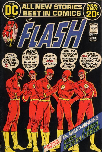
I love the chaos of Nick Cardy’s Flash #217 cover, Nick sure loves using those deep black backgrounds, doesn’t he?
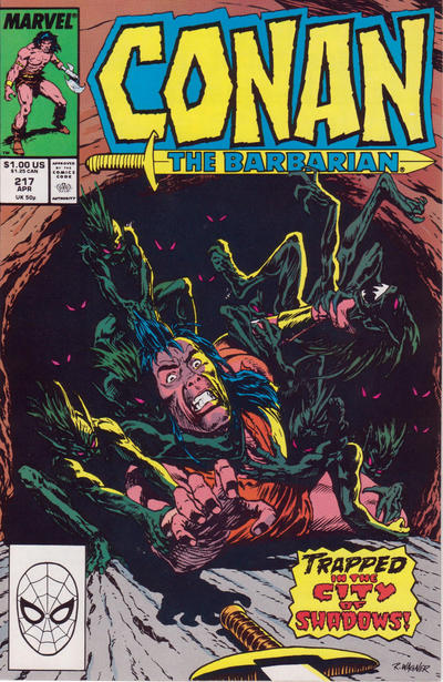
Ron Wagner’s cover to Conan #217 took me by surprise, lots going on, I really like this one.
Strange Adventures #217 and Batman #217 were both solid Neal Adams covers.
A great comic book cover matching each day of the year, 1 through 365. Please chime in with your favourite corresponding cover, from any era.
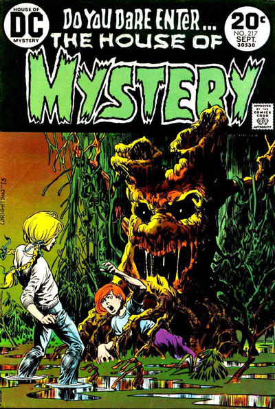
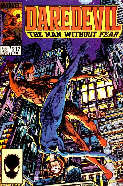


I don’t think Wrightson ever did a bad cover (although I’m sure someone will try to point one out to me) and this is obviously moody and evocative. I can even get behind the Smith cover although overall I think its sort of ordinary. But after that? I really think you’re stretching things. The higher the numbers get the less your choices.
Robin, them’s fightin’ words if you are saying that Batman #217 is not great. It remains my pick.
I think the coloring for House of Mystery is too garish, but I love Wrightson’s art.
I don’t think you can give too much credit for a black background on Flash, and the cover is (maybe intentionally) boring.
The Conan art is too crude but I like the layout.
While Strange Adventures seems to be a fixture because of the cover, I personally think this is relatively weak work by Adams. Strange is disproportionate.
There are a number of possibilities for #218 and I will choose Incredible Hulk, which hits on all cylinders.
Kid Colt is the runner up, another great Kane cover.
Conan, Superman, Tarzan, even Marvel Tales worthy of mention.
JLA #218 an original play on JLA #217 and superior to that weak Perez effort.
Blackhawk tries for the JOWA with The Plantimal, but can’t beat Adventure’s Speedo-wearing Jor-El (I would _not_ go to another planet with this guy).
I love both the Wrightson and the BWS covers. Berni because, well it”s Bernie and BWS because the athletic figure of both the Widow and Daredevil are so lithe and perfectly proportioned, for basically gymnasts with attitude.
While in never thought BWS excelled at superheroes, this is an exception! While every character seems to have an “I quit!” story… the Batman is an interesting cover. Yes Bernie is great… sometimes greater then other times and I agree the coloring could have been subtler. Flash… really? That is considered a great cover? Looks like Carmine simply sent in a figure study from his sketch pad and said the hell with it that month.
While I put DD on my short list, I couldn’t support it as the best due to the “Smith Face” problem. Rotate it 180 degrees and look at the Black Widow’s face. She looks like a department store mannequin. By this point this was probably seen as distinctive Smith style, but to me it looks more like an artistic limitation. This isn’t _my_ Black Widow.
“From Hell It Came” the walking tree monster sf movie makes it onto a cover. That’s funny but a good Wrightson.
The BWS Daredevil surprises me because I always thought he did early Conan then was gone into his fine art prints. Never realized he hung doing some other Marvels like this or Weapon X, Machine Man etc. until spotting them on eBay or in these articles. Interesting.
hung around
Chris forgot to mention the ‘Kane nose’… but Its possible Smith felt the Widows face was so fleeting in the glare of the street light no detail would have been perceived. I am thinking if it were detailed it would not look right.
Interesting Wrightson cover, could be better with a color fix like Chris said. I can’ t believe how much I’ve been agreeing with him lately~
For 218 I’d go with Avengers due to shock factor and drawing a potential reader in to see the story. Not necessarily ‘great art’, but impact is there.