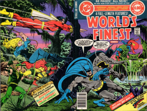
World’s Finest #255, DC Comics, March 1979, Artist: Jim Aparo.
I’ve caught myself looking at your picks for the next day and felt they were swaying my decisions, it’s like I wanted to be nice to everybody. Well, it doesn’t feel right, I gotta put the ones out there I see fit and face the wrath, better this way because this way we get mine versus yours rather than mine trying to agree with yours.
Jim Aparo gives us another gem, fantastic wrap-around cover to World’s Finest #255.
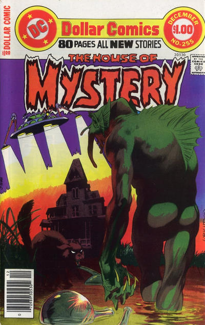
I had Bernie Wrightson’s House of Mystery #255 picked out until I saw Aparo’s magic, besides I wouldn’t feel comfortable giving the crown to some monster’s bare ass.
Morris Gollub is another artist that this column has opened me up to, great painted cover to Four Color #255.
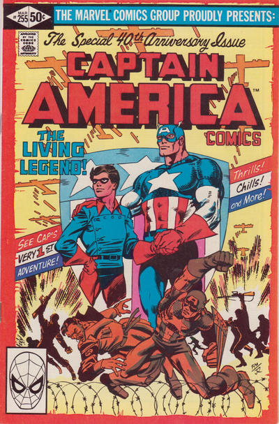
Frank Miller gives us a memorable cover to Captain America #255, I’ve always liked this cover.
A great comic book cover matching each day of the year, 1 through 365. Please chime in with your favourite corresponding cover, from any era.
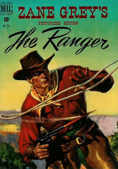


Morris Gollub might be the best comic artist in history Walt at pure illustration goes. Nothing cartoonish about his work
You do you, Walt!
Enjoyed all the picks today: The wrap-around World’s Finest is an exceptional cover, and I agree that the Zane Grey comic cover has more of an artistic feel than comic cover. Also, the current run HofM covers – including yesterday’s Octopus and today’s backside view – have been marvelous, with great art and staging.
But my choice would have to go to one of my all-time favorite Batman covers (and my favorite Batman story) in Batman #255 – “Moon of the Wolf”. The great Adams cover is diluted by the mix of other images on the cover of the “100 Page” issue, but it is fantastic and dynamic, displaying a scene directly from the dark and spectacular Wein/Adams story inside that offers an Adams monster and the Dark Knight.
I can get behind your pick of the day but not the runners-up.
When I looked at that House of Mystery I thought that Adams had dropped the ball, but then I saw it was Wrightson. I have to say the more I run into Wrightson in this exercise, the more I see his inconsistency and lack of stylistic flexibility, in contrast to Adams. Also the addition of color seems to have been a big stumbling block – the cover above probably looks a lot better in b/w.
To David’s point, I don’t know what “as pure illustration goes” means exactly, but I will acknowledge that Gollub was probably better at realistic depictions than the great majority of comic book artists. That _does not_ equate to great _comic book_ covers. The above looks like a cover for a pulp western novel, and I have no interest in adding the book to my comic collection. Aparo clearly couldn’t do what Gollub could do, but his _comic book cover_ still wins the day.
In contrast the Captain America is clearly a comic book cover, but to me the color scheme and layout immediately bring Schomburg to mind, and the comparison is so unflattering that I cannot support the pick.
No standout for #256. After a bunch of hemming and hawing I am going with Daredevil. I think what clinched this for me was Jr’s nothing as surface of the water – it takes developed skill to use nothing to represent something so well. The above/underwater coloring difference, poses, dripping, bubbles all add.
ASM similarly is nice use of light vs. dark, but it is a bit too crude for my liking, and there isn’t immediate action. FF is a very cool conceptual cover. I think Tarzan is great and probably the best “realistic” illustration, but it is a fairly standard Jumbo-esq retread. Uncanny X-Men is a standing around/crouching around cover, but I still really dig it as a harbinger of the Jim Lee juggernaut (Juggernaut?). X-Factor is yet another facet of Yardin’s creativity, but it is still a lying around cover.
DC as usual offers the main JOWA contenders in Action and Detective. I will go with Detective. As Comic Connect puts it, “Won’t you take me to – Funkytown!”
Because of a page refresh I didn’t see Derrick’s comment before I submitted. I do agree with him about the piece of Batman #255, but unfortunately it is only about 25% of the real estate, which kills it for me.
I want to buy that World’s Finest! Nice wraparound with a story teaser rather than just a posed multi-hero cover. Lots of excitement and seems to be matching Marvel for cover text hyperbole (never used that word before). Not familiar with Aparo’s name but have seen his art in my trawling.
Yesterday, I went to the GCD looking for tomorrow’s covers, interesting exercise that took a couple of hours, and found one to nominate for something… Another World’s Finest #256 wrap around with a story. I make no claim it’s the best for the day or a jowa but I do like these a lot, there was another with Superman unmasking Batman. Lotsa fun.
HoM has everything on it but colour seems blotchy. Nice painted “pulp” cover on The Ranger.
I like this Aparo entry and considered him pretty good with one exception… he often drew women’s lips as if they had a donut pasted onto their faces. I like painted covers… I also like pulp art… so I am behind the Dell pick. The HoM cover suffers from the coloring I think… perhaps it would look different exposed to a black light. The Cap cover is disappointing mostly. I might have been behind that Batman cover mentioned but agree with the criticism of the sidebar images which cause it to fall flat.
“I gotta put the ones out there I see fit and face the wrath”, well said Walt. It’s all our opinions in the end, but we do enjoy sharing them with all. I can’t deny that World’s Finest is a good cover, but to agree with Chris, the others are ‘meh’. That’s not MY Frank Miller on Captain America, so purposely over-homaged I can’t stand it. The HoM was interesting, but I can’t see the point of the whole scene with random beekers floating, black cat, ‘haunted’ house and alien ship. It was a ‘throw it all at the wall and see what sticks’ exercise in my eyes. Zane Grey is indeed a nice painting, sorta reminds me of Ken Steacy’s style, but even more realistic, however I agree with Chris again, “looks like a cover for a pulp western novel”.
Covered 256 has a few JOWA’s, so I’m starting with the worst first. Detective has it, especially funny to see the alien ‘conqueror’ waving as Batman and Robin pas by with a breadbox and yoga roller looking items. Runner up JOWA’s would be Action’s big head Superman, apparently they are saying he was a idiot before, Wonder Woman for worst facial expression, and Spectacular Spiderman for it’s killer bunny.
For the GOOD covers I pick Daredevil as well, JR Jr knows how to make a cover no doubt. I also like his Iron Man this issue. Other covers to consider are FF with it’s ‘fill in the negative space’ cover, Marvel Tales by the late Michael Turner, and all the ‘X’ titles, Uncanny, Factor, Legacy. They all are good to look at.
WWWP? I have a sneeking suspicion of one cover he’s bound to choose that I will not mention until tomorrow. 😉
Comic books certainly evolved from the pulps….and a great many comic artists and writers had careers in the pulps pre comic boom circa 1940.
Donut Lipped girls Gerald , potential for great Kissers. Gotta like that Mr Aparo 🙂