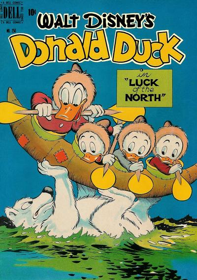
Four Color #256, Eastern Color, December 1949, Artist: Carl Barks.
What do you get when you add lots of sky blue to a great Carl Barks drawing? Walt’s cover of the day! Four Color #256 is feel-good comic art from a true master.
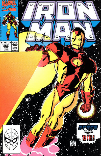
I have no idea why I like John Romita Jr’s cover to Iron Man #256 so much, I love the effect of the beam leaving his hand.
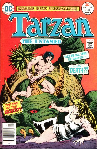
Finally, I chose another Tarzan cover, Tarzan #256 has no apes on it thankfully but it does have a nice composition by an unsung hero of the 1970s, Ernie Chan.
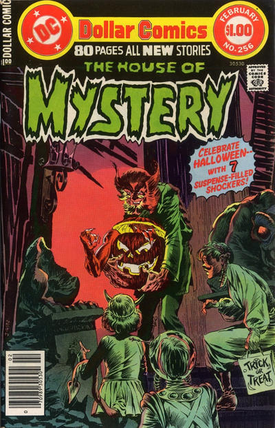
It’s almost default when Bernie Wrightson puts pencil to paper, and I do really like his cover to House of Mystery #256.
A great comic book cover matching each day of the year, 1 through 365. Please chime in with your favourite corresponding cover, from any era.


Hey Walt
That Four Color holds fond memories for me. I own a Canadian edition which I bought from the late, great Harry Kremer for five bucks because it was only a lowly Canadian edition back then. Harry sold all of the Canadian reprints at rock bottom prices. A few years later they were going for about a third of the price of the Yankee original. These days I wouldn’t even think of selling mine for anything less than the original. It is, after all, ten times as rare! Harry had a great selection of such rareties and he also was the guy who sold me my very first Canadian White which has led to a genuine passion which persists to this day. Great, great memories indeed. Thanks for this Walt!
cheers, mel.
Mel, I am all for your approach on the Canadian edition after picking up the Canadian Fighting Yank #12 which has the U.S. Fighting Yank #10 cover. A bit of sleuthing has only turned up one other existing copy, so hopefully the light bulbs illuminate and the scarcity will give these a kick in the pants.
As far as great covers go, however, The Donald only gets a “amusing” rating from me. Of the four above I would choose Tarzan as I said yesterday. The others are good, but Iron Man is just a poster, and once again the coloring on Wrightson’s House of Mystery causes problems. I had studied this cover yesterday, but only further study today revealed the demon emerging from the Jack-‘o-lantern. Red against a red background? Come on. This one get about a nine on the murky scale.
Very slim pickings for #257 so I am going to have to go against my criteria and pick FF. This is a heads floating around cover, but luckily it is by Byrne and his love for the characters combined with his talent elevate it. My first runner-up is Detective. This is a goofy story from a goofy period, but Curt Swan has arrived in Funkytown, giving us great composition and art, with beautiful colors added. I actually can weakly recommend JLA, which I expect to be Walt’s pick due to the vibrating visuals. Finally Uncanny X-Men is another early Lee that fills me with nostalgic anticipation.
JOWA to Kubert’s G.I. Combat. This is a Code book? Good for you, Haunted Tank!
Nice choices today. Even though there were no home runs, I especially enjoyed the Banks Disney cover and the effect of the image on House of Mystery #256.
Since this column started, I have gained an appreciation for the darker horror/monster covers, and have attempted to collect some House of Mystery issues along with some earlier macabre Brave & Bold covers. But true to the warnings I received (from Chris and Walt) that has proven to be difficult due to the dark colors and backgrounds which show every wound a cover ever received.
Ernie Chan’s Tarzan cover looks like Conan was asked to do a stand-in performance for Tarzan, but it works for me.
Also thought FF #256 was worthy of a mention (with the exception of Sue Storm’s hairdo) – great concept and color, and the cover gave the FF that cosmic effect that made their adventures more interesting.
Amazing Spider-Man #256 may not be to everyone’s taste but it is a cover I enjoy – maybe because so many other ASM covers around this time were just not very good.
Justice League #256: Made better if you know the Martian Manhunter’s weakness to & fear of fire, but a really effective comic cover image.
But there was also plenty of JOWA candidates, and I had a hard time choosing among the 3 top contenders:
• Action Comics #256: Oh my.
• Detective Comics #256: How bad is the drawing of the “waving” alien?
• Spectacular Spider-Man #256: A villain riding a giant mechanical rabbit.
I like all the choices myself. As for Walts preference to intense colors… it reminds me of a friend if mine back in my early college days in a painting class. He did mostly landscapes and they were always done in intense colors not found in his subject matter in nature. Turns out he was unaware of that and they looked normal to him… he was colorblind.
I think I’m tone deaf too Gerald…
Walt’s breakfest Deaf for sure…hasn’t shelled out for pre store opening breakie for months…maybe decades. 🙁
Nice covers though