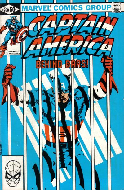
Captain America #260, Marvel Comics, August 1981, Artist: Al Milgrom.
Another guy I’ve learned to appreciate more thanks to this exercise is Al Milgrom, check out his eye-catching cover to Captain America #260.
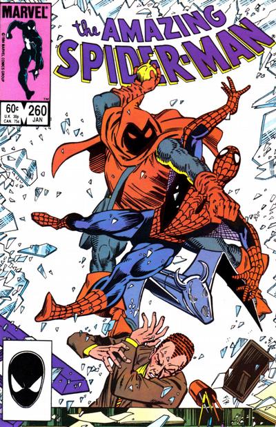
Ron Frenz’s cover to Amazing Spider-Man #260 grabs you right away, a fan favourite forever.
The cover to Blackhawk #260 is Howard Chaykin’s way of saying “yeah, I’m good”.
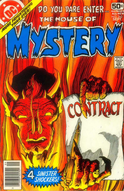
I thought it too simple at first but on second glance I see the allure to Mike Kaluta’s House of Mystery #260 cover.
A great comic book cover matching each day of the year, 1 through 365. Please chime in with your favourite corresponding cover, from any era.
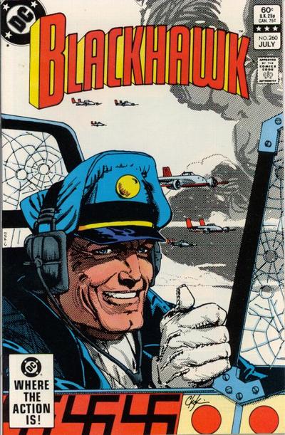


Al Milgrim showed promise Walt, then his art went to Hell in a hand basket…what happened? Really like the Blawkhawk cover, but whats up with the swastikas?
Seems to me that I signed that House of Mystery cover when I bought a certain Sgt Fury Collection off a certain Big Beelzebub Owner….Hmmmmmmm?
David, I think that the swastikas indicate the number of enemy plane kills, like notches in a gun.
Good choice today, Walt. I really like this Captain America cover – The simplicity of the cover allows the colors and the shadows falling across the scene to add the enhancement.
House of Mystery #260 and Thor #260 were the only other covers that caught my eye.
I initially took a second look at FF #260, but the Johnny Storm figure seemed to be “stretching” like Mr. Fantastic and the background color just wasn’t quite right for the scene.
As for ASM #260, I am saving my ASM nomination for issue #261.
I like the Cap cover too for its simplicity. Blackhawk is a nice homage to both the Golden Age and also I think to Reed Crandall that the Chaykin emulates! While I know nothing of Toronto housing market the HoM is pretty cool as well. Where I have a problem with Spidey is where I have a problem with a lot of breaking glass images… in reality it would be safety glass which doesn’t create jagged shards… call me picky but it bugs me ( some artists still use it on cars in this day and age)!
Lots of great effects in the Captain America but his face really knocks it down. Generally after that Avengers run it is going to be hard for me to give Milgrom the benefit of the doubt.
The ASM is action-packed but pretty crude. Spidey hit the ThighMaster for about a month before this one.
The Blackhawk is a pretty generic Chaykin, I think he just traced his American Flagg work for this run.
For #261 we are back to plumbing the depths. I don’t know if I can stay interested for another hundred days of this quality. Derrick’s ASM is the best but leagues from being a great cover. Even today’s Byrne FF doesn’t rate.
At least we have Superman’s smooch for a JOWA.
Maybe the building contractor cheaped out and didn’t put in the safety glass and he’s about to get very badly landed on by Spidey and I don’t know the villain – is that a new Goblin but not green? But yeah a second look does notice odd things like Spidey’s hulk thighs. It’s a good action fight scene otherwise.
I might have made the pen red or black/red so it’d stand out more from the flame.
Interesting, swaztikas on Blackhawks plane and Japanese (?) hashmarks but not the WW2 Rising Sun symbol.
Thank you Ivan !!! makes sense !!
Tim good catch on the wrong Japanese flag on the Blackhawk. More evidence of Chaykin phoning it in.
Yes good catch on the Japan flag! Chaykin is not always known for his political correctness, perhaps he has an underlying intent…