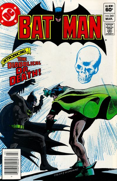
Batman #345, DC Comics, March 1982. Artist: Gene Colan.
A great comic book cover matching each day of the year, 1 through 365. Please chime in with your favourite corresponding cover, from any era.
Only 20 more sleeps ’til the end, man the days are flying by.
That is one tough angle Gene Colan goes for with his Robin pose on the cover of Batman #345 and he nails it, superior artistry from Mr. Colan. I’ve always liked this cover and so have the people collectors constantly pulling the book put of my bins.
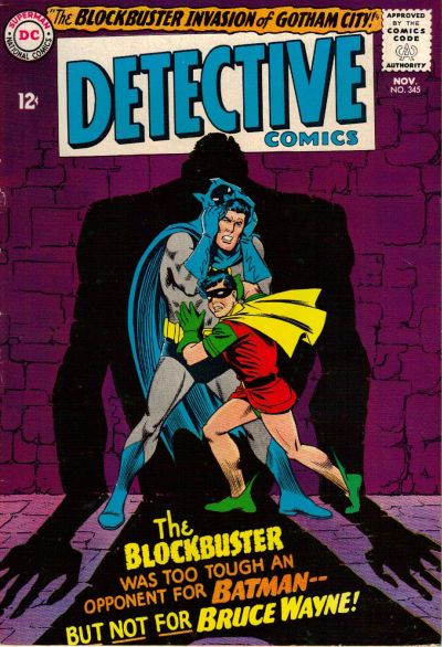
I don’t like seeing my Batman cower in fear in front of any foe, it’s too un-Batman like! Carmine Infantino does give us a simple yet striking scene with all the bright colours concentrated in the middle and the darkness and shadows around them.
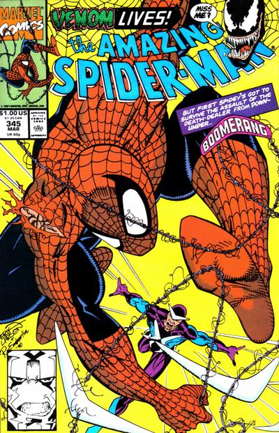
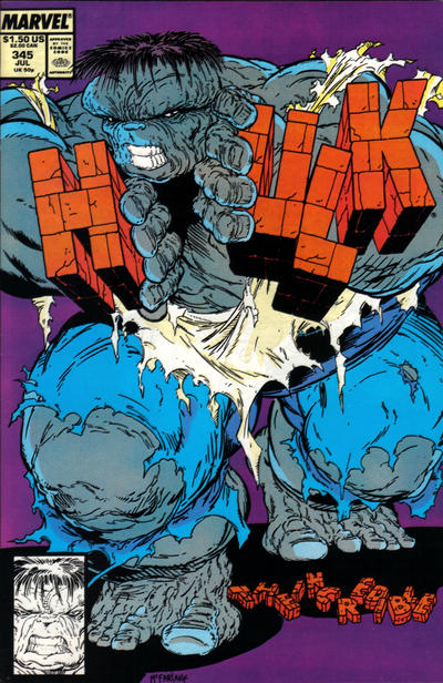
Erik Larsen’s cover to Amazing Spider-Man #345 and Todd McFarlane’s cover to Hulk #345 are basically the same cover to me, both are overkill, way too much of our heroes and way too close to my face. Whatever these two guys were after they didn’t get it.


As comic book fan, one can never complain about 2(!) Batman covers. I like them both but may give a slight edge to Detective #345 as the first choice solely based on the preference for the purple background – used so effectively on other occasions for Batman/Detective covers.
Amen, to the McFarlane/Larsen critique.
And at least on Day 345 there were some other nice covers including:
– Avengers #345 – I know Walt has liked some recent Avengers covers, so I am a little late in joining.
– Superman #345 – I really enjoy Superman flying covers, and this one would have been much better if not upside down, but the images of Supes are really good.
– Thor #345 – I like everything but the overwhelming blonde hair eating away at the cover, which almost destroys the “menace” factor that is working in the rest of the cover.
Hulk 345, WINNA !!!
Definitely Gene the Dean Colan wins the day! Take that Hulk cover away… it HURTS my eyes!!!
Wish I could come and visit your store, Walt, you have interesting comics. I think after this all over I’m going to back through and make a list of the cool covers/comics to look for starting with my dusty-overpacked-long-boxes local store. Maybe you’ll hear from me at some point.
Behind a bit on the covers as I couldn’t get on the site, just error messages. Of these, I just like the Bats covers over the Marvels.
Sometime, a long long time ago, in an interview with CBG, one of the new age wiz kids (Larson, Liefied, Lee, etc.; I’m not exactly sure who) said that they (meaning them and not the “older” artists) were trying to draw things that were more “in your face”. He might have even drawn a comparison to the emerging NBA stars of the time who were changing the way they related to the public. I’m sure that one of my more knowledgeable friends could tie this whole quote down better. Bottom line is……..I don’t like it and these two Marvel covers are a wonderful example of why. Personally, I don’t find any redeeming features to either one of them. Call me a traditionalist or an old fogey or whatever but I prefer to see well thought out composition, proportion and a sense of anatomy.
Maybe Colan got the pose right, but Robin’s freshly-waxed leg is a big hurdle for me. Also, while a “homage”, that still means points off for lack of creativity – the retread Dr. Death (who had taken a hiatus from DC to narrate This Magazine Is Haunted) combined with the composition lift from Shadow Comics (a title that was king of the skull covers). Of course I couldn’t disagree more about the Larsen ASM. The Detective does nothing for me. In this exercise I have seen many more misses than hits from Infantino.
Tomorrow offers a few choices. I am afraid that you will pick DD, but in this case even if the art is good, I think it should be boycotted for the gratuitous blood. This is a Code book? I have to go with – sorry – Larsen’s ASM again. More of a poster but I think it is super cool. The runners up are both Simonsons – I say FF second (I think you will really like the background color), Thor third (another cool poster-like cover with not much story in it).
If you want me to bash a Larsen I can do it for you with Incredible Hulk. Larsen’s Hulk is mostly better than McFarlane’s, but they would have to rename the character The Incredible Brow.
It would be nice to meet and say hi Tim, perhaps at a con one day or for someone’s wedding in Niagara Falls .?!
I’ll concede Chris, it is a bit of an upskirt on Robin.
Hey Walt…Im a huge Colon fan…but here ,the Batman covers look flat,washed out and 1 dimensional. In fact most of his DC covers of the era look the same way. Contrast those with his 1960s Daredevil covers….That’s the era I wish gentleman Gene had drawn Batman. And I love the Hulk cover