It’s been almost three months since my I highlighted the splash pages from early Marvel keys. Today I’ll add the next three keys chronologically. Showing only three will allow us to add some variety into the post and it will give me a head start a few months down the road when I feature the next three keys.
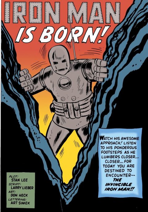
From March 1963, Tales of Suspense #39 features a strong dramatic splash page from Don Heck, frankly I think this is the best of the three Marvel splash pages featured today. Sorry I could not find an image not remastered.
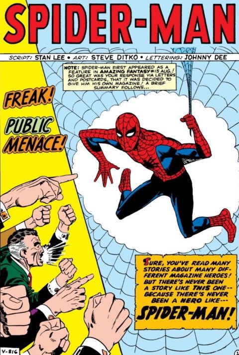
Also from March 1963, Amazing Spider-Man #1 gives this wanting Steve Ditko splash page, I like Ditko as a Spidey artist but I don’t really like the awkwardly drawn Spider-Man here.
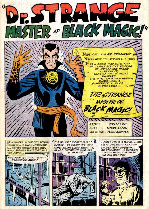
In July 1963 Marvel added Doctor Strange to their line up in Strange Tales #110, the Doc was not on the cover so we are first introduced to him in this Steve Ditko Splash page. Again, not a stellar page of art but it is a very important one. Are splash pages worth more if they represent the first appearance of a character?
For my money those were three so so art pages above, their historic significance though is huge. Lets take some tonic and enjoy some stellar art.
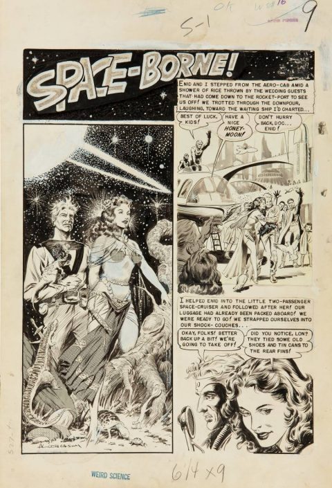
Al Williamson is at the top of his game with this splash page from E.C.’s Weird Science #16 from December 1952.
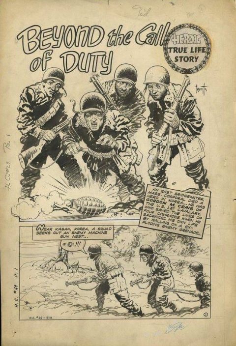
Lets keep going, how about a nice Frank Frazetta splash from Heroic Comics #69 from November 1951. Is it me or do the Frazetta faces along the back look a little like Jack Davis drew them. Henry Kiefer gives us his version of the scene on the cover to this comic.

All great splash pages as always, Walt. But, here’s a question for you. The first two splashes you show (the TOS 39 and ASM 1) are not the way I remember them. They look like recoloured versions on glossy paper stock taken from a later omnibus. The ST 110 is closer to the original. When you present splash pages from the past (golden, silver, and bronze ages) should it be the original version on newsprint with the original colouring or the re-worked, more modern reprinted versions? I, myself, see these two as different and always prefer the original newsprint version, I guess because I grew up with it. I know in academic papers these two versions are regarded as separate items and have to be cited differently. Does it matter in the end. You’re always safe with the original black and white page, but that leaves off the impact of the colour and misses the point of what we really encountered when we lifted that cover off the body of the book. Maybe this is all too pedantic in the end.
I agree shots from an original comic would be better but as Walt said he couldn’t find non remastered selections. I only own one of the three( Strange), but would happily let you photograph it!
I agree the Heck is the most outstanding of the three and also the simplest! Sometimes less is more! I do see a little of the 50’s horror Ditko in those bottom panels on the Strange however! Ditko just got better on his two creations as he went along and unfortunately was at his best when he gave them both up!
Al Williamson was a graphics god in my book! His career spanned several decades and his quality never diminished! That stipple he used on the first panel reminds me of Virgil Finley! I dunno Walt, those look like Frazetta faces to me! Davis would have had them far more wild eyed with possibly white pupils to enhance the effect!
You are right Ivan, I do’t like the remastered pages either but I could not find nice images of the newsprint ones. My preference is always newsprint 1st, black and white original art 2nd and the remastered stuff 3rd only if I can’t find the other two. Often I won’t even chose random art if it is remastered but I had the Marvel Keys splashes going and needed them.
Ditko did get a lot better deeper into the Doc Strange run Gerald.
Gerald Al Williamson IS a graphic god. I completely agree that his art never faltered over his career. I was lucky to meet him in Pittsburgh one year and I tried really, really hard to get him to do a sketch for me but he wasn’t up for it. However he gave me a chance to look at his personal sketchbook.
While looking at the book there were all kinds of amazing sketches and figure drawings. I saw one that had a kind of typical hero and damsel in the foreground and some kind of cool city way in the background. I asked him what it was from and he said.. “I don’t know … They’re all kinda the same.. you know, some kind of ‘lost city of blah, blah’ or whatever.”
https://i.pinimg.com/564x/d4/f3/08/d4f30862412fd114bb9e87c5b0c5891c.jpg
Hey Ivan and Walt…. source Marvel Tales and other such early marvel reprint history books, for a better recapturing of that early Marvel newsprint magic. I know Both you and Walt know this Ivan…But I need an excuse to razzz Walter. 🙂
Dave, you NEVER need an excuse to razz Walt…
😀 Thanks Chris. We share a Gorilla mindset