When discussing the most “important” characters and comics of the Canadian Silver Age, the works of several creators come to mind. The word “important” has several connotations and I use it here in part because of its ambiguity. What makes something important when it comes to comics? Is it name recognition? Sales at the time of release? Critical reception? Collectability? One could make arguments about the importance of a particular character or series using one or more of these frames. For me, however, I tend to gauge importance in terms of legacy. That is one of the benefits of writing a column about comic books from decades past. It is easier to assess something’s legacy and its affect after the fact.
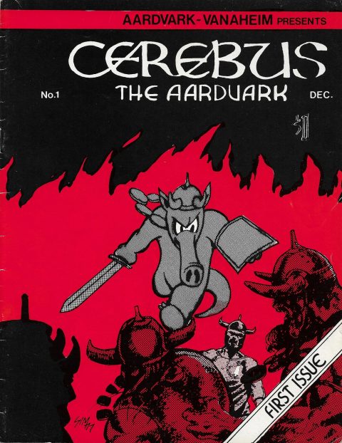
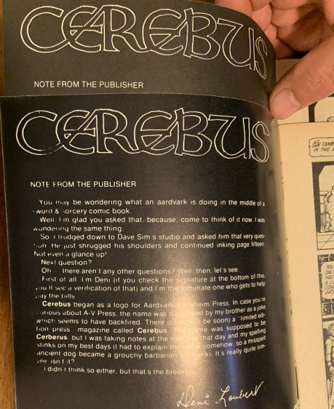
In my opinion, the legacy of Cerebus the Aardvark is more impressive than any other character from the era. Dave Sim’s comic ran for three hundred issues beginning in 1977 and ending in 2004. Indeed, Sim’s company, Aardvark-Vanheim, published more comics during the era than any other publisher. That said, most were Cerebus books, especially after his ex-wife Deni Loubert started Renegade Press and assumed publication of all non-Cerebus titles after their separation, beginning in 1984. However, this legacy has become complicated over the years.
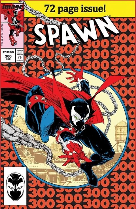
The length of the series is one of the most fundamentally impressive parts of its legacy. It is the only creator-owned title to ever reach three hundred issues, but this is about to change with Todd McFarlane’s Spawn scheduled to reach issue # 300 this August. Reflecting on his upcoming milestone, McFarlane recently told Comicbook.com that, “It’s saying, just like with what Dave Sim laid down to start with, that you can create a book and 25 years later you can still be staring that book and owning that book. That possibility exists. Dave Sim proved it, and I’m just gonna become another example of doing it and then you’re gonna see the Robert Kirkmans of the world probably go past my number. It’s doable.”
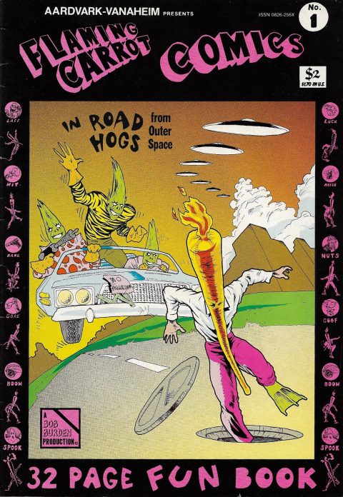
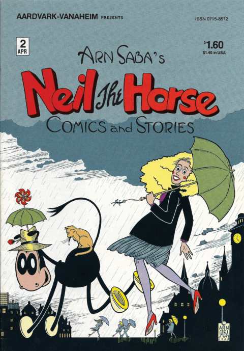
Just as incredible as the longevity of the title is the fact that Dave Sim caught lightning in a bottle upon the release of the first issue in 1977. The first issue quickly sold out and print runs for subsequent issues rapidly increased. The series was so popular that it inspired other creators to embark on publishing their own creations during the alternative comics boom of the 1980s. Prior to his separation from Deni Loubert, Aardvark-Vanheim was publishing several creator-owned comic books in North America, including Flaming Carrot Comics, normalman, Neil the Horse and Ms. Tree. Aardvark-Vanheim did publish The Puma Blues during the mid-1980s, but otherwise, the label focused entirely on Cerebus-related titles after Loubert left.
In 1987, Diamond Distributors decided that they would no longer distribute The Puma Blues to retaliate against Dave Sim after he decided that he would not distribute the Cerebus graphic novel “High Society” through them. The aftermath led to Sim banding together with several other creators (including Kevin Eastman and Peter Laird of Teenage Mutant Ninja Turtles fame) to create the “Creator’s Bill of Rights,” which was presented as a list of twelve rights. In retrospect, it is questionable as to whether or not this action had any effect on comics distribution.
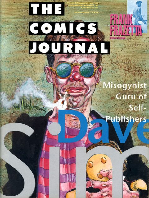
In the 1980s, Sim was one of the great stars of the independent scene, but he fell from grace in the 1990s. Perhaps the legacy of Cerebus would be different if Sim had not become embroiled in controversy with The Comics Journal in 1995. Issue # 174 of the publication takes Sim to task for alleged misogyny appearing in Cerebus the Aardvark # 186, where Sim (using the pseudonym “Viktor Davis”) characterized women as voids, “without a glimmer of understanding of intellectual processes.” The Comics Journal published the responses of numerous comic creators to Sim’s views, including Alan Moore, Steve Bissette, Deni Loubert, Seth and Chester Brown, with some expressing anger and others thinking that he was joking. Ever since the spectre of misogyny has followed Sim’s career. In 2001, The Comics Journal took Sim to task again due to an essay he published in Cerebus # 265 espousing similar views and in 2008, Sim notoriously offered an ultimatum that he would no longer engage in correspondence with people unless they declared that he was not a misogynist.
After ending the original Cerebus series, Sim published glamourpuss and Zootanapus from 2008 to 2012. After glamourpuss ended, Aardvark-Vanheim did not publish another comic again until 2016, with Sim revealing in September 2017, that he had a debilitating wrist problem that had left him unable to draw. In recent years, Sim has published a series of mini-series and one-shots, starting with 2016’s Cerebus in Hell, where he cuts and pastes images of Cerebus onto illustrations of Dante’s Inferno by 19th Century artist Gustave Doré.

Recently, Sim has found himself back in the news as a result of his relationship with Comicsgate figure Ethan Van Sciver apparently imploding after a Twitter user brought to Van Sciver’s attention that Sim had groomed an underage teenager to become a romantic partner during the 1980s. Van Sciver had announced that Sim would be writing the revival of his comic Cyberfrog but distanced himself from Sim after learning of the situation. Sim has made no secret of his relationship with the child in question in the past and anyone who is interested in this rabbit hole can read more about it here.
Regardless of how a person feels about Sim, it is difficult to separate these controversies from the legacy of the comic series. This is one of the caveats of collecting Cerebus. Sim still has a large cult following, highlighted by one of the more entertaining and long-standing fan blogs in comics, “A Moment of Cerebus.” At the same time, the series has long been neglected by comic book readers and I rarely meet fans or collectors looking for Cerebus stuff at comic shows. It has been fifteen years since the original series ended and an entire generation of readers likely do not even know who Dave Sim is. The fact that this series lasted for three hundred issues, inspired a generation of comic creators to attempt to maintain control of their works and that the 6,000-page series improves dramatically over the course of its run from an artistic and narrative point of view would normally have a long-lasting effect on collectability. Yet, mainstream collectors do not seem interested in the series outside of the first dozen or so issues and only the first issue is particularly sought after by collectors.
The most recent Overstreet guide positioned Cerebus the Aardvark # 1 as number two on its list of top fifty books from the American Bronze Age, nestled between Incredible Hulk # 181 and Green Lantern # 76. This places the comic well ahead of key issues such as Giant-Size X-Men # 1, Amazing Spider-Man # 129 and House of Secrets # 92. Whether or not the first issue of Cerebus deserves to be as high on the Overstreet list is a matter of debate among collectors. That said, the highest price ever achieved for the comic occurred in 2014 when a CGC 9.4 sold for $9,000 USD. In many ways, this seems really high. In other ways, this seems undervalued (and Walter presents a good argument for this in his 300th edition of his “Undervalued Spotlight” column from 2016).
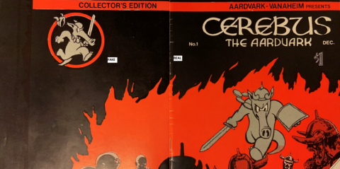
What makes collecting Cerebus # 1 especially difficult is that it had a low print run of only 2,000 copies (of which, supposedly, four hundred were so damaged by the printer that they were not sellable). It was also so popular that a counterfeit came to market in the early 1980s. The counterfeit is itself collectible now and is one of the few counterfeits that CGC is willing to grade.

The counterfeits would not be a problem if there was not as much misinformation about them on the internet. The tells are consistently debated on internet forums and some are easy to spot in person but difficult to identify if purchasing a raw copy online. CGC can easily tell the difference and I witnessed Dave Sim easily identify a counterfeit at his “The Last Signing” in Halifax nearly nine years ago.
My colleague Dan Bryantowich has spent a great amount of developing best practices for identifying the differences between authentic and counterfeit copies and presented his results on the CGC forums this week. Dan’s interest stems from an incident that happened a year ago when he ordered what he thought was a counterfeit from a dealer in the USA. What Dan received was actually an authentic specimen, but the seller thought that Dan was trying to scam him. The seller had relied on misinformation and Dan accidentally ended up with an authentic copy. Dan felt guilty about the situation but had little recourse because the seller did not believe him. I have scrutinized pictures of Dan’s copy and it is the real deal. Dan was able to purchase a counterfeit recently for the sake of comparison and many of the old tells are simply not reliable enough.
With Dan’s blessing, I am reprinting his results here in the hope that his research will form the definitive guide for identifying a raw authentic specimen online or in person. I am using his pictures for this exercise, but have reordered everything from most important to least important. Dan also identifies two possible new tells that have not been discussed before that I present at the end and which require additional research for confirmation of accuracy.
1. Inner Cover Gloss
This is the best tell because it is the easy to identify and is not as confusing as some of the other tells. Real examples have glossy outer covers but the inner covers have a matte finish. Fake examples have a glossy inner cover stock that matches the gloss of the outer cover:
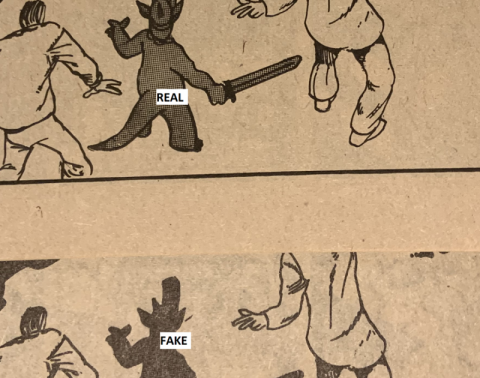
2. Darkened Screened Images of Cerebus
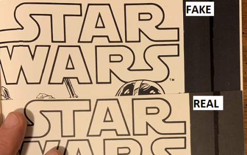
Most interior images of Cerebus appear darker on the counterfeit when compared to a real specimen. Some images almost appear to be a dark solid grey opposed to a screened grey. The best spot to check is on the “Dragon Page”:
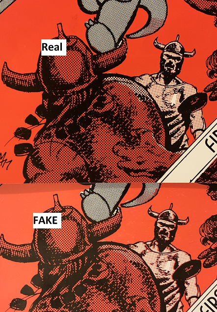
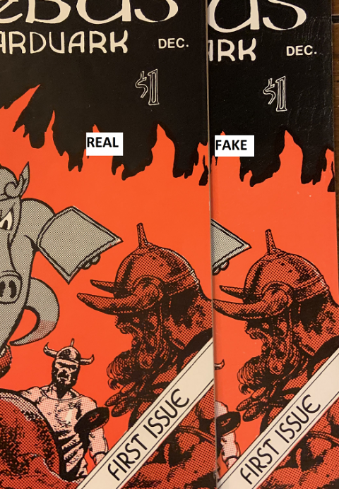
3. Screened red dots
This is a good tell, but it is confusing to the naked eye and is most easily identifiable when comparing an authentic and counterfeit specimen side-by-side. Online images may be blurry or produce patterns that obscure the image. The best areas to view the difference is on the front cover. Counterfeits will have extra red print in white areas around the black print in some places, particularly the upper shield of the red solider (located in the centre) and the chest of the white soldier:
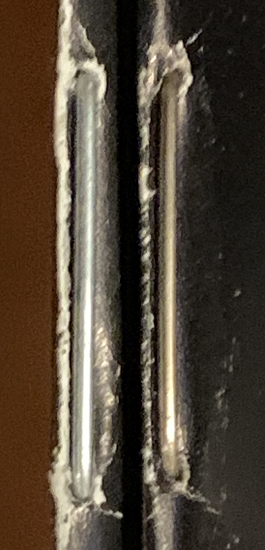
4. Staples
This is a great tell that was first published by Jay Kennedy in 1982. Real examples have bright silver staples and the staples of the fakes are bronze in colour. The caveat here is that staples can be replaced, which is why this is not higher on the list:
5. Red Hue on the Cover
Yes, the “red” on the covers of counterfeit examples is lighter than those of real ones. In some cases, the counterfeits look more orange than red. This is a good tell for looking at specimens in person, but online images and the conditions under which they were taken generally lack the nuance of this tell. Another thing worth considering is that the effect of fading from UV light may cause authentic specimens to look less red than they should, particularly if the specimen was a “wall book” at a comic shop for an extended period of time. Dan could easily distinguish colour differences between his copies but the difference disappears in his picture.
The following picture places a counterfeit book’s back cover up (on the left) directly alongside the real book’s front cover (on the right). It’s almost impossible to spot the difference:
6. Front Cover Print Quality
One of the most popular tells discussed on internet forums is the quality of the black print on the front cover. Many people assume that authentic specimens will look darker or muddier than the counterfeits. Although this is sometimes the case, this tell should not be used. Dan and I both concede that a healthy percentage of real examples do have muddier black print on the front covers, but many authentic examples are just a sharply printed as the “better” printed fake:
The New Tells:
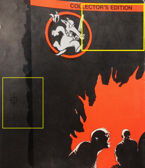
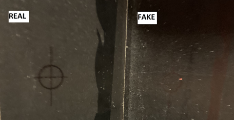
7. Phantom Registration Markings
On the back cover of authentic specimens, there is a noticeable black registration target mark and faint lines extending from the red title border into the black margins. This supports that the width of the book was extended with solid black print post-film/plate. The design should have ended at the red border. These marks also appear very, very faintly in fake examples but are printed in red not black and are difficult to spot to the point of not being there. As far as we know, Dan is the first person to report this. After identifying this tell, I have scrutinized images of a dozen known authentic specimens and all have the “crosshair” that Dan identifies.
Also, notice that Dan’s image has an older tell that we do not consider particularly significant: in his example, the Star Wars advertisement on the inside back cover bleeds through the back cover. This is not evident in the authentic specimen that my wife owns and should not be used as a tell.
8. Extended Cover Back Page Design
This is unconfirmed and requires additional research. Dan’s fake has a white line along the page edge of inner back cover. This likely has to do with front/back registration and the jogging/squaring of print stock prior to printing and cutting. There is a small chance that this white edge always appears on the back inner cover of all fakes. This could be an excellent tell, but until it is confirmed to exist on all counterfeits, please use this example with a grain of salt.
Finally, if you are lucky enough to find a signed raw specimen:
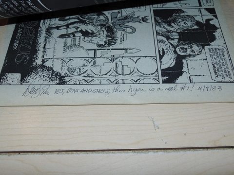
9. The Signature Tell
Although Sim has not officially signed books since September, 2010, he actively signed at events for decades. There are many raw authentic and counterfeit books that Sim inscribed during the course of his career. However, when Sim came across a counterfeit at an event, he would would forge a different comic creator’s name instead of signing his own (such as that of Neal Adams). On the other hand, Sim tended to write “real # 1” or some variation of this on authentic specimens, which he would happily sign. I do not have any examples of him forging a signature on a fake, but my wife’s authentic specimen is inscribed and signed. Consider this the luckiest of tells:
Regardless of how you feel about Dave Sim or whether or not Cerebus the Aardvark # 1 is overvalued or undervalued, the importance of the character and series transcends Canadian comics. Cerebus may be Canadian, but its legacy is not confined to our borders. The success of the series inspired creators to get into the business, to aspire to maintain control of their works and even today, with Spawn # 300 only months away, the series continues to have an effect on the comics industry. Any serious collector of the Canadian Silver Age should be interested in Cerebus and the first issue of the series continues to be one of the grails of the era. Thanks to Dan Bryantowich’s research, we now have what I consider the most definitive list of tells for identifying authentic and counterfeit specimens of the first issue of this important series.


Flaming Carrot rocks. Nice tip of the hat there for the A-V series brian.
As for the ‘bootleg’ Cerebus, I missed the first few issues myself but I never cared about all that stuff. I just want to read the stories and as a reader primarily I was happy to get the Swords of Cerebus books so I caught up there.
I do have a Diamondback card set though.
I love Flaming Carrot too, Jim. Since its not actually a Canadian book and its only ties to my research are the first few issues published by Aardvark-Vanheim, I could not resist throwing it in (who knows if I will have another chance?). The Cerebus phone books and the old Swords of Cerebus books are easily obtainable, so I agree that this is the best way to read the series, especially considering that collecting the first issues of the run can be difficult. I like the Diamondback card set, but I think my favourite piece of Cerebus memorabilia is the vintage plush doll. They don’t come up for sale often.
Sadly, Dave Sim’s character invariably intrudes into any discussion of his creation. His attitude toward women, whether deadly serious of just joking, has eclipsed his genius as a creator for quite some time and will probably continue to do so for years to come. Having said that, there is no doubt that his contribution to independent comics and creator rights has been a significant one. I think maybe now the most damaging aspect of his work is the continued milking of the character with his supposedly humorous paste ups over a Dore masterpiece. This work has done nothing to enhance his career accomplishment overall. It’s just a shame he didn’t let the character die a dignified death and leave it at that.
Thanks, mel. I agree with your synopsis. Separating an artist from his or her art is a fun thought experiment, but is impossible in reality because the two are never mutually exclusive. I think that Sim’s legacy has been tarnished dramatically over time (as a result of his own actions) and I agree that this will likely continue into the future. I am unenthusiastic about his most recent Cerebus work. At first, I thought that it was a fun idea, but it became very repetitive very quickly. It probably would have worked better as a one off, but there appear to be dozens of different issues available. Admittedly, I have not counted them all. My wife had been buying them here and there, but recently lost interest herself. It is what it is. What is undeniable is the significance of Aardvark-Vanheim and Cerebus for the Canadian Silver Age and comics more generally. I think it that it is worthwhile to discuss topics and characters of all kinds from the era I am researching, warts and all. Yet, I don’t want warts every month, so I have something different planned for July. I always appreciate your comments and interest, mel! Cheers, brian
Good lord! Choke! I just noticed that, in that foursome of pictures, the one on the bottom left, is it just me or does Sim look remarkably like Richard Nixon? Seriously!