It’s been said that when it comes to popular appeal of comics that “They come for the art, but stay for the stories.”
I’ll agree with that.
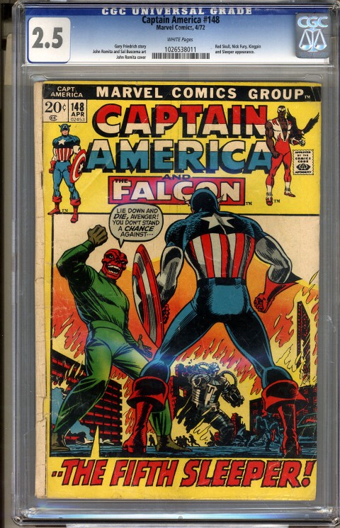
Classic comic art by Jack Kirby, Frank Frazetta, John Romita, Neal Adams, Jim Steranko, Alfred Alcala, Pablo Marcos, Jim Lee, Todd McFarlane, Tony Daniel, J.H. Williams III and many others is one of the reasons I’ve been a comic collector for almost 50 years.
But while going through my collection of more than 1,400 books I’ve acquired since 1967, I’ve noticed that writing is primary in deciding whether or not I keep a book or toss it.
For me it’s the story that matters most, not the art — as a rule.
If I don’t want to read it again and again, I don’t care what it looks like.
Flashy art without a good story in comics is the same as a Hollywood movie that is strong on special effects, but the producer forgot to hire a writer.
Does the first Hulk movie come to mind?
I believe putting story first and then matching that with good art is what is best in comics and not the other way around.
To illustrate my point, I’ll cite examples of great art work that is ruined by bad storytelling or good stories that struggles to overcome lackluster art work from the pages of Batman; the title with which I’m most familiar as a reader and collector, but I’ll point out some other examples as well.
One of the latest examples of great art, but a completely forgettable story would be Neal Adam’s “Odyssey.”
WHAT A PIECE OF JUNK!
Nuff said?
Yes, some great Neal Adams art, but the story didn’t make sense from issue No. 1 and it never got better. I really expected better from a comics legend and was disappointed to have to cancel the title after the second book.
Another would be “All Star Batman and Robin, ” a rewriting of the origin of Robin by Frank Miller. Of course, Jim Lee’s artwork is outstanding as usual. I read that book about three times and finally decided it was not good enough for my collection and consigned it to the dollar box at my local comic store.
I can say the same about “Batman: RIP” by Grant Morrison and Tony Daniel. Junk writing accented by some great art, but not worth the $10 I paid for the hardback on sale.
However there have also been times when a great story lost some of its potential when it was mixed with bland art.
As much as I loved “Batman Year One” and “The Dark Knight Returns” by Frank Miller, both could have been much better if the artwork has matched the story-telling. For me, the art in both stories was just too “cartoony,” although I consider David Mazzucchelli’s art in Year One to be superior to Miller, Jansen and Varley’s work in “Dark Knight.”
Yes, both are classics and near mint copies exist in my collection, but they could have been better. The recent animated movie takes the art a step further and is a definite improvement.
I’m often dejected by vague, bland art that has unfortunately illustrated some of the best stories Marvel, DC, Dynamite, Image and other comic companies have produced; probably because the artists were over-worked and rushed to put out quantity over quality. Of course, sometimes good pencils can be ruined by poor inking and that may be some of the problem in some of the examples I noted above.
Some of the best comic art I’ve ever seen can be found in Creepy, Vampirella, Eerie and other Warren magazines and more often than not the art is matched by great writing. The black-and-white format really brings out the penciling, which in some cases is incredible and preferable to color in many way.
But if I don’t like the story, the magazine gets tossed or not purchased at all; Frazetta artwork or not.
I think many great stories by Stan Lee, Marv Wolfman, Steve Englehart, Denny O’Neal, Miller, Bill Finger, Jeff Loeb, Grant Morrison, Chris Claremont and most recently, Scott Snyder, have proven that good story telling will sell better than flashy art or another pictorial masterpiece tied together by a story that no one remembers five minutes after reading it.
I’ve come to the conclusion that, as much as I love good comic art, it’s good writing that keeps me coming back for more.
Story content is what’s most important to me, not one-dimensional, flash-in-the-pan graphics.
Of course, I prefer both good story and good art that can be appreciated and passed on to coming generations of comic lovers the way we love a good Stan Lee-Jack Kirby masterpiece today.
Notice I didn’t say Stan Lee-Steve Ditko. Never did like the art on those early Spiderman or Doctor Strange stories.
I’m really looking forward to the upcoming Scott Snyder-Jim Lee Superman story.
Hope they don’t let me down.
P.S. Somebody please do something with Wolverine. I miss the little fellow.

mazz and miller art BLAND!!! Most would beg to differ but your opinion. Just would never think that would someone first examples of bad art. What is good than? wow
Well, would have to agree with the warren mags, but then the Ditko diss. I would go with Ditko over romita’s romance spidey anyday. Also jim lee isn’t all that.
Hey Grendel, When I compare Miller and Mazz’s art with Frazetta, Lee, Daniels, Adams, Alex Ross, Pablo Marcos, Alfred Alcala, Kirby and many others, it just comes out looking very bland and “cartoony.” Of course Miller is better than a lot of others. Compare Miller and Mazz to some of the work in the Warren magazines. Of course, like I said, some of the blandness in “Dark Knight” and “Year One” may be due to the inker, not the penciller. But my main point was not a comparison of artists, It was how much more important a good story is as compared to the art work. The most memorable stories, including “Dark Knight” and “Year One” is because of the story, not the art.
Hi Tom,
I don’t see a giant difference between the two. I think they are both very important to the making of a great comic. I want both. If I want just a good story I can go and buy a novel or read a magazine.
I agree with you story is very important. Let’s use one of the one of the creative teams you threw under the bus Lee/Ditko to highlight this point. Steve Ditko drew Amazing Spider-Man #1-38 and they were very popular. Why? It was the character and the story that we all loved. It certainly wasn’t Mr.Ditko’s artwork.
Most of the kids I knew at the time hated it, including me, but we still loved Spider-man.
Enter a new artist John Romita. Spider-man’s popularity goes orbital. Why? Did Spider-man change in some way. No. Did Stan Lee suddenly become a better writer and start writing better stories. No. It was because the writer and artist meshed perfectly and the
two created the Spider-man we know today. Let’s look at one more piece to push how important the art side of the comic book is and how it aids in the making of a great memorable story.
Fast foward to Amazing Spider-Man #42. The famous last panel where Peter Parker lays eyes on Mary Jane Watson for the very first time and has the great line ” Face it Tiger, you’ve just it the Jackpot”. Mary Jane watson is drop dead gorgeous and heard line literally smokes off the page. Great stuff.
Now lets have Steve Ditko draw that same panel and let his Mary
Jane Watson say the same lines. Same words. Same Character. I go limp just thinking about it. All of Steve Ditko’s women look like strung out 1930’s gun molls or school marms (aka Betty Brant).
The artist in this case completely changed the book by matching the writers intent.
Art is very important.
As a PS I also wanted to say congrats on this new column. I have always enjoyed your your contributions to the CBD forumn and look foward to more.
two created the definitive Spider-man
Enter issue #39 and John Romita
which most young kids saw as crude. Ifelt Mr.Ditko was miscast
Sorry about the dribble on the bottom of the PS. I thought I had erased that. Clearly I am not a writer!
I’ll 10-4 that good buddy. You just can’t beat a great story with great art. That is why I chose FF No. 48 as a perfect example. A Stan Lee-Jack Kirby masterpiece. I had provided some photos of bland art from “Dark Knight” and great art from “Creepy,” but they didn’t get posted. I may not have done it right. I agree on Ditko. I just don’t like his art. He’s better than I am, that’s for sure, but Romita beats Ditko any day.
Ditko was always my favorite when growing up……..
I thought the art in Batman Hush was too much, didn’t really care for the story either. If I had bought the issues each month instead of the TPB I don’t think I could have followed it.
I’m with you on most of that Owen. Overall I think Jim Lee’s art was good, but it seemed to me to be too many full-page, poster-type pieces and it seemed as if the story was written to fit the art and not the other way around. Overall, the art was the only justification for the book even being printed. I most definitely would not have even bought the book if I didn’t pick up a hardback copy on ebay for $10. As far as Ditko, he was good – very good – but I’m a fan of highly-detailed art, such as Frazzetta, Ross, Adams and Marcos and I guess it was just Ditko’s style that doesn’t appeal to me. Everybody has their favorites. He’s just not one of mine; although he made comics history and I have lots of Ditko in my collection.
I started collecting Marvel comics regularly in 1972 and my initial exposure to Ditko’s art was in Origins of Marvel Comics. As a kid, I really didn’t like his art, which struck me as rather crude, but eventually I came to appreciate it much more. Sure, Ditko could not have drawn a really beautiful Mary Jane, but on the other hand I’m not sure if Romita could have come up with Spider-Man’s struggle in ASM #33 to lift tons of debris he was trapped under — remember, Ditko was doing the plotting on both Spider-Man and Dr. Strange during much of the two years before he quit, and his quitting had absolutely nothing to do with a disagreement over who the Green Goblin was (Stan’s original plot for ASM #14 was for the Green Goblin to be an actual supernatural creature — a real goblin, but Ditko thought Spidey villains should be more down to earth and not include the sort of alien or supernatural baddies that were routine in Dr. Strange and the FF; only a few issues later, in the Goblin’s 2nd appearance, Ditko introduced the yet un-named Norman Osborne with the intent all along that he would be the Green Goblin). During the last several issues of his run, Peter Parker was becoming increasingly unlikeable, apparently willfully alienating himself from everyone — tending to reflect Ditko’s very private and objectivist outlook, while within Romita’s first issue, Peter and pretty every other supporting character featured softens up so that Peter & Harry actually become friendly and there seems a real chance of Peter becoming romantically involved with Gwen. Romita didn’t have the wild imagination of Ditko, but he made the characters, aside from the villains, look far more attractive than Ditko did. And I doubt Ditko could have created characters as nice and reasonable in demeanor as Robbie Robertson and Captain Stacy.