Earlier this week I posted some opinions on the hot market for Copper Age books so I thought I’d try to dig up a few and feature some splash pages, always trying to stay topical…
I found the colours a bit flat on all these issues, the early 80s seem to have this printing process that dulls the colours and gives the pages a slightly faded look.
This week’s winner has to be the Jimmy Janes and Bruce Patterson splash page to Marvel Team-Up #95. I looked at this page and had to flip over into the book and keep reading, Parker obviously doesn’t know the pretty blonde in front of him and he doesn’t know about those two henchmen coming up behind. Are they after him or her? I had to turn the page because I had to know! From July 1980.
I remember the Chuck Norris movie Good Guys Wear Black, it was a huge hit in the late 70s and Frank Miller drew on the pop culture to get our attention with his Good Guys Wear Red banner, Miller and Janson give us a great double splash action scene as well. From Daredevil #184, July 1982.
Holy cow that Bill Sienkiewicz run in Moon Knight was beyond trippy. Bill gave us pages and pages of some very unique and funky art. I remember when these issues were hitting the stands, some people didn’t know how to process this art and decided they didn’t like it. From Moon Knight #23, September 1982.
Again the dialogue on this splash page from Amazing Spider-Man #209 draws me in and makes me turn the page to see what she has to say, I know it will mean some sort of mission for Kraven. Alan Weiss does good work on the perspective here though I’ll admit this one is not my favourite this week. From October 1980.
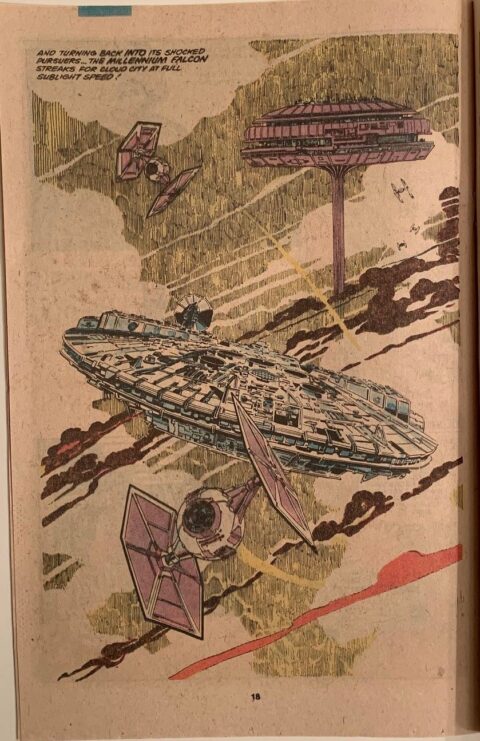
I first dismissed this Al Williamson splash page from Star Wars #44 but as I was filtering the pictures down to these five I found a lot to like on second look. It’s a very stylized piece with imagery that I’m familiar with thanks to my love of the movie. This scene would seem pretty sterilized and difficult to give character if you had to draw it but Williamson gives it this artsy style and makes it work. From February 1981.

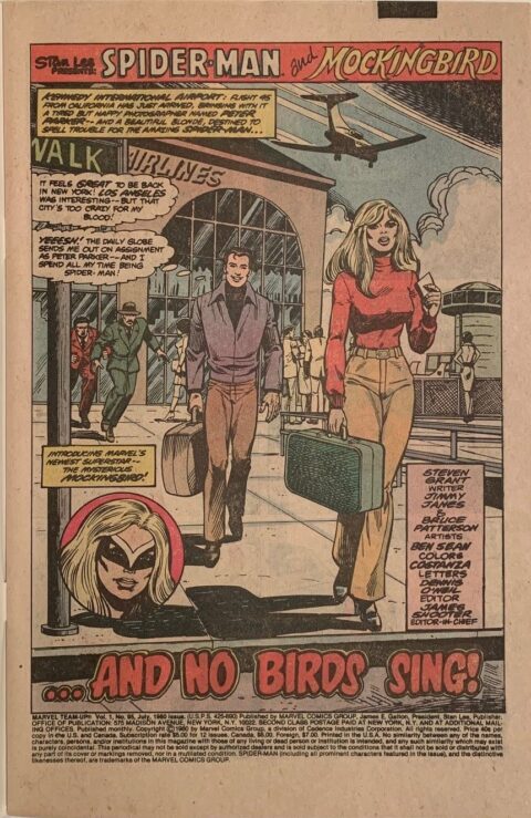
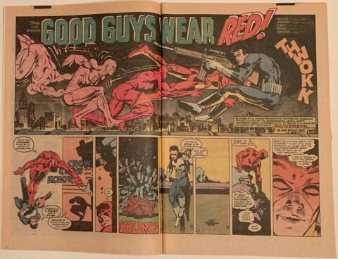
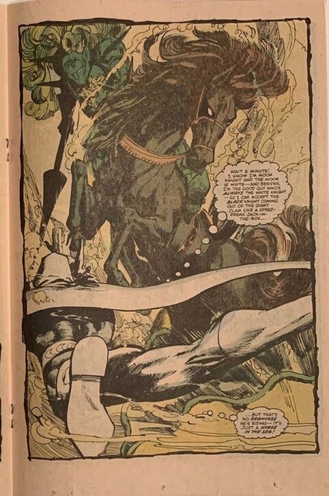
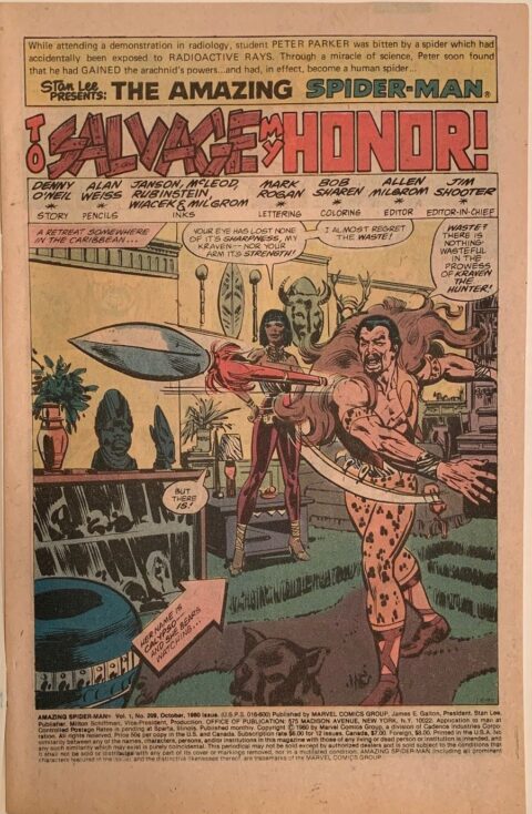
Hello
A couple nice splash pages. A couple were average. But I do have a question??? Why are they all from Marvel Comics?? I know their movies are doing well, but when it comes to comic splash pages other companies have them as well. Perhaps spread the wealth.
Even at my age I still buy new comics. Most all of them are DC, as they have better art and stories than Marvel does. I barely can even force myself to read a Marvel comic of today (poor stories and hard to follow art layouts).
Oh well, just my opinion.
Jeff Kepley
Hi Jeff, point well taken, I should have added some DCs, even a few Charlton’s I had lying around. I’ll try to throw a few up in the coming weeks.
Despite your DC discrimination Walt…these are all first rate splash pages, these look really good, but I have to say, a lot of comics during this period were printed horribly… I don’t know if it was the plastic plates coming into fashion or simply bad printers but a lot of late 70’s – early 80’s comics I do have are awful to look at no matter who the artist!
These are great pages Walt! Are there better ones, sure. However, it’s nice to see some pages, that I may not have seen otherwise.
The Marvel Team Up is fantastic. It just seems like we never get to see full backgrounds like that anymore.
Thanks!
Just like the stand alone non cosmic stories and villains are missing Chris, so are the backgrounds . I miss the comic days when runs were hundred of issues long, with stand alone and non cosmic multi part stores were inter mixed with continued next issue stories.. Another reason I stopped buying new comics.
Marvel team up, the Brave and the Bold, Marvel two,the Worlds finest, and one and more recently the JLA by Grant Morrison, Mark Waid, Great series to collect.
I still await Walts splash page for a Clasic Harvey Character not named Dick Tracey , Palooka or a Harvey Horror property.
Dave! Don’t get me started on the lack of stand alone issues….OR how everything is cosmic in the Marvel U. Even DC tricks people into mini series… Oh that mini series that just ended? Yeah… You need to read the next one to see what happens… And the one after that… And… And… And.
Kind of a muddy period, was it spread across all comics or just certain publishers? Inks, plates, vagaries of newsprint? Today’s comics seem the other end of the spectrum, oversaturated and over glossy. Neat splashes though. Thanks! I was thinking the other day about the Team Ups and What If’s as a collecting strain.
I recall that a lot was said about the muddiness of newsprint back then and a move toward better quality baxter paper was inevitably started.
Tim, an interesting collecting strain would ‘comic games’ issues.
Back in the early days of TBG (The Buyer’s Guide For Comics Fandom), writer and editor, Murray Bishoff, started listing comics featuring comic games, such as Neal Adams reversing the colouring of his number13 box in every comic he did, or other artists drawing themselves in their comics etc.
An offshoot of that could be accidental and on-purpose cover errors such as Marvel Two-In-One issue #1 reading Two-On-One up in the corner (an unfair fight, if you ask me), or Nova’s issues reporting ‘He’s Here!’ up in the corner of every issue except for the last issue, which reported ‘He’s Gone!’.
Klaus, good point re the move to Baxter around that time, there was a general lack of spunk on those early 80s colors.
So many cool collecting stains, we can practically make up our own, I think the errors on covers is quite active already.
Previously unbeknownst (I’ve always wanted to say that) to myself, I’ve engaged an interesting collecting stain, discovered when I was doing some re-bagging. Thusly – Canadian Price Variant (since that’s a big thing apparently) – check!, First Printing – check!, Printed in Canada – check! NM to M – check! Quadruple word score or what!!! Bonus points for full runs with Alan Moore and Kurt Busiek and others writing, art by Alex Ross and Chris Sprouse and others! Yeah, baby! Money in the bank, so to speak but not just yet… so to speak.
Yeah, I assigned the grading myself, un-slabbed or raw (is that the designation?) so sue me. ; ) Back in the mid-90’s apparently there was a big comics printing boom going on in Canada for Vertigo, Wildstorm, America’s Best Comics, Image etc. I had no idea, all of them blind buys online of comics that just appealed to me. Funny but true, don’t know what to term it though!
Jimmy Janes on Spider-Man? I didn’t know he did any work for Marvel. I remember him from his stint on Legion of Super-Heroes. His art was interesting, but rather awkward in some ways. I didn’t try to follow him, but I’m guessing he got better over time?
Sienkiewicz *was* very impressive before he got too stylized, but maybe he got tired of the Neal Adams comparisons.
And that Al Williamson splash is definitely great stuff. Glad you included it.