In Part 1 we looked at various criteria that helped to identify “quality” books as potential investment vehicles. In this follow up, we’ll examine some common traits that may, or may not exist as we continue the discussion with a look at some esoteric qualities. There’s a lot to cover so let’s jump right in.
Not too long ago, there was a couple of websites called hulk181.com and spiderman129.com that seems to have been taken down. From what I can remember, both websites were created by the same person, which consisted of a simple essay lauding the appeal of both respective books. One of the things that stood out for me was that the author attributed the success of Hulk #181 to its predominantly red cover. This caught my attention because, as a designer, I understood how colour can affect people. Indeed, there’s been lots of research done on this subject, with the findings used to help market products, as well as brand of companies. So while there is some validity to this premise, is the Hulk #181’s red cover really responsible for its success?

If we are open this idea, that we can be influenced by colour… lets just quickly address the concept of semiotics, which is the study of meanings. This is what makes art and media culturally important, and this is what anthropologist will eventually study about us thousands of years from now in order to better understand how we lived. As an example, let’s deconstruct the random image (above) I’ve selected from the TD WebBroker website.
What we see is a seemingly benign business image of a typical bank moment used to break up textual content and add interest to an otherwise dull corporate site. It’s a black and white photograph of three people. A young couple in front of female who we, the viewer, assumes is the institutions representative. Interestingly, three is a dynamic number that is often referenced in art, writing and even engineering. All persons are fairly young and attractive without looking glamorous, which illustrates the banks attempt to portray a certain degree of realism, but more importantly, their preference for their ideal audience. The bank representative is faceless, letting the viewer imagine what she might look like. She also signals that the bank is open to hiring and featuring a woman instead of the traditional business male. The couple looks to be successful, but not too successful since they require the banks assistance. The story here is that they are beginning their lives together and the bank can help map the way. The central placement of the white male establishes him as the more dominant person, reinforcing a traditional value as his smaller Asian female companion is doing the work in a somewhat submissive posture. He smiles approvingly as he is serviced by two attractive ladies. He doesn’t wear a tie and has some facial hair because he’s smart casual, which is probably how the bank also wants to be identified. The interracial couple is a response to the changing demographic or political correctness and it is the institutions way of communicating their open mindedness… but not too open because they take finance seriously…

I can go on but let’s stop here. People who are not familiar with semiotics are probably rolling their eyes and crying BS at this point. After all, the image above is probably a stock shot that was photographed years before the bank ever decided to use it, so there is no way all those messages could have intentionally been placed there. This may very well be TRUE… but, we are talking about sensibilities here. Trained and experienced creatives know what works, and what the client is ultimately looking for, even if the mandate is unspoken. As well, an image speaks volumes, whether the messages are intentionally placed or not. Consider that men wear suits to communicate stature and professionalism. Hugo Boss in particular adopts a box cut in order to emphasize the shoulders which helps to assert dominance. We pick up visual cues from body language and subtle facial expressions all the time. A squint of the eyes can be an invitation or a signal to stop. Messages don’t have to be intentionally placed because they already exist, even if it’s at the subconscious level. Architects speak of materials as feeling noble, evoking prestige. Sports cars are streamlined in order to look “cool”, which ultimately distracts buyers from thinking about the engine specifications or the build quality. The number one question most often asked when buying a car is… “what colour will you get?” There are unspoken signals all around us. In business, it is used to communicate the things companies want heard, much of which is non verbal but rather… tonal. Case in point, both Microsoft and Apple sell computer products and software but have very different identities. Over the years, there have been lots of debate as to which OS is better, but ultimately customer preference will be determined by who or what they feel most connected to. So, what does any of this have to do with the Hulk #181’s red cover?
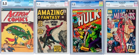
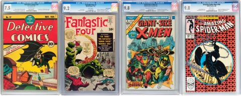
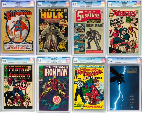
Red is a dynamic colour. It is passionate, aggressive and is the most dominant part of the spectrum, signalling importance. It is known for getting the blood to circulate faster, literally during tests. Red is also associated with strong emotions such as love, war and prestige or winning. As well, red is erotic and hot and is used to get attention whether it’d be on a stop sign or red lipstick. As the predominant colour on a cover, it should then come as no surprise that red helps to enhance and add excitement to an already dynamic layout. Let’s further examine this notion by lining up the big grail books from their respected eras (pictured above). When we examine these books side by side, indeed, there does appear to liberal usage of red… or at least colours from that part of the spectrum. However, comics by their nature rely on bright primary colours. Historically speaking, comics were meant for kids, they were printed on dull newsprint and a simplified or limited palette is what was need in order meet production requirements. And what of other “key” books such as Spider-Man #129 which has a yellow cover? How consistent is this among a greater pool of “keys”? Let’s take a look at the next set of “keys” (pictured below). There does appear to be a good representation of red in this set as well, even on books like Fantastic Four #1 and Giant-Size X-Men #1, which are considered to be white covers. Or, perhaps this is just a coincidence due to reasons already mentioned? No doubt, there will be lots of exceptions here… but let’s carry on.

2. Christina’s World by Andrew Wyeth, 1948. This celebratory image of rural life is contradicted by the woman’s thin arms, hands that appear to be clawing at the grassy field and seemingly unable to walk, creating tension and mystery to the idyllic setting.
3. The Kiss by Alfred Eisenstaedt, 1945. A U.S. sailor, who grabs and kisses an unsuspecting nurse, expresses the feeling of euphoria in America as World War II is declared officially over.
4. Afghan Girl by Steve McCurry, 1985. A portrait of young, green eyed Sharbat Gula at a refugee camp, who’s parents were killed during the Soviet occupation of Afghanistan.
5. Going Home by Ed Clark, 1945. A deeply moving image of Chief Petty Officer, Graham W. Jackson Sr., playing “Going Home” during President Franklin D. Roosevelt’s funeral procession.
6. Migrant Mother by Dorothea Lange, 1936. This image of Florence Owens Thompson at age 32 has become the embodiment of the Great American Depression.
7. Luncheon on the Grass (Le déjeuner sur l’herbe) by Édouard Manet, 1863. A controversial but innovative painting for breaking traditional rules by flattening space, portraying women as less than ideal and using a composition borrowed from a print by Raphael. An early example of naturalism or realism, while commenting on the French bourgeois society.
8. The Starry Night by Vincent Van Gogh, 1889. Van Gogh’s post impressionistic interpretation of the night sky was painted while in the hospital, leaving fans to speculate if this tormented painter really saw the world as he painted.
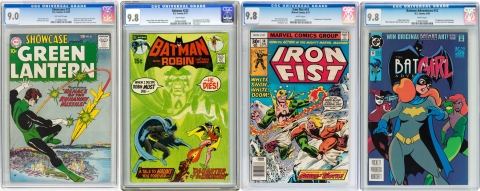
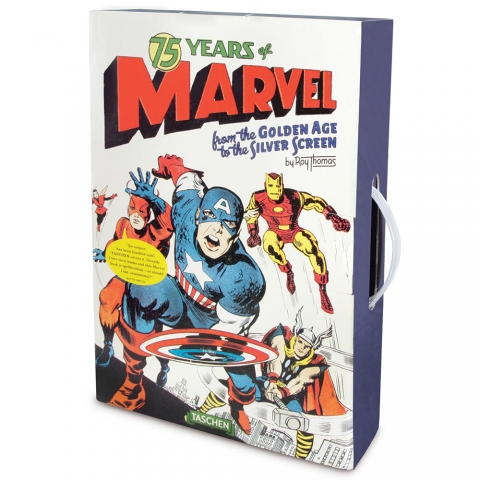
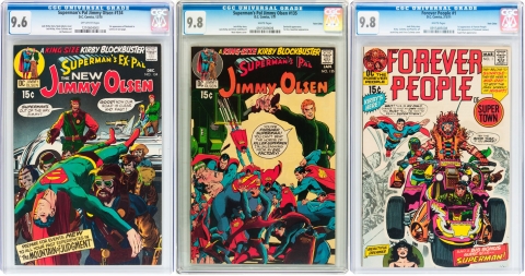
Do you recognize the images from montage above? Of course you do. You may not know the context or why these pictures are so revered but I’m willing to bet that most of you have seen these images before. They represent various moments in our history, and as such, the images above have been presented to us, over and over again, as the visual encapsulation of their respective time period. These images stir our emotions as well as inform, and over the years they have become… ICONIC. Now, lets take a look at some comic covers (presented below). Like the images above, these are very well-known covers, appearing in books about comics over and over again. They are continually referenced and are often made into posters, fridge magnets or put on t-shirts. Anyone who has even a peripheral awareness about comics will have seen these covers before. We can debate the reason why these particular covers have been featured repeatedly, but we can’t deny that these covers have also become iconic within the comic world.
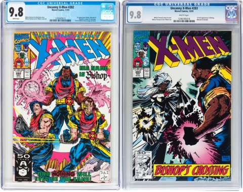
What constitutes an iconic cover? In virtually every case, the hero is the central figure, either large and upfront, or dynamically in action. In advertising, we have a term that we use, “the hero”, which refers to the product or the main idea. This is a term that is directly taken from comics in reference to the prominent depiction of the main character. This also helps to explain the markets preference for X-Men #282, which features the first cameo appearance of Bishop, over X-men #283, Bishop’s first full appearance. This seems inconsistent with the markets greater preference for first full appearances until you compare both covers side by side and realize that Bishop is portrayed more prominently, full frontal on issue #282.
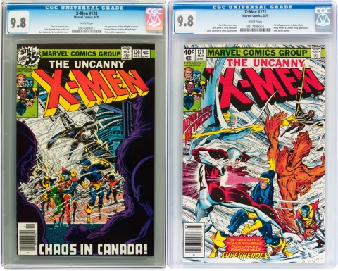
But what about Alpha Flight and Darkseid? Are these the exceptions to the rule? Perhaps they are, and there have been lots written about these books in the blog-o-sphere. Some have suggested that there are less copies of their respective cameo appearance in circulation, while others have rationalized that the dark covers make their cameos more desired. Dark covers will naturally display more flaws, like colour breaks along the spine, while light covers are more forgiving. Either way, the result is the same, which is less higher grade books available to the discerning collector. There is some circumstantial evidence to this effect if you compare the price differential between companion books Giant-Size X-Men #1 and X#94. Giant-Size X-Men #1 is a “key” book but X-Men #94 has always been able to keep pace and even surpass Giant-Size X-Men #1 at higher grades. However, this appears to be changing, which I’ll discuss in a future write-up.
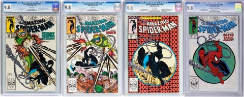
Even more perplexing is that at certain times, just before 2008/09 recession and at the peak of the markets comeback in 2014, Amazing Spider-Man #301 graded 9.8 would trade as much as Amazing Spider-Man #300. Why or how could this run issue command such a valuation? Simply put, being a run issue, there were less submitted for grading, resulting in less 9.8 copies available to collectors who wanted the four book McFarlane set from issue #298 to #301. But why would collectors want issue #301 when the Venom story arc basically ends with #300? The answer to this is on the cover. The cover of issue #301 mimics the cover of #300. Even today, #301 is still a $600 to $700 book, which seems ridiculous when compared to semi key issue #298, which only commands about $200 in 9.8. This is confirmed by the census numbers which shows:
#298 – 531 9.8 copies.
#299 – 580 9.8 copies.
#300 – 855 9.8 copies.
#301 – Only 108 9.8 copies.
Finally, let’s talk about the superhero movie phenomenon. I love superhero movies and I hope the studios will continue to make these films, which I suspect they will as long as there’s money to be made. I have benefited by timing the sale of certain books to their corresponding movie and I have also been burned for buying a book because of a movie appearance and holding it too long. Consider this, for every dollar I make from a book is a dollar out of someone else’s pocket, which would be okay if all books continue to appreciate… but not all of them do. In fact, many books revert back to their normal valuation, prior to being hyped up by movies. Older books tend to be more stable while modern books can fluctuate unpredictably. Thus, my final criteria is that the ideal investment candidate should be able to stand on its own, independent of movies or trends. Otherwise, it’s more gambling than investing. And yes, I do recognize the fine distinction here. If you miss the window, be prepared to take a loss or wait years for inflation to catch up.
Just a quick side note: Some people seem to think that the natural effects of inflation is a valid method of recouping a loss. Just wait long enough and you will get your money back. Nothing could be further from the truth. I have no idea why some people think this way but currency is devalued, little by little each year. A book may some day be worth more “dollars” eventually, but depending on how long you hold the book, you’ll only be able to buy half as much… or less, with the buying power from the proceeds greatly diminished. I’m not an economist but even I recognize that “money” has become separate from “wealth”. Consider when my parents were kids, they could have purchased about 10 comics for a dollar. When I was a kid, I was able to buy 2-4 comics for a dollar. Today, the same dollar will get you only 1/5 of a comic. The point being, if the money is just sitting in the bank or a book, at the current rate of devaluation, in 20 to 30 years it’s buying power will be less than 25% of what it is today. Need more proof? You can also look at home prices, education and a can of pop. Just something to keep in mind if you’re planing on waiting around for your book to come back.

Okay, now that I’ve thoroughly confused everyone, let me bring it home and sum it all up. I don’t actually believe that a red cover is an indication of a books’ invest-ability. However, the idea does have merit and I do believe that colour is part of a much bigger criterion that I’m trying to impress upon you, which is the cover design. While I don’t believe that a specific colour, by itself can have such a consistent impact, I do think that it helps to have bright colours in conjunction with a dynamic layout that features the main character prominently. A simple test you can apply is to ask yourself if a cover would make a nice poster. If you think it’s something that can be enlarged and people would enjoy hanging it on their wall, then the cover most likely meets the right design requirement. As well, take a close look at how and what the cover is depicting. You don’t have to be an expert on semiotics to decode a comic cover. Unique compositions, the cool factor, sex appeal, political awareness and a cover that pushes the boundary all make it desirable. This is especially meaningful to new books, which are published with multiple covers. If you have to make a choice, use the poster test in order to make your pick. Ultimately, we want to invest in a book with a cover that’s good enough be iconic.
In most cases, trying to determine a books investment potential is not a simple “yes” or “no” endeavor, but rather a nuanced exercise based on what the market holds dear. Despite all this, you can still get lucky with bad books or unlucky with good books so nothing is absolute, but a few lucky strikes does not necessarily make a trend. I was hoping to apply these various attributes to some specific books as case studies but this write-up ran long so perhaps I’ll save that for another day. My apologies for being so verbose but I wanted to be thorough. If you made it this far, thanks for hanging in there, and don’t forget to have fun because it’s probably the most important criteria of all to be engaged in this hobby.


Thanks for the thoughtful article from your point of expertise, Charlie and I’m glad you ended it the way that you did. Those who have read my own columns and my comments on other CBD columns know that I tend to see the investment side of comics as a side show to collecting and appreciating them (but I’m still willing eventually to cash in all those books I bought off the shelves and at second hand bookstores for a dime or a nickel each and make use of the profit). I agree that it’s important useful to understand how semiotics contribute to fiscal return in the marketplace but I would also want people to understand that this as a sort of mercenary and focussed use of semiotics, a concept and theory that stretches over many disciplines including, literature, the study of religion and myth, art, linguistics, music, and so on.
My question would be if time and socio-cultural evolution can make semiotics a sort of two-way street so that collectors, several decades removed from the original publication of a comic, impart or imbue that comic with a new set of semiotic sign posts coloured by the socio-cultural sensibilities of that later time. In this way, a comic, say a Superman No. 1 or Detective 27 have a cover designed and published based on certain semiotic impulses but, three generations later, may have a additional semiotic significance imparted to it that contributes to it’s collectability. For example, can we consider a comic encapsulated in a plastic case with a blue CGC (not CBCS) label and large 9.8 in the upper left corner as having a completely different semiotic aura than the original comic as published.
Anyway, just a stab at something. Thanks again for another CBD article worth reading.
Thanks Ivan. Signals are everywhere and context is everything when it comes to semiotics, which is also “key” to its ability to inform. The image from TD Waterhouse that I lifted will have a completely different connotation if the same image is used 100 years from now, or was used 100 years prior. However, if we are looking back on it 100 years from now, it holds many clues to our present day values, as do comics and other cultural artifacts.
Case in point, check out this racist Pears’ Soap ad from 1800’s:
http://www.aaanything.net/wp-content/uploads/2011/08/racist_pears_soap.jpg
It’s hard to imagine today that people could actually believe such claims but back then, but this was the mindset. Not only that, the laws, ethics and social standards of the time supported such ignorance. People believed that their way of thinking was correct… in the same way that people continue to stand by their current beliefs and no where is this more true than in geek culture. This is why critical thinking is so important.
I think the aura of CGC is good old fashion money. The large number in the corner indicates monetary value attached to it. This in itself is a signal and is consistent with our current value system.
This is interesting. BvS is one of two considered to be the worst film of 2016 by the Razzies:
https://www.aol.com/article/entertainment/2017/02/25/batman-v-superman-hillarys-america-win-razzie-worst-fil/21721713/
Is it any wonder that Ben Affleck wants out from being Batman (rumoured), while his little bro is up for an Oscar for his part in Manchester by the Sea (which I felt was overrated). That just adds to the pressure for WW to succeed.
On a brighter note, Namor may be back at Marvel and there is a production currently in the works, code name: Namor. Also, if Fox is producing X tv shows, what did Marvel get in return? Dare I say… the FF? The real win here would be the Surfer, Galactus and Doom. Fingers crossed.
I also think about New Mutants #87 as a modern age key with an iconic, hero front and center, bright red/orange cover (interestingly enough, it seems that there really are two distinct color versions which I don’t see any difference in value.) I wonder why this particular book has that variance.