The new DC logo is not being received very well but this is not surprising considering this is the age of the internet and people don’t always react to change very well.
For all intents and purposes, a logo is a symbol or mark that represents a company, product or service. A corporate or visual identity is the consistent application of the mark, often through systems that involve typeface, colour and other visual elements. Branding is the impression that is made, in part by identity systems, language and all other forms of communication, including behaviour. All this is a way of humanizing a company, product or service because studies have shown that people tend to trust the things that they are familiar with, so by applying human attributes to a business, the idea is that the consumers will be loyal to a particular brand. As such, organizations, groups and even ideas are given an identity with a personality that will resonate with their respective audience. It’s all very much like getting to know someone on the first date. You want to say the right things, dress the right way and behave in the right manner. Once the right mix of signals is established, a connection can be made.
However, all this is not an easy task. A lot of it is subjective and difficult to quantify. Focus groups, research and stats help to narrow the field of ideas but it does not necessarily guarantee an outcome. As well, people who develop brands are part of a team who works with the marketing team on the client side. Everyone has an opinion, everyone wants to be heard because everyone thinks they are right. In the case of comic books, it’s even more complicated because each character is a brand, the publisher is a brand, the retail store is (or should be) a brand. Even the writers and artist who have followers is brand. With so many layers to one ultimate goal, which is to sell more books… what meaning does DC’s new logo have.

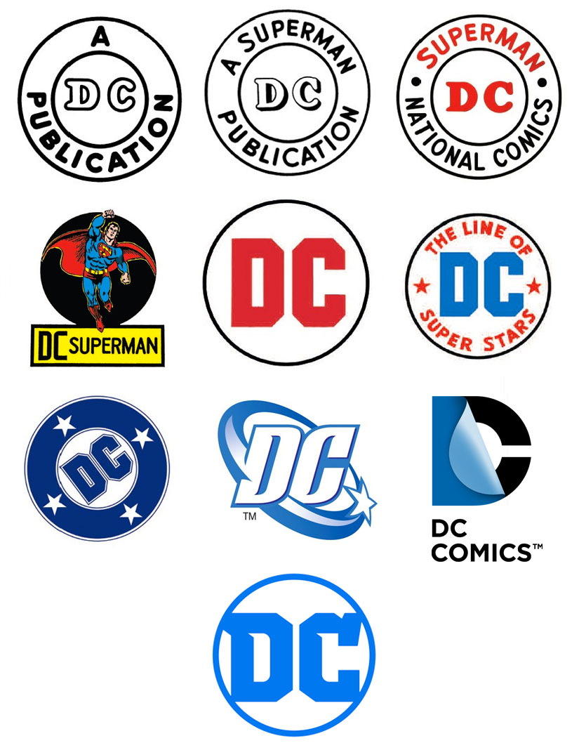
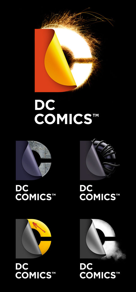
In a word; none. Some people will like it and some people will hate it making the whole exercise seem moot. So then, why would DC spend big bucks developing a new logo? These days, branding is often initiated by corporate restructuring. A new CEO will typically want to make their mark by signaling a change, resulting in someone like Marissa Mayer to spearhead the redrawing of Yahoo!’s new logo back in the summer of 2013. In the case of DC, it would appear that the publisher wants to draw attention to their upcoming “Rebirth” initiative. Considering their current logo signaled the launch of “The New 52’s” back in 2011, does this mean that DC plans to change their identity every time they reboot their universe? I certainly hope not because that’s what ad campaigns are for. A logo, identity or brand is much more fundamental. It requires time in order for it to be effective. DC may have a history of modifying their logos during the 1940’s but back then, their business identity was never really fleshed out or formalized. It wasn’t “designed” as so much as it simply responded to legal name changes. It wasn’t until 1976 that they had a modern crafted logo that was more than just an after thought, which lasted nearly 30 years. The subsequent “spin sports” logo lasted about 7 years and the current “peel” logo is getting the boot after just 5 years which is not a lot of time for an identity to be established. However, the good thing is that the complexity of the comic book brand landscape will work in DC’s favour in this particular case. People who read Superman, Batman and Wonder Woman most likely don’t care who the publisher is, let alone that their logo has changed, which is an argument that can work for and against introducing a new mark. It also raises more questions, like should the readers care about DC in the same way that many of us love Coke, Nike or Apple? Does it matter so long as the readers love and continue to read Superman, Batman and Wonder Woman? I would argue yes. As comic consumers, we want our stories, but the relationship could be that much stronger if we cared about who produced them. Differentiating from Marvel or Image is worthwhile but in a contracting market where print is becoming antiquated, admittedly, it’s a lot easier said than done.
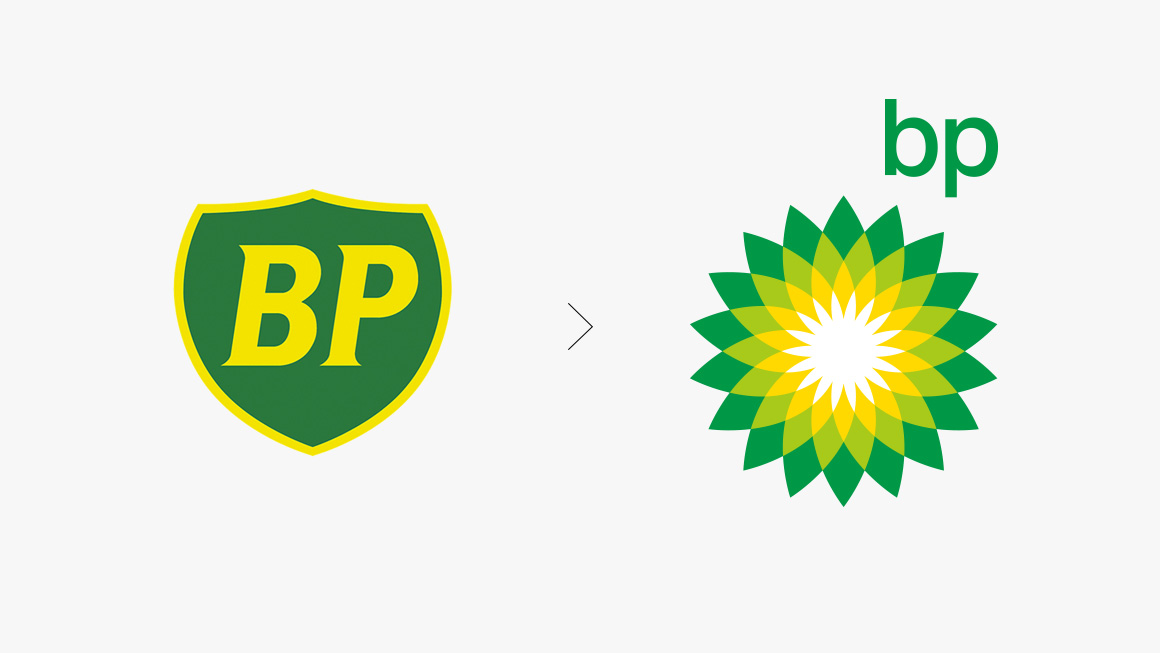
Landor help to change British Petroleum to “Beyond Petroleum”, presenting BP as green company that cared about the environment. Unfortunately, after the Deepwater Horizon oil spill and the irresponsible comments made by then CEO, Tony Hayward, this brand remains tarnished. Simply put, their behaviour was not consistent with the promise of being environmentally responsible.
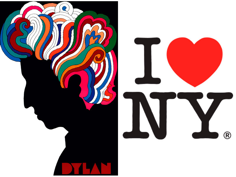
The other thing I wanted to note was that the 1977 “bullet” logo was designed by Milton Glaser. In the world of design, Milton Glaser is huge. Seen as a father figure, he would be the equivalent to say… Frank Frazetta in comics. He is best know for his Bob Dylan poster and was quintessential to 1970’s design era. The 2011 “peel” logo was designed by Landor, who is the current preeminent branding experts. A small San Francisco company that has grown to international status with offices around the world. As part of the WPP conglomerate, their client list consists of the worlds biggest brands and their influence is everywhere. The new logo was designed by Pentagram which is also another epic company. As a whole, they are more diversified in capability as a result of being a consortium of smaller successful companies. Some of their partners such Alan Fletcher, Michael Bierut and Paula Scher are already being written up in history books. It’s very exciting for me to have my two biggest interests intersect and it’s pretty amazing that DC is bringing in such heavy weight designers.

Saks Fifth Avenue branding program by Michael Bierut of Pentagram, New York. He takes the logo, cuts it up into tiles, which then can be reconfigured to create various patterns.
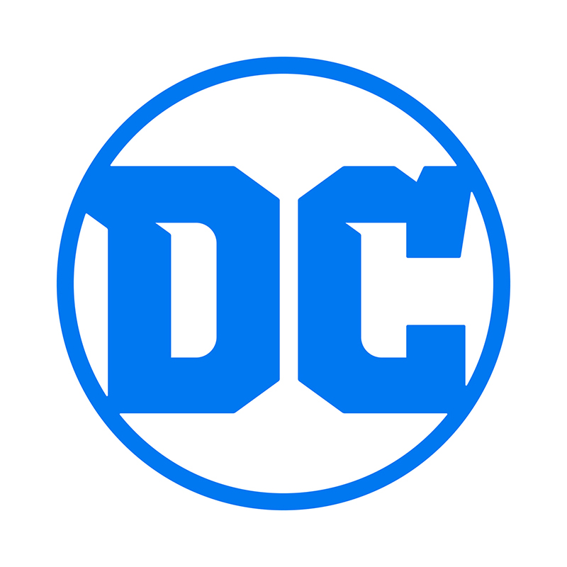
Personally, I never liked the “peel” logo it but I am disappointed that it didn’t get utilized to it’s full potential despite the initial promise and the incredible resources that Warner Brothers has. And like the “peel” logo, the new mark will eventually grow on people as they become accustomed to it. The new logo is much simpler and hearkens back to the more traditional circular form, which I think is a good thing. In a recent Instagram post, Jim Lee has tried to rationalize the design by stating:
“The nooks and angles are meant to evoke the Superman ‘S’, the Wonder Woman ‘WW’ emblem and the Bat logo.”
Maybe it does, but I wish it had a stronger message… one that DC could live up to. As it stands now, the whole exercise appears uneventful. Still, it’s a much simpler, graphic logo than the illustrative “peel” logo so the potential for this new mark to be used in exciting ways is there.
I leave you with some short videos by the late Hillman Curtis of Milton Glaser and the people of Pentagram. These films are artistic in themselves so I hope you enjoy them:


Nice examination! I scarcely noticed the “peel” logo and before you even mentioned your distaste of it, I was in agreement. I don’t like it and find it unclear and confusing, the last thing anyone wants a logo to convey. The potential for playing with it does seem huge as you eloquently point out, but it still must work on its simplest level–and smallest size, and it doesn’t for me
I have a marketing degree so don’t get nme wrong, I don’t have any prejudice against marketing people. But a consulting outfit helped encourage me to change our business name, which still makes some sense to me but customers mostly disliked or ignored, it. mostly they still just use my name (Bud Plant Comic Art became Bud’s Art Books).
But internally , my marketing director designed a new logo and it became a linchpin in a struggle that I almost lost my manager of 20 years over. He bought into the need for change, but for me the logo change was one step too far. I gave in, hated it, and switched back to my one-and-only original book-and-rose logo after he and my manager moved on. Amazing the importance what a seemingly small item can have.
The latest DC label does the job at least…iI like Glaser’s bullet but it might feell dated and certainly now the bullet concept is not a great one in today’s polarized world of opinions about guns. I had b
I had no idea of the big designers who created each iteration. Love seeing the progression, I want to make your examples a poster on my wall.
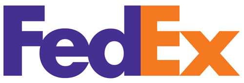
And I had no idea of the arrow in FedEx. Really!
If you have a business and you talk to someone in marketing, they’ll most likely try and convince you that you need advertising or a new logo because this is how they make their living. However, the trick is buying into the right solution. In the case of a logo, it should have the right balance of functionality, communication and aesthetics. Once this is established, stay committed to it and build on it because it takes time for people to associate the logo with your business.
As well, a logo never works in isolation. You can put on a nice Armani suit but if you behave badly, it won’t convince your date or people around you to be loyal. A nice suit or a nice logo helps to communicate your intent… but ultimately, you need to follow through and embody who you want to be, which is primarily determined by how you walk and talk.
Perhaps a modification of your “book and rose” design is what was needed. Equity counts for something, which is why many retail brands tend to take an evolutionary approach. The current “peel” logo concept is supposed to reflect the “peeling” of clothes or an identity, revealing the hero underneath. The problem I have with this logo is that it’s too highly rendered. Back in 2005 or so, Landor sent out an internal memo that logos no longer had to conform to traditional standards. While I understand that we live in a digital age and that logo’s will almost always appear in full color these days, I feel there’s still value in a traditionally constructed logo. A much simpler logo within a system that would allow for it to be “rendered” for certain applications seems like a better solution to me. But it’s a competitive market and “shiny, glossy” effects do help sell an idea. However, no properly trained creative person would issue such a mandate so I suspect the mandate came down from a sales executive. I think the new DC logo retains the equity from prior logos and will be a lot easier to use.
Bud, it’s an honor to have such a seasoned veteran of comics such as yourself comment on my post!
Well it is the first logo to give a sense of the product. Which is what it is supposed to do.
Good on the designer.
Hmmm… sorry about the videos. Looks like the account holder has decided to make them private all of a sudden. However, you can view them at the Hillman Curtis website, along with other well know designers such as Sagmeister, Carson and architect Daniel Libeskind who did the ROM expansion:
http://hillmancurtis.com/artist-series/
Charlie, Thanks so much for your additional commentary on my note. As I’m sure you know, a logo and even the name for a business often don’t get the attention they deserve when the business is small and new. To use my own experience again, I co-owned a chai of comic book stores 1972–88. We began as “The Berkeley. Comic Art Shop,,” “The San Francisco Comic Art Shop,,” etc. Bad, long names. But we wanted to sound classy so we swiped (our friend) Phil Seuling’s “Comic Art Con” phrase. Then artist Bobby London created an Illustrated.sign for one of the stores, “Comics and Comix,” denoting both regular and ”undergound” comics…the name stuck and all the stores, seven in the end, adopted the name. Our logo was somewhat forgettable.
You said it Bud. Unfortunately, that is how most businesses tend to get set up. Naming and design is at the bottom of the priority list, because it’s effects are not immediate. Most business don’t consider that they could expand, evolve and don’t really look ahead. Case in point…
Up here, we have a successful chain called “Canadian Tire”. Over decades, they have expanded their offering but have been unable to shake off the association from “tires” because it’s embedded into their name. For the same reason Apple dropped “computers”, that’s why “Amazon” is such a great name… because it has nothing to do with books. As such, it was easy for them to quickly expand to become an online retailer.
One could argue that Canadian Tire is still successful. True, but they are holed up in the discount segment of the market, competing only on price. Plus, they spend a small fortune trying to let people know that they have other stuff with taglines such as “There is a lot more to Canadian Tire than tires” or “There is a lot more for a lot less”.
I think in your case, you’re a very integral part of your business. Comics have become a commodity and resources are probably limited so an active positive public persona will help to create value and generate a preference. Nothing wrong with a practical approach. However, looking ahead… it might still be worth while to try and create a separate identity for you business so that you can sell it down the road. Even if it’s only $10k for the name… that’s still $10k for having built up some goodwill over the years, which you’re doing anyways. Cheers Bud!