As I am wont to do, I was looking at a random long box and this one happened to be the Mighty Thor. I have a good run from Journey Into Mystery #121 up which was, for me, when the run was really in full swing. The first thirty issues or so were standard superhero fare that didn’t really follow the Asgardians in all their Shakespearean glory. Thor fought such unworthy villains as The Cobra and Mister Hyde.
While I was flipping through the long box I stopped on Thor Annual # 13 from 1985. I never liked the cover of this issue which was done by Walt Simonson, but I remembered it was a stunning tale featuring Mephisto and Ulik the Troll.
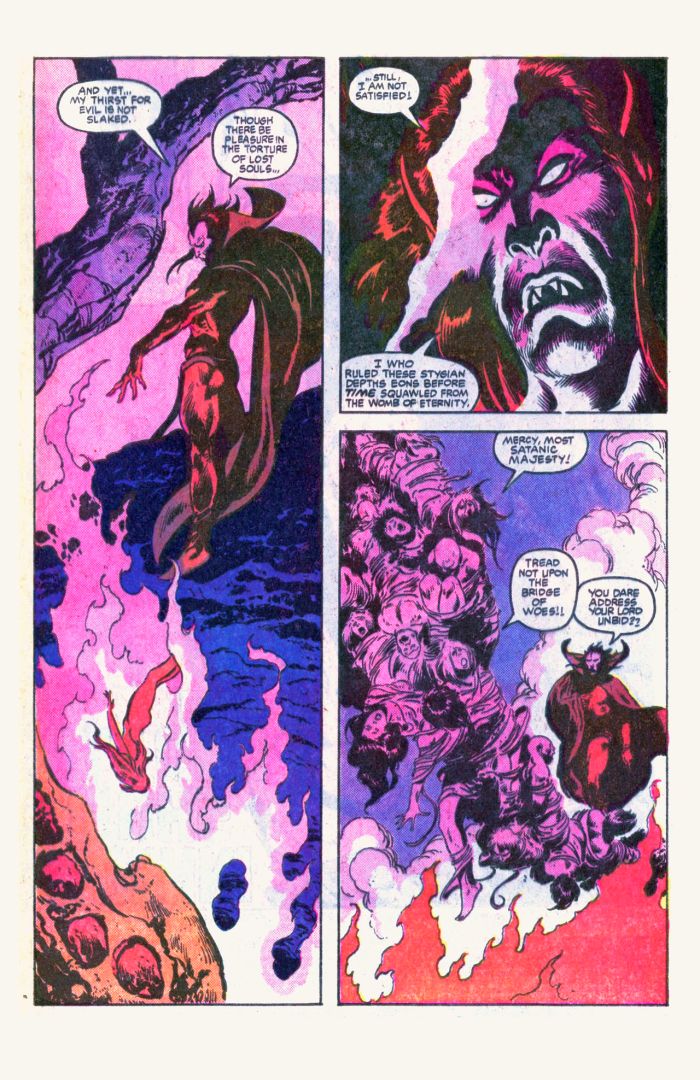
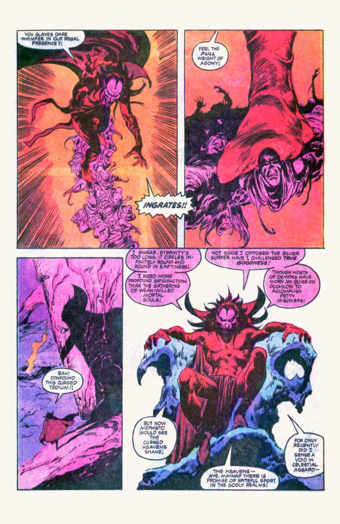
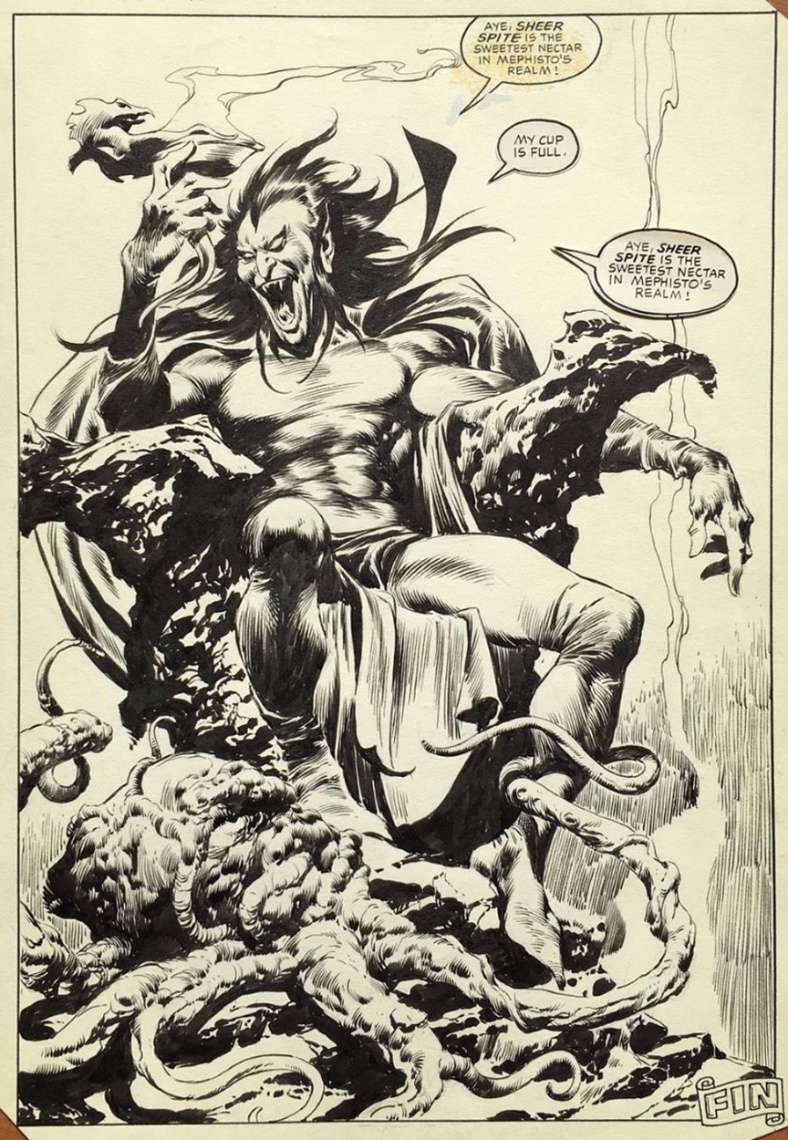
Now any long-time readers here know how much of a fan of the Silver Age artists I am and yes this is firmly in the late Bronze age but this issue is fully pencilled and inked by Big John Buscema! I have always been drawn to John’s work but especially when he inks himself.
This issue features Mephisto, which is arguably one of John’s greatest villains, that he created along with Stan Lee in the legendary Silver Surfer #3.
To be honest with you I never reread the story which was written by Alan Zelenetz, who I am not really familiar with, but the artwork just captivated my attention. The sheer villainy of Big John’s rendition of Mephisto almost left the scent of sulphur in the air.
I would love to see this in an Artist Edition format as the mid 80s art reproduction left something to be desired.
You can pick this book up for peanuts at your local comic shops back issue department for probably $10.
Artistically, it is a masterpiece!
Continued Happy Collecting!

Wow, stunning work.
It’s one of those books that gets overlooked.I don’t think the Walt Simonson cover did it any justice, and that’s not so much a knock against Simonson , it just is such a stark contrast to the interior art.
That Mephisto splash is simply out of control. I guess it might be offensive to Buscema-ites to say it this way, but the creature at the bottom gives Wrightson a run for his money, while Mephisto is unmistakably Buscema. I can see what you mean about his own inks. This contrasts with my feeling about Byrne (to add more offense), where I feel his own inking leaves the art looking unfinished. While of course Austin’s inks were brilliant, I thought Rubinstein’s inking of Byrne was near perfection.
Chris ,the “creature” at the bottom does have a Wrightson look to it, the eyeball looks like it has painful intelligence . I on the other hand like and amazed that he could actually do 3 monthly books plus sometimes.Now granted, some of Byrnes inking was a little rushed but some was amazing.One of my favorite inkers for Byrne is Bob Wiacek .Loved that artistic team!