Where Jack Kirby was explosive chaos, and John Romita beautiful women and great storytelling, nobody ever drew like Gene Colan. Before or since.
Gene’s artwork moved with a graceful flowing motion. His characters looked like members of your family, or your friend’s family. His mastery of light and shadow was exquisite in its flawless perspective.
One of the reasons I love the Silver Age so much (and the Golden Age for that matter) is that these guys were what kids today would call”old school”. You know what? I like old school. I like the fact that I can instantly recognize the penciller by his style. The way he draws hands for instance. The dynamics of his storytelling. The manner of clothing, or machinery, or shadows. These guys could draw anything: sci-fi, western, superhero! Anything!
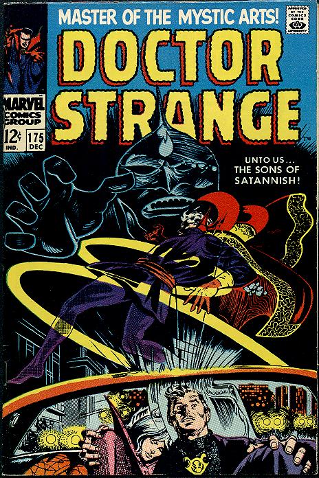
No one was better at it than Gene Colan. My first introduction to Gentleman Gene Colan was Dr.Strange # 175 “Unto us…The Sons of Satanish!” Take a look at the cover of that issue. There was no photoshop in those days. This was artistic technique! Pure Talent! Pure genius! From the vertigo inducing opening page taken from a view deep beneath the streets of New York. To a coven of pure evil. These guys were bad news and they were going after Dr.Strange and Clea.
I did not know the back story of these characters at the time, but because of Gene Colan’s artwork and the fantastic inking of newcomer Tom Palmer, this strip had a look and a feel that made it totally unique. No other comic book looked like this. Tom Palmer used zip-a-tone to enhance Gene’s use of shadows. Now zip-a-tone could come in all different sizes. The dots larger or smaller to give a desired effect, and it had to be cut and pasted in the areas you wanted to have shaded. The effect was like nothing I had ever seen before and it gave a type of photo realistic look to the finished artwork.
Gene layed out the panels on the page in a dizzying fashion that was an integral part of the storytelling process. Gene always worked in full pencils. He didn’t do breakdowns .This made him a lot slower than his contemporaries and it was a lifelong challenge for him to reach deadlines as a result. But boy was it worth it. And I don’t think I will get too many arguments when I say Tom Palmer was the best inker Gen ever had. Just check out their Bronze Age run on Tomb of Dracula.
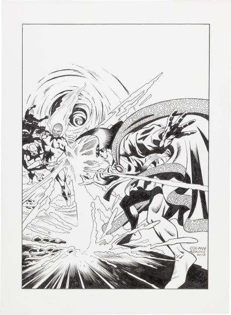
If you have never seen these Dr.Strange stories, I would highly recommend the late 60’s run in his own mag. It was a short lived series lasting from his debut #169 -# 183 but still to this day has some of the finest art and stories ever produced. Gene’s run started at issue #172 of which I have attached a picture of the original art that Dan Adkins recreated just shortly before his death (light Boxed from Gene’s pencils) earlier this year and hangs proudly in the Comicdenn.

My favorite artist ! The combo of Gene and Tom was amazing! I believe Gene was the sole artist on the 70 issue run of Tomb of Dracula.
Having come out of an artsy-fartsy school, I’ve heard all sorts of art-speak, but you seem to be creating a whole new vocabulary:
“His characters looked like members of your family, or your friend’s family”
I’m not sure who’s family you’re referring to but it certainly isn’t mine ^_^
“His mastery of light and shadow was exquisite in its flawless perspective.”
Light and shadow I get… but I’m not sure how it correlates to “flawless perspective”.
Personally, I was never a big fan of Gene Colan. His stuff looked too much like historical illustrations from my high school text book or a 70’s teen novel as opposed to “comic art”. It’s unfortunate that he was never really celebrated during his time. I think much of his current appeal stems from old timers waxing nostalgic, in the same vein as Kirby. Still, the best stuff from these guys were definitely appealing but there just wasn’t enough of it to put him par with the likes of Neal Adams or the boys from Studio. However, much of this is often determined by fashion, especially these days… so to each his own.
In any case, I think this is a great post and I would encourage you to continue doing an artist profile, at least once a month (or a week if so incline) and make it a regular feature. In particular, I would love for you guys to highlight iconic team ups like:
• Perez/Sinnott
• Byrne/Austin
• Miller/Janson
…Who’s individual style lends itself to enhancing each others work. God created Janson for Miller and Miller needs Janson, or else we end up with ink blots with toes and fingers on it like his Sin City stuff but justifies it by calling it “noir”. If “noir” means “lazy”… then okay, but it still doesn’t make the art any more attractive.
Do Bill Sienkiewicz next.
http://fuckyeahbillsienkiewicz.tumblr.com/
That’s right Ed.An amazing feat to say the least.And I think about 64 were inked by Palmer as well.Fantastic run indeed.
Charlie, I’m not sure if I should say thanks, or sorry .Thanks for taking the time to comment and thanks for sharing your thoughts.Sorry if I wasn’t clear in my comments.First of all, I agree that art is definitely in the eye of the beholder, to each his own.My comment about his characters looking “like members of your family”were that they looked ordinary, not fashion models, but ordinary people.All ages and sizes but with that certain something that seemed familiar.Take characters like Harold H. Harold, or Walter Lawson,Raj in TOD and Quincy Harkness or Dr.Stephen Strange, they all looked natural.Like regular people.Regarding “flawless perspective”, I was talking about the light source and how the shadows fell properly.Unlike “ink blots with fingers and toes”.You may be right about us oldtimers waxing nostalgic as well,but I certainly won’t apologize for that.This hobby is all about nostalgia in many ways.You are only 10 once ,but no matter how long you live you carry that 10 year old with you, and I often wonder if enough 10 year olds are coming into the collecting hobby anymore with so many books written to an older”darker” audience.Glad you are enjoying the post!I am enjoying writing it as well.