The Top Ten WECA Covers
A recent movement that has risen to the surface in comic book collecting seems to be a focus on impactful covers—especially impactful golden age covers. This focus can, of course, overlap with other collecting strains such as Good Girl Art (GGA), Keys, Seduction of the Innocent (SOTI) books, Nazi covers, runs of a specific character, title, artist, etc. Take a look at Walter Durajlija’s recent pop-up column “Covered 365” that suggests a great cover to match a specific issue number for each of the 365 days of the year.
In the context of cover collecting, I also need to mention the fairly recent trends in collecting variant covers. These include variant international covers, newsstand pricing variations, and the millennial trend for multiple variant covers (including sketch covers) for a given single issue. Cover collecting can even target factory-produced anomalies such as multiple (double or triple) covers and colour variance covers as well.
In this column I want to put forward some personal candidates for the most collectible covers in the WECA comic set (Canadian war-time comics 1941-46).
However, the irony is, that with the limited number (approximately 780 or so) issues that comprise the WECA comics set, compounded by their scarcity, collectors of these comics tend to grab them up whenever they can and don’t really enjoy the luxury of collecting any sort of subset. Also, if you look at the first thirty or so selections that Walt has made in his column, the thing that, above all, contributes to making a great collectible cover is the subject matter—the content. The more sordid the gore or depiction of female sensuality (GGA), the better. To a lesser extent, but still among the most popular, are political covers depicting Axis and Communist enemies in combination with American patriotic themes or just stand-alone American patriotic themes altogether. A tier below these are covers without the exaggerated energy of the previous themes. These are covers which are desired for their aesthetic merits as based on composition, colour, and draughtsmanship—they often bear some well-known signatures such as L. B. Cole, Lou Fine, Will Eisner, and Frank Frazetta.
Canadian war-time comics were generally devoid of the pronounced luridness of some of the best golden age American covers. Our books were generally toned-down, beige counterparts of the hype and energy of many of their contemporary cousins from below the border. We can find a number of Nazi covers (there was a war going on after all) and one or two covers that seem to be approaching Good Girl Art status. The best I can offer here is a subjective suggestion of some of the candidates that might be considered as the most collectible covers of the WECA period. This is a personal gallery of ten great WECA covers set in my order of preference and is meant as nothing more than a starting point for further debate and discussion.
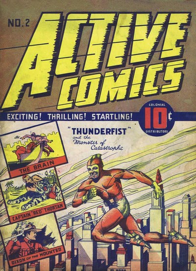
No. 1
When you talk WECA covers, you have to begin with the Nelvana compendium issued in the summer of 1945. This iconic, Dingle illustration serves as a totem for all WECA comic collectors. The central image has appeared on a Canadian stamp and the character was the inspiration for the name of one of Canada’s most successful animation companies (see here). This comic and this cover have to be one of the most sought-after items in the WECA collecting world.
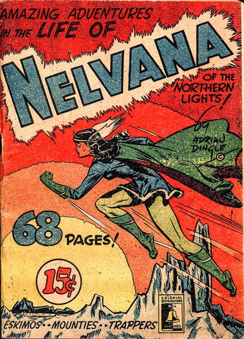
From the feminine force of her leading fist to the ballet grace and elegance of her flight pose, this Canadian demi-goddess was more Mary Marvel than Wonder Woman. The gradient aurora in the arctic sky of the background echoes her source of powers and Adrian Dingle’s stamp of copyright below his signature on her cape emphatically states how important the character was to him and points to the future he hoped she would have. You can almost hear Wagner’s “Flight of the Valkyries” as she arcs across the barrens to save Canada and the Inuit peoples from some Axis menace. I’ve never really figured out what those two wisps attached to her headband were. In early issues they’re clearly wings or a feathered headdress of some sort. She has them when she returns from her sojourn in Glacia in Triumph Comics 18, but after she takes on her secret identity of Alana North in Triumph Comics 20 she doesn’t don her fur-trimmed mini-dress and cape until issues 30 and 31 of the title, and the ‘feathers’ are missing there as they are in her full-colour erstwhile revival in Super Duper Comics No. 3 in 1947.
No. 2
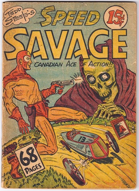
For my next most collectible WECA cover I have to stay with the same publisher and even with the same compendium-themed batch that came out in the summer of 1945. This time it’s Tedd Steele’s Speed Savage compendium. This one is slightly lurid with the death-skull and boney finger pointing to the number 13 race car on the track while Speed, as the ‘White Mask,’ straddles that track with Kirby legs and pops off a shot in the spectre’s ear. This is a dynamic cover and its swirl of motion is perhaps its greatest strength. As time went on after the comics, Tedd Steele moved more and more away from his illustration and tried to concentrate on his storytelling and writing but with this 1945 compendium cover he hit his illustration high watermark.
No. 3
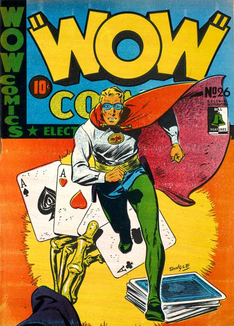
Not ready to leave Bell Features yet, because my next cover on the list contains the image I chose for the cover of my book Heroes of the Home Front. It’s Wow Comics 26, again with a Dingle cover that shows Gerry Lazare’s character, The Dreamer, sprinting out towards the reader with his cape unfurled. The background, which adds the metaphoric element of menace and evil that is The Dreamer’s constant nemesis, sports a skeletal death’s thumb and fingers holding a pat four-aces poker hand. This cover makes you want to find out what’s going on inside and who that costumed guy on the cover is. I settled on this ‘coming-at-you’ Dreamer image by Dingle for my book front cover over his better-known flying Nelvana because it was a little more obscure and, for me, a little more directly impactful.
No. 4
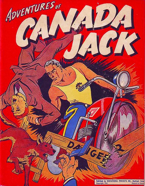
For my next great WECA cover suggestion I jump to Montreal’s Educational Projects and their best draughtsman, George Menendez Rae. It’s another 1945 book and another compendium—this time the Canada Jack compendium. This is an explosive cover with the main character bursting out of a red background on a motorcycle and through a road danger sign. A crook and part of another crook, along with CJ’s German Shepherd sometimes sidekick, are choreographed into the whirlpool tumult around the explosion Canada Jack has punched through the front cover. Educational Projects and Menendez Rae showed what they could really do with this cover. It’s a shame that the company folded just a few months later.
No. 5
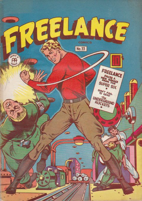
Rounding out my suggestions for the top five collectible WECA covers is Ed Furness’ image for Anglo-American’s Freelance 33 with its iconic, fist-swinging hero in jodhpurs levelling a neo-Nazi trooper in the middle of an enemy munitions factory. This book came out in the late-summer of 1946, the final year of our WECA comics, and the war had already been over for a year. That’s a faux-swastika on the trooper’s armband. Note also that there were American printings of these late Anglo issues done in a Cleveland plant and the covers of these American printings are slightly more washed-out in appearance to the Canadian printings. Here we have a cover that best depicts the All-Canadian hero (whose origins weren’t really Canadian) levelling an enemy threat to Canada. It’s the pendulum of his fist anchored in that firm jodhpur stance that makes the image. This is cover is really just an increment below that iconic depiction of Paul Henderson scoring the last-minute winning goal against the Soviets in the 1972 Summit Series.
No. 6
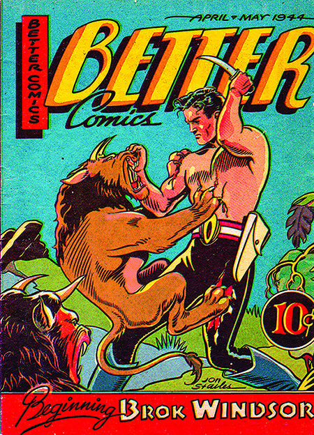
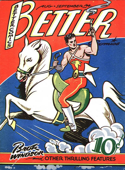
It’s hard to believe I’ve gotten this deep into the best WECA covers without stretching out to the west coast for a Maple Leaf book and a Jon Stables cover. Well, the next suggestion on my list is, in fact, the cover of Better Comics Vol. 3 No. 3 which contains the origin and first appearance of Brok Windsor. The run of Brok Windsor in Better Comics is among the best-drawn series in Canadian comics and this cover, features a hero who looks like a Canadian combination of Tarzan and Flash Gordon in a life-or-death struggle with a pair of weird horned lions. It’s a cover that has a dynamism and tension that would make me pick it up first out of all the other issues on the rack or the newsstand. Stables always produced great covers, and this was probably his best.
No. 7
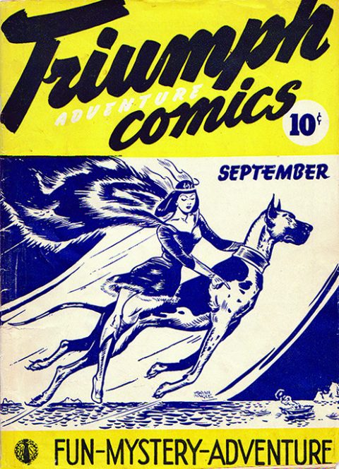
Some of you may have noticed that the covers I’ve suggested so far belong to the latter half of the WECA period, that is from 1944-46. For my next suggestion, I go back to that first year of these war-time Canadian comics, just a few months after the Canadian comics ‘Big Bang.’ My next candidate is the second issue of Hillborough Studio’s Triumph-Adventure Comics which features Nelvana’s first cover appearance and her second appearance overall. This issue has the same cover date, September 1941, as the first Commercia Signs/Bell Features comic, Wow Comics No. 1. Here, Nelvana is not the flying female fist she is on the 1945 compendium mentioned above. On this cover, she is more ‘demure and ladylike,’ elegantly sitting side-saddle on the back of her brother Tanero in the form of his Grate Dane avatar. Her downcast eyes signal an additional modicum of modesty, though if you follow them down through her extended index finger, you see that she is simply pointing out an enemy vessel. Strangely, her cape here looks more like a remnant from a bear skin than the cloth one she usually has. This only a two-colour cover, but it has tremendous eye-appeal.
No. 8
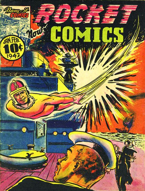
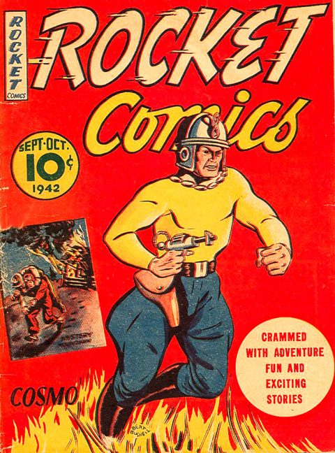
The next cover I’d suggest is the first Rocket Comics cover though its indicia shows it as Rocket Comics Vol. 1 No. 2. This comic is dated Jan.-Feb. 1942 and was the result of the contest in Name-It Comics Vol. 1 No. 1 to give the new title a name. The featured character on this cover is Spike Brown’s creation Cosmo and the unsigned cover is probably drawn by him. On the cover, Cosmo deals a meteoric, glancing blow to the bridge of an enemy battleship and skims by an astounded crewman who is bathed in the glow from the explosion and from Cosmo’s defiant ‘look what I did’ grin as well. This is the sort of subtle propaganda and spirit boosting cover that Canadian kids growing up on the home front in the middle of a world war could lap up.
No. 9
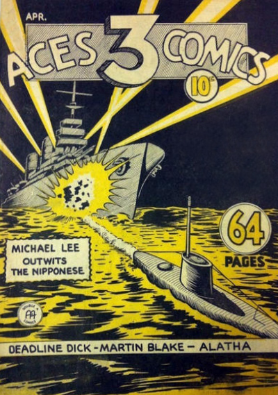
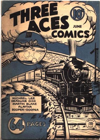
My penultimate suggestion is another early WECA book that appeared on the stands just a month or so after the previous cover. It too is a battleship cover and belongs to Anglo-American’s Three Aces Comics Vol. 1 No. 4 from April 1942. This is a stark two-colour cover depicting the open-water night encounter of two war vessels. It is impactful in its simplicity. It’s not made clear which of the two is the enemy war machine, but a surfaced sub in the foreground is connected by the cylindrical wake of a torpedo to the exploding hull of large battleship that has just come over the horizon. The battleship’s searchlights are slicing up a starless sky and make the surface waves glisten. No people, no superheroes, no insignias or flags… just metal and water. This may not be the choice of many, but I think it deserves a place in the top ten.
No. 10
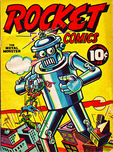
My final suggestion is from the Pacific coast and Maple Leaf Publishers again and it’s from right in the middle of the WECA period. It’s the great robot cover from Rocket Comics Vol. 2 No. 2 from May-June 1943. This is a fun cover that depicts a giant robot wreaking Godzilla havoc through a city scape. It’s wonderful 1940’s kitsch. The robot menace is more Wizard of Oz Tin Woodsman or basement boiler than the cgi stuff we’ve become accustomed to, but it is knocking buildings over and looks like it could pop one or two of the humans it’s got right into that grill just below its steaming nostrils. This is a classically simple golden age cover with all the elements, the flat primary colours, the masthead, the background, the central image, and the price container working together in just the right way. You want to have a photo taken of yourself reading this book to show that you are into golden age comics.
Well, those are my personal and therefore vulnerable suggestions for the top covers from the WECA era in the order I prefer them. I welcome readers to share their own personal preferences and their own sequencing. Only one or two collectors I know might have all of these. I am lucky enough to have three of them and aspire to get any of the others that might come my way without having to remortgage my house. Let’s also keep hoping that more of these WECA books come out of the woodwork in the year ahead.
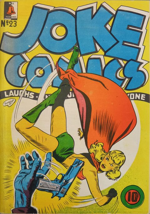
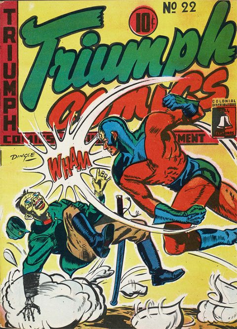
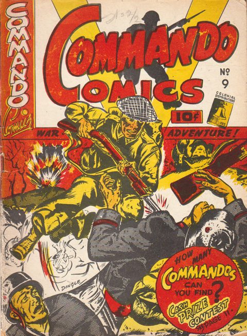
Below is a selection of a dozen other stand-out WECA covers that could easily merit inclusion in the above top ten with their individual arguments.


Great article Ivan.
Thanks very much, Vince. Hope you spotted a couple of elemets you could swipe.
Great fun! And several covers completely new to me. I think your #10 robot cover should be higher on the list, it’s one of the best. Glad to see the later Anglo-American issues here. I particularly like these, as I just mentioned in a posting of your article to my Facebook page. I am ignorant of the Cleveland printings of these…I thought they were all done up north. How do you indentify these, other than the washed out covers? More issues for me to try and upgrade…*sigh* But I will take WECA books in ANY condition if affordable. Nice work…glad you added the “almost-made-it” covers too.
Weren’t you thinking about a Gerber Photo-Journal style collection of covers? …I mention it eagerly…I think that could be a real eye-opener for collectors who still know little about the books, and a great source for everyone else, even if you never buy an original issue. Gerber’s book profoundly affected the U.S. market and created a huge surge in interest for key and themed covers, as well as little-seen obscure titles and issues.
Gerber was the ONLY way to see so many covers until the internet came along, and I still use it for a handy quick reference. But I admit Grand Comics Database has almost replaced it for me. I hope that isn’t telling about a print version for you…I still insist there is a place for one, just like there is for your printed WECA price guide. Overstreet remains indispensible in its print version, far, far easier than looking online.
Looking at that BING BANG cover I was struck by how much that kid getting the spanking resembles a certain president right down to his pouty expression and that ridiculous unruly blonde hairstyle … BTW, those women on the cover wouldn’t be Russian, would they? … :/
Ivan, as always super high quality and interesting. As a nearly total outsider to Canadian Whites my one comment would be that I think your choice of covers is strongly influenced by the meaning of the cover rather than simply an “objective” evaluation of the cover. I am going to be my usual heretical self and argue that the Nelvana cover looks more like a decorative poster than a comic book cover. No question it is a very cool piece of art, but I would argue that choices 4-6 are more what I think of for a great comic book cover. (For originality and composition I am really digging Canada Jack.)
I have to thank Bud for his comment because it got me to revisit GCD. I had tried to use GCD for the “Covered, 365” exercise but I had been searching incorrectly, and I was just getting back a gazillion links. Bud’s comment led me to believe there must be a way to get Gerber-like results from it, and sure enough… My current search method has been to search both Heritage’s sale archives and ComicConnect’s inventory database, which is pretty good (probably 80% coverage of covers worth considering), but GCD will certainly be better.
And to further follow on Bud’s comment, I think there is no substitute for print. Maybe in the future with a super-fast internet and flexible, paper-thin, ultra-high-resolution screens we will get close, but today we are nowhere near. The two tools are now very complementary and should be viewed as such. I guarantee you that I can get to a cover that’s in Gerber faster than you can find it in the GCD, and I can immediately look at the covers around it, get some sense of whether it is a cover typical for the style of the series, whether it features an unusual character (e.g. to the uninitiated, you might not expect so many Hawkman covers in “Flash” Comics). I can also randomly peruse and observe things or come up with questions – using GCD you generally are going to have to have some idea of what you are looking for already. Yes you could probably build a GCD query that would return something like Gerber onto your screen, but how would you know you wanted that in the first place? And the tedium of “flipping through the pages” in the GCD results is orders of magnitude slower and more difficult than doing this with the printed version.
Another key advantage of print is the editor. GCD has no filter, so to the neophyte the difference between Nelvana and Big Giant Comics might not be well-understood. Gerber is a compendium, but there was a lot of editorial work as well, and also the intro material which I still find valuable thirty years later. I think a print Gerber-like compendium that focused on relevance with some commentary rather than 100% inclusion would really be something. Get to it.
Bud and Chris, thanks for your encouraging comics and for supporting the need for a Gerber-type collection of WECA covers. Bud, the more I see that Robot Rocket Comics cover the more I like it and perhaps it should be higher on my list. Chris, I relied on my memory for the WECA covers I liked best and reduced it to the ten that I picked based simply on how they appealed to me. You may be right that my subconscious brought into play the artists behind the work and the collectible significance of many of the books… I certainly never entertained comparing them to the great American golden age covers because we have two different animals here. I try to deal with WECA art and illustrators on their own terms. A few people I’ve encountered have always disparaged Canadian artwork on Canadian covers because they can’t compare at all with the works of Baker, Lou Fine, Will Eisner, Frazetta, and the rest of the shooting stars that blazed their way across the American golden age sky.
James, I should have seen that one myself. It’s so obvious. Good get!!
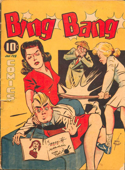
Great list! I’ve liked every Adrain Dingle cover I’ve seen and feel you could do a list with just him. I also like those weird humour covers and war covers by Darian (?) for Joke and Commando. Love the giant bloody snake and the girl in a knife-fight with a robot that Dingle did. Love that John Stables Piltdown Pete cover where the cavegirl is painting “All Canadian Comics” on the dinosaur. I like “Down with Pinky” (Bing Bang #10). Love that hockey cover!
Bryan, you are right. There are so many great covers in this first set of Canadian comics. The best thing of all is that they are our own–they’re Canadian! I think it misses the point to set them up against the great American golden age covers as some Canadian collectors of American golden age comics sometimes do with a sense of superiority that they are collecting the very best.
Chris, glad to have inspired you to check out GCD again. But I agree 100% when you compare the ease of using Gerber and especially doing cover comparisons. One small point for GCD, Gerber left out tons of more run of the mill covers, later in long title runs or on minor titles, such as romance totles, and most are on GCD.
Another source I use for cover scans is MyComicShop. They are very complete on major titles…and at the same time, you can see if any you might want are in stock. After Jim Payette, they are my favorite source buying for well-graded Gold and Silver Age.
But they are super-lame on WECA scans so far. More reason for The Kocmarek WECA Photo-Journal!!
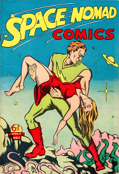
Some interesting choices. I like the colour scheme of The Mounties cover. The Space Nomad cover was one of the first Canadian comic covers I came across. The name caught my attention.
While Nelvana seems more poster than cover it is a well deserved No.1. It has become such an iconic image.
Hey ivan, would you like to see a world I’m making based partially on the old WECA comics (I’m kinda making a bit as I go along, I have olny the reprints). It’s coming along at my own pace.
Alex would love to see your ‘WECA World.’ Give us a link or directions on how to get there. For more source material you should check out all the full pdfs of the Bell Features comics that the Libarary and Archives of Canada has online.
https://www.worldanvil.com/w/weca-earth-mangekko
So the thing is a work in progress and I made up stuff, some of it is my interpretation while most is a fill in the blank thing. The goal is to include as many heros as I can and maybe some fanfiction when Im finished.
I’ve just found this site and am enjoying all the different articles. Keep it up! I also have a copy of your WECA Comic Price Guide. It was great to see! I bought it in Halifax so you know it’s making its was around the country. Whenever you do the next edition (hint) I think it would be great to expand it to include Canadian comics up to the demise of Superior. I know this is well beyond the WECA period, but it was also the end of Canadian comics large scale for decades and means some later issues can be included from the early fifties. Also, as Superior had US distribution they are listed in Overstreet so they could give a nice price comparison. They are more widely available and have enjoyed a larger collector audience on both sides of the border but it would be nice to see them recognized as Canadian content.
Alex, you’ve started a wonderful project that shows your passion for these Canadian war-time comics. There’s a lot of scope there and a lot of work. I hope you can take it where you want to go. I remember an old website based in St. Catharines, I think, that presented some fan fiction about the WECA heroes lives after the forties through to the seventies. I wish I could find the link, but I think that the author had Johnny Canuck marrying Nelvana and then getting divorced or something. Anyway that author made their lives more down to earth and human as they aged. Again, good luck with your effort and don’t hesitate to ask for any help you might need.
Stephen, copies of both my books have gone far and wide, even to the Yukon, the UK, and South Korea. It’s great that the word about WECA comics is gaining an interest all over the place. I’ve talked alot about producing a FECA (1947-56) Canadian comic guide with Jim Finlay, who helped out with the pricing in the WECA Guide, but the scope of those comics, including all the Canadian reprint variants, is huge. A lot of research still has to be done. Jim estimates that there are probably 4,000-5,000 individual issues that have to be tracked down. With the WECA Guide there were only about 780 issues. The 1947-56 period of Canadian comics has to be mapped out at some point, but right now I see it as a couple of years away at least and a lot of pooling of collector resources.
Ivan, do you mind if I email you if I have any questions?
Alex please do email me with any questions. In fact, I welcome email questions, comments, and suggestions any time from readers of this column.