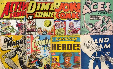
It’s hard to contradict the axiom that comic book collecting these days is character driven. In this piece, I’d like to focus on a few WECA period artists who maybe should be more collectible just for the quality of their art apart from the fact that they created very collectible WECA era characters. Remember that almost all Second World War Canadian comic book artists wrote, laid out, pencilled, inked and lettered their stories all on their own. It was a one-person job from beginning to deadline. I’ll begin by pointing out the obvious caveat that the selection I propose bellow is heavily coloured by my own tastes and sense of appreciation. It’s presented to you as a starting point for appreciating the great art in these first Canadian comics of ours.
It’s ironic that one of the commonest reactions to the topic of Canadian Second World War comics whenever it is brought up has been that the artwork they contain is invariably and significantly inferior to what is found in American comics of the same period. That our comics, especially from the point of view of the art they contained, were only triple A ball at best compared to the major leagues below the border. True we didn’t have an Eisner, Kirby, or Lou Fine but we did have a bunch or darn good artists given our population was one-tenth that of the US. Our weak business model wasn’t conducive to attracting large numbers of artists and technological constraints (printing equipment, newsprint restrictions, distribution across a much broader geographic region, etc.) often degraded the final product on the page. Even the impending threat of the return of the burgeoning American juggernaut as soon as the war ended, made the industry hamstrung from the beginning.
Here then are a bunch of kickoff suggestions that would benefit greatly from readers’ input and comments.
For the top tier artists, I think we should take an example from each of the 4 major publishing houses. This would give us Adrian Dingle from Bell Features, George Menendez Rae from Educational Projects, Jon Stables from Maple Leaf Publications, and Ed Furness from Anglo-American. They all had academic art school training, but Dingle and Rae had already established themselves as fine artists before the comic began.
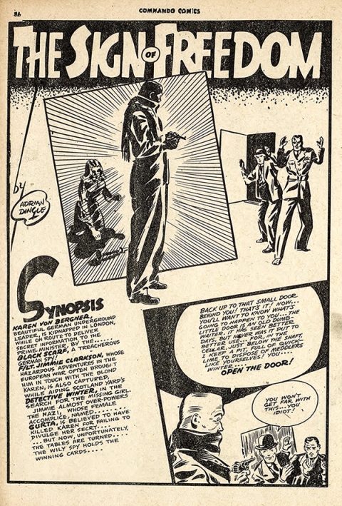
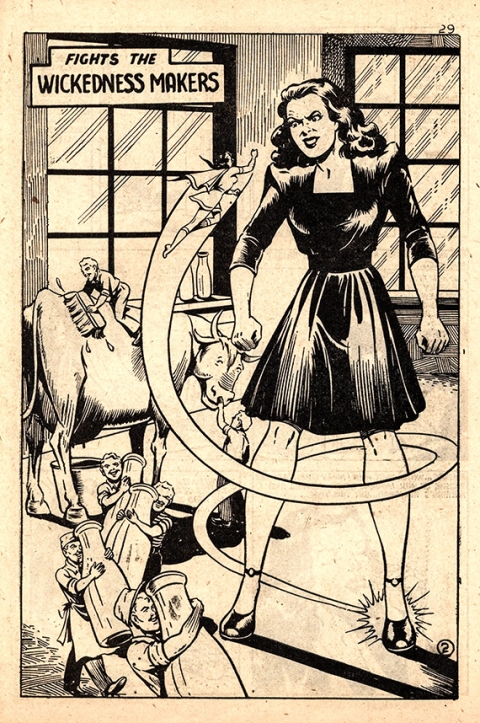
Dingle, aside from the fact that he created Nelvana and the Penguin, was a master of spotting blacks on the page. His design, story layout, and composition, belied the training and experience he had. He was 30 when he began drawing comics. Everyone is familiar with his Nelvana compendium cover, his Wow Penguin covers and that iconic Dreamer cover on Wow Comics No. 26. Here is Dingle’s splash page for his “Sign of Freedom” strip in Commando Comics No. 29:
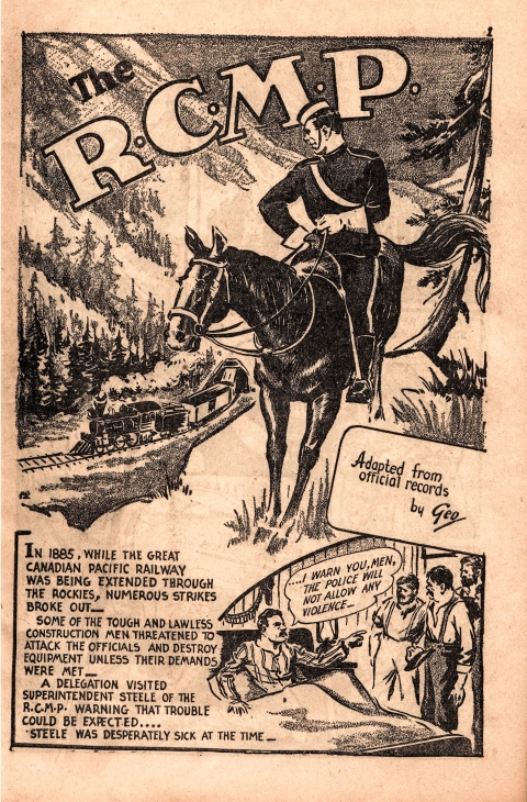
George Menedez Rae often seems to be forgotten when placed alongside the character driven forces of Dingle’s Nelvana and Jon Stables’ Brok Windsor. He was 32 when he started illustrating comics and he produced some of the nicest pages in all of Canadian comics and you don’t have to look just at his Canada Jack character to find them. Rae did beautiful shading textures in many of his RCMP strips for Canadian Heroes Comics such as this one from Vol. 4 No. 5.
Here’s a splash from one of Rae’s historical stories, Canadian Heroes Vol. 2 No. 5:
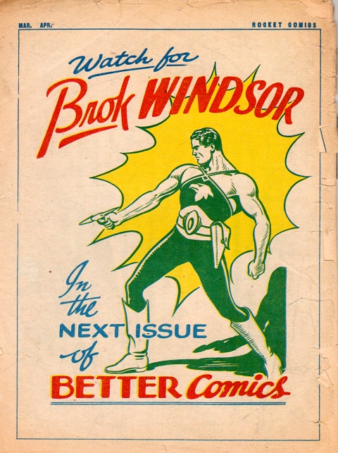
On the west coast, we had Jon Stables. We can’t forget the great work he did on his Bill Speed strip in Rocket Comics, but his iconic work will always be on Brok Windsor. His smooth, strong lines and attractively proportioned figures will always place him high up on the Canadian collectible artists list.
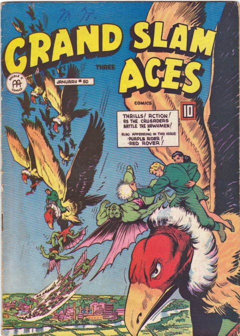
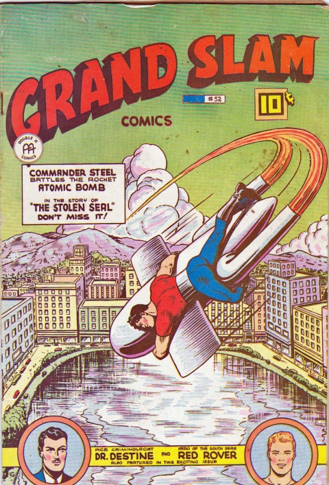
Back in Toronto, Ed Furness was part of a production line system that Anglo-American Publications employed (See Robert MacMillan’s great article based on interviews with Ed Furness called “The War Years: Anglo-American Publishing Ltd.” In John Bell’s 1986 book Canuck Comics). Ed, though, seemed to be left on his own to do his two main strips, “Freelance” and “Commander Steel.” For me, Ed Furness comic art always evoked the spirit of those wonderful American Fawcett books below the border and it’s easy to look at Anglo-American Publications overall as Canada’s counterpoint Fawcett comics across the border. Of course, there is the layer of irony that, in it’s early development, Anglo-American chose to rely on redraws of Fawcett scripts for a number of years. Anyway, here are a couple of great Furness covers:
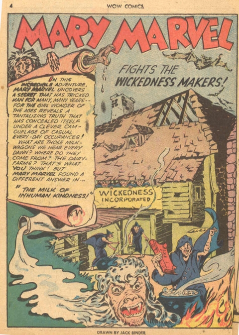
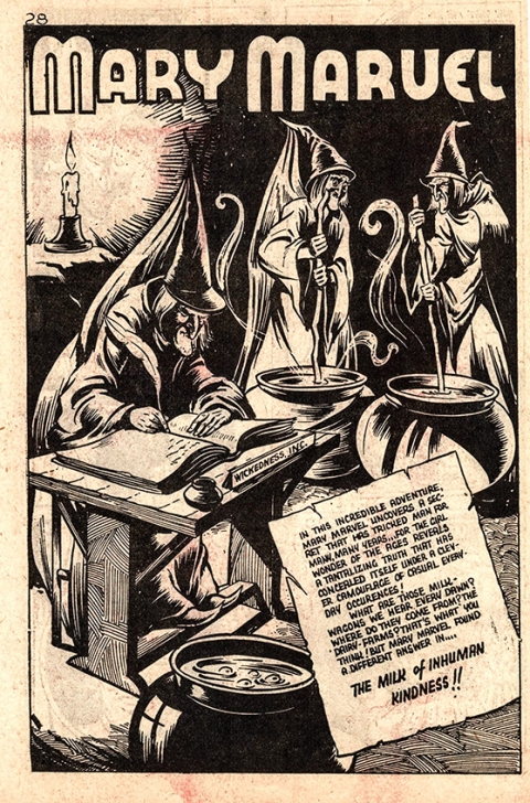
And here are some examples of how Anglo-American redraws compare with the same script pages as they originally appeared in American Fawcett comics. In my opinion they seem to be an improvement. First the American splash for the Mary Marvel story in American Wow Comics No. 17:
And the Canadian version in Spy Smasher Comics Vol. 2 No. 7:
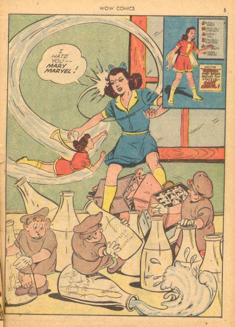
The following page in the American Wow 17:
And the Canadian version in Spy Smasher Vol. 2 No. 7:
In my humble estimation, the Canadian pages seem to be an improvement.
Those four artists, Dingle, Rae, Stables, and Furness, I’d put at the top of the list according to my own preferences.
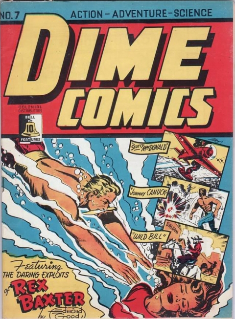
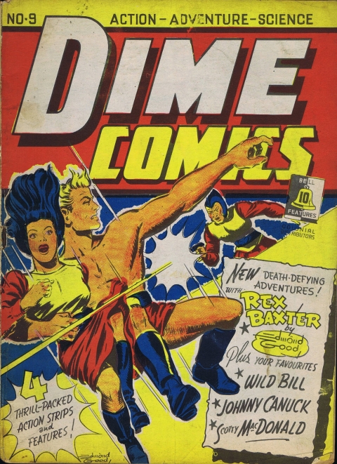
I’m not exactly sure where to go from here but let me suggest that Edmond Good (Bell Features) and Bert Bushell (Maple Leaf Publications) clearly stand out. Edmond Good served as Art Director for Commercial Signs of Canada as it transitioned into Bell Features until Adrian Dingle came on board to take over as Art Director. Here are a couple of great Edmond Good covers from Dime Comics No. 7 and No. 9:
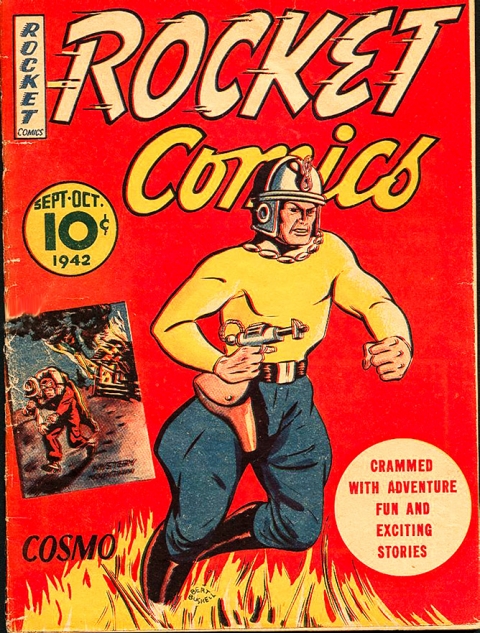
Bert Bushell was born in 1916 and died young at 60 in 1976. He worked for Maple Leaf Publications drawing strips like, “The Black Wing” and “Ether Escapades” in Lucky Comics, “Pinky” and “Adam and Eve” in Bing Bang Comics, and “Callahan the Detective” in Rocket Comics and “Senorita Marquita” in Better Comics. Though he doesn’t draw like Eisner, I think there are similarities in approach with a tongue in cheek humourous approach to each strip, varied perspectives and his ability to do ‘good girl’ art now and then. Here are some examples of Bushell’s work:
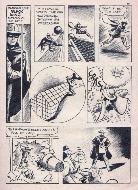
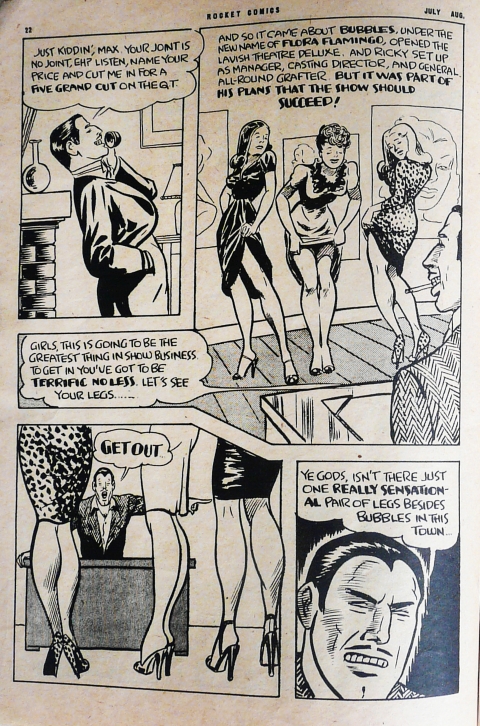
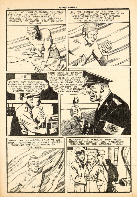
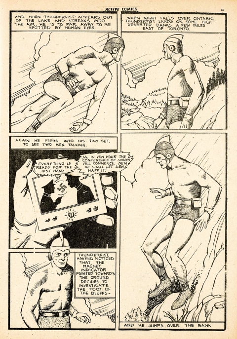
There are other artists at each of the four major publishers to look to. At Bell Features we have Murray Karn and Clayton Dexter (Howard Cowan) who both channel a strong Alex Raymond style. Murray Karn often used models and I think this sometimes made his style look a little stiff. Here are a couple of Karn’s Thunderfist pages from Active Comics No. 8:
Clayton Dexter came to Bell Features after the war but he had already drawn for Adrian Dingle at Hillborough Studio in Top Flight Comics. Dexter had a really clean and firm line but he had the peculiar habit of always starting off stories with a large splash panel and two rectangular panels underneath. Similarly, the rest of each of his stories always consisted of pages with 4 equal-sized rectangular panels. Here are two examples of his art:
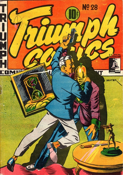
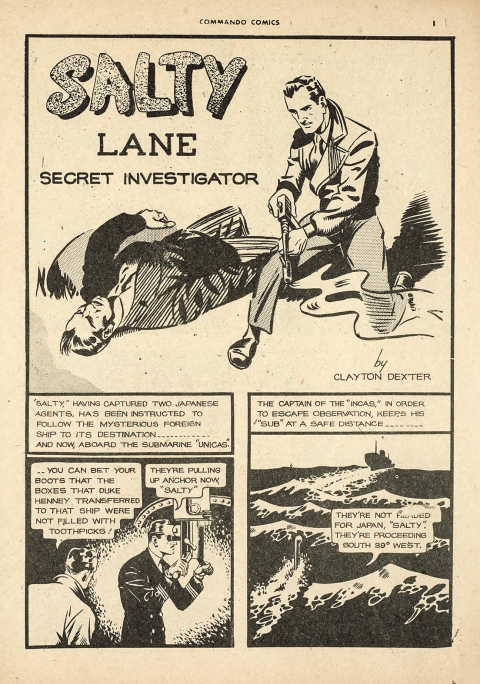
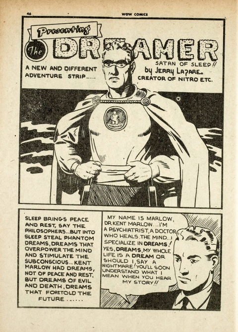
Other artists at Bell Features that we have to consider are Gerry Lazare, the creator of Nitro and The Dreamer:
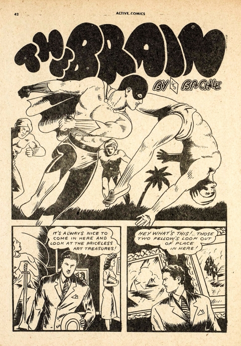
Leo Bachle the creator of Johnny Canuck, The Brain, and The Invisible Commando had a hurried but effective style that was suited to action heroes:
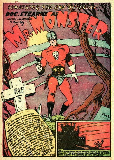
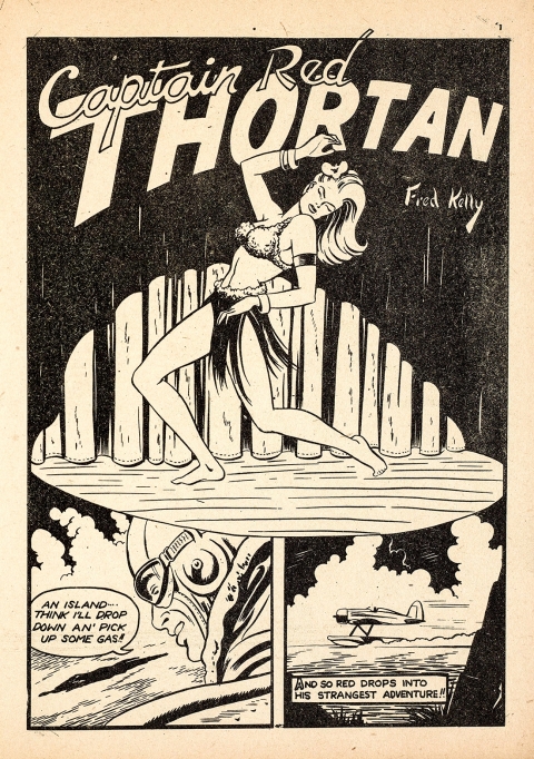
And Fred Kelly the Creator of Doc Stearne, Mr. Monster, The Blade, and Clip Curtis musn’t be left out:
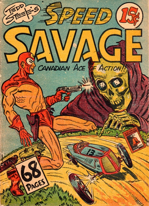
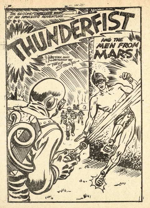
Tedd Steele was the creator of Speed Savage and also closed out the Thunderfist strip with the “Thunderfist and the Men from Mars” arc in Active Comics Nos. 23-26. His style seemed to have some Kirbyesque influence with his characters careening through panels with legs splayed. His stories were always well-written and pages were often crammed with text. Here is Steele’s cover for the Speed Savage Compendium:
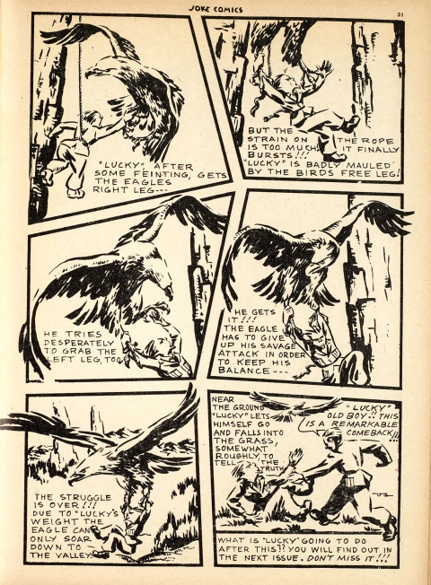
Let me throw a more obscure but accomplished artist who also had fine art training. Here is what I feel is a classic comic page charged with dynamism by artist Oscar Schlienger showing Lucky, The Unbeatable in a mountain top battle with an eagle from Joke Comics No. 4:
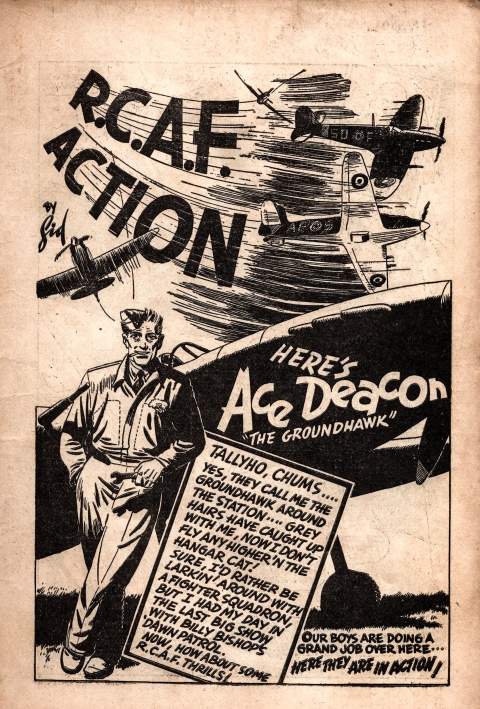
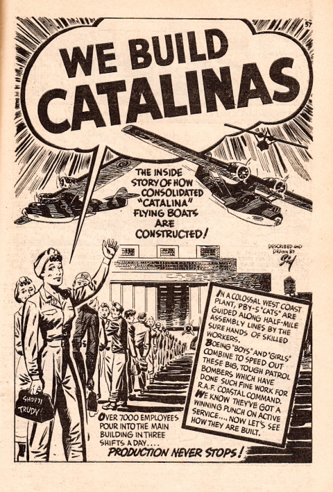
At Educational Projects we have to call attention to future editorial cartoonist Sid Barron who did features such as “Bos’n Bill” and “Ace Deacon” in Canadian Heroes Comics. Here is an Ace Deacon splash followed by an ‘edu-comics’ piece he did in Canadian Heroes Vol. 3 No. 1:
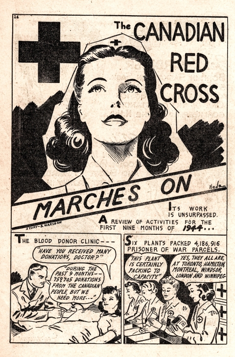
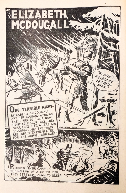
Also at Educational Projects was a remarkable individual whom nothing is known about but who signed work as “Neda.” This artist deserves more recognition and I hope that someday we can solve the mystery of this person’s identity:
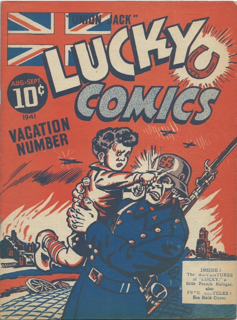
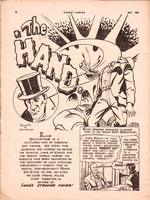
In Vancouver, I couldn’t forget Ernie Walker who created “Lucky” the French war orphan saga that began in Lucky Comics No. 3 and did “The Hand” for Rocket Comics:
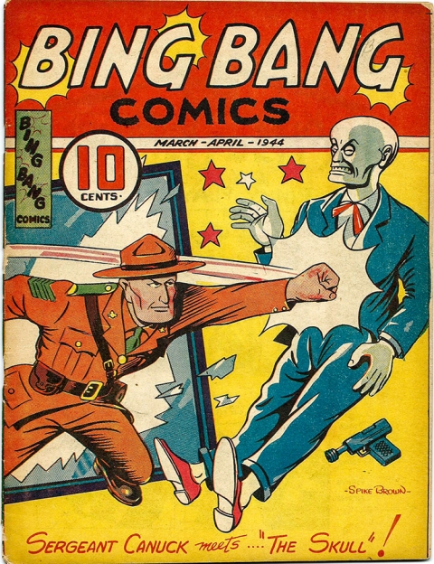
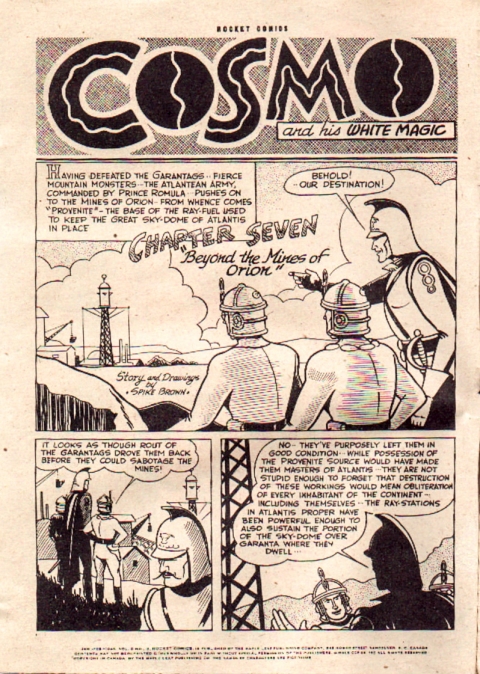
Or Spike Brown who created the “Cosmo and his White Magic” strip as well as Sergeant Canuck and whose real name was Percy Herwood Brown. His day job was working for the British Columbia police:
Of course, there are others who could be mentioned but the defence rests. There was, without doubt, some mediocre art and even some regrettably bad art in the pages of our Canadian war time comics but it’s clearly unwarranted to dismiss our WECA comics to the remainder pile of throwaway, second-rate art. We can be justifiably proud of the quality of art in those black-and-white Second World War pages and whoever unthinkingly chooses to disparage them clearly hasn’t put in the effort to read enough of those cool Canadian war-time books.
I’ll be presenting a panel called “Heroes of the Home Front” that will include former Bell Features artist Jack Tremblay and his son Rick Trembles at Montreal Comic Con on the weekend of July 7-9. I’ve also started up a Facebook page last week and will announce there the exact time the panel will be presented once I’m made aware of it by the con organizers.

Among the four or five people I discuss Canadian Whites with we never talk about them as inferior artwise. Why would you be interested in these if not for the art? Maybe they are the kind of investor collectors who focus on rarity and dollar value alone. If that spirit is abroad it is an just another sorry example of Canadian self-hatred and a focus on the “winners” of cultural history in an American-centric world. Thanks for this wonderful article. Excited for the book!
Hey old chum
You’ve addressed a longtime bane of my love of the WECA comics: public perception.
For one thing, these books are so obscure that they are well beneath the radar of most comic historians.
I hear the argument for the likes of American creators like Kirby and Fine used by comparison, but I hate it when it is used as a form of dismissal of the finest Canadian work.
I’ve even been subject to comic dealers who openly deride the stuff to my face when I have the utmost gall to even ask if they might have any in stock.My late,great friend Harry Kremer used to cheap them out, sure, but that was because he couldn’t get any more back in the day before anybody had realized what they were…or even cared..
Ivan, this is wonderful intro to the talent we had during our own homegrown Golden Age. It’s a tribute to you, as well, and the work you have done to bring these books back into the cultural consciousness.
cheres, mel
P.S. Personal favourite? George Rae!
I agree with you Brian, Canadians have had a strange penchant to believe that anything culture-related produced in the States in Europe is by default magically superior to what we create here ourselves. That’s why so many musicians and actors feel they have to go down to New York or L. A. to make it. I don’t think our war time comics have to take a back seat to anyone and I’m so proud that we Canadians were able to create them and that we can call them our own. It’s one of the things that impelled me to write about the artists who created them.
(*I noticed a typo in the text just above the Adrian Dingle “Sign of Freedom” splash graphic–the source should be Commando Comics No. 19 not 29 as it reads.)
Mel, I’ve had the same experience with dealers. I think that one of the main reasons for this unwarranted derision is the scarcity of these books and the fact that most of these dealers and probably most of the collecting community as well simply hasn’t had the opportunity to read a broad spectrum of them. Some of the recent collected reprints have alleviated this to a small extent but these character driven reprints still only present a small sampling. Even some of the people who collect these books don’t always make the effort to actually read what’s inside and would rather see them as trophies. You know that, in the end, I don’t see myself as an historian, researcher, or collector of these books. I (maybe vainly, but I hope not) see myself as a champion of the innate quality and cultural/historic significance they exude. There are many dragons to slay out there.
Great column. Great to hi-lite that not all the art was bad. There is just as much bad art in the American books, but it tends to be overlooked. Obviously with less books the Canadian bad art stand out.
The redrawn Fawcetts look way better in the Canadian versions, and that is with no Mac Rayboy.
Stables will probably always be my favorite. Just great clean line work.
Haven’t seen much Bushell work but very distinctive. Have to check him out.
The “Stevie” missive hurt my head just scrolling. lol
You know Peter, I bet all the artists mentioned in this column could have gotten work below the border if they were really keen on it. In fact people like Edmond Good, Leo Bachle, Mel Crawford, and even John Stables ended up working down south though for Stables it wasn’t in comics. I think, in terms of overall popularity, Jon Stables will probably always end up at the top of the list of Canadian war time comic artists. Also, one of my ongoing questions has always been, “When will Amercan Fawcett collectors realize what was being done north of the border in relation to their favourite stories and characters?”
As an administrative point, my previous comments took a while to load so i clicked repetitively on “load-comment” a few seconds apart. The loading was apparantly stopped and restarted half way through several times, making it appear to be the repetitive rant of a madman. Thanks for deleting my recent failed comment and i hope this explains the pitfall of clicking more than once on “post-comment. ”
Since the substance of my comment was not understood, or viewed as an abuse, i think it best to limit my comment to one phase – IMO “Whites are most culturally relevant for their Canadian stories and message to readers” : The art is a vehicle, not an end in itself.
Thanks to Stevie and Scott for sorting this all out. Stevie, I agree with you that these war time Canadian comics are much more than just the art and whether the art or the stories pull us into them may be a matter of personal taste. I also agree that it is the whole package that makes them important to me and a lot of other people that love them. They are part and product of the history and politics of a relatively young Canada, their clubs and call outs of kids across the country and even abroad have great socio-cultural significance, and the fact that they featured the adventures of Canadian heroes often in Canadian settings makes a great contribution to our sense of national identity. For me some of the very best stories in these Canadian comics were written by Frederick Griffin, who wrote as Vic Griffin, that started appearing in Bell Features comics from Active Comics No. 9 on and a lot of which were collected together in the 1945 Thrilling Stories for Boys compendium. Also, Ted McCall’s Freelance stories for Anglo-American are invariably well-written. Both these guys were professional journalists and the quality of their stories are evidence of this. What is compelling about these comics is that whole package. I guess this column simply says that the art component of that package was, in general, no less comparable to that found in comics below the border and the disparaging attitude it sometimes commands is unwarranted.